We're torn over this Airline's new, modern logo
Has Caribbean Airlines lost its sense of fun?
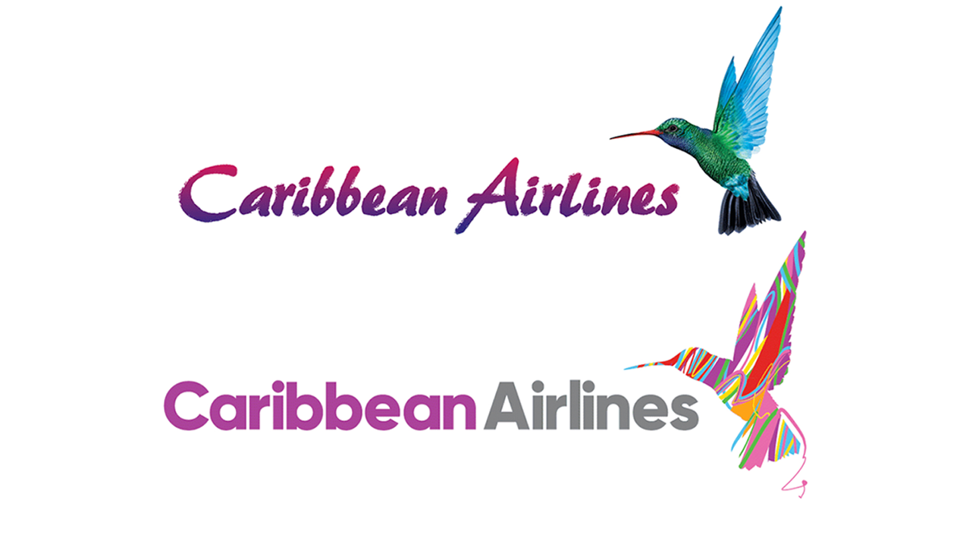
Caribbean Airlines has unveiled its first brand refresh since the airline began in 2007, including a new logo and wordmark, as well as a new livery adorning its aircraft. Rather than a full rebrand, the airline calls its new look a "an exciting makeover, not a new start." The airline's aesthetic is (unsurprisingly) inspired by the warmth of the Caribbean (check out our guide to logo design inspiration if you're looking for ideas of your own).
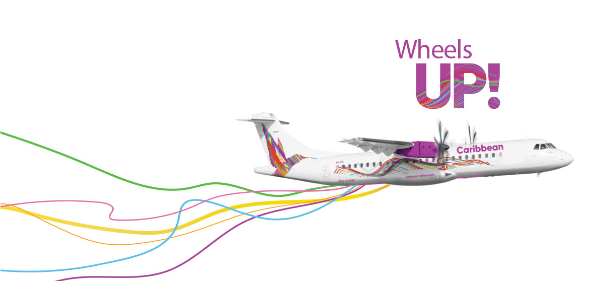
First and foremost, the logo's hummingbird has transformed from a life-like illustration to a render filled with multi-coloured ribbons (or "fluid lines"). The airline's wordmark has ditched its, er, 'characterful' typeface in favour of a more modern, sans-serif affair. The aircraft livery extends the ribbon motif, with colourful lines splayed across the side of the plane.

In a blog post about the brand refresh, Caribbean Airlines says the airline's aim is to "embody the warmth of the Caribbean", and the new look is more modern and vibrant, whilst "retaining the emotional connection of the original branding to that essential warmth".
Article continues below 
Do we prefer the new design to the old one? To be honest, we're torn. It's clear why Caribbean Airlines felt the need to update their look – the Vice City-esque text looks positively cartoonish a world of minimalism and flat design. The new design wouldn't look out of place in a line-up of airline logos (take a look at six of the best airline logos), which may well be what Caribbean Airlines was going for.
And yet we can't help but mourn the loss of the slightly retro, '80s aesthetic of the original. The airline says it's all about warmth, and we'd say the nostalgic feel of the original typeface is 'warmer' than the muted pink and grey of the new, geometric version. Perhaps something halfway between the two could have worked?
For us, the hummingbird symbol fares better. Those new, bright colours certainly convey the "spirit of flight and vibrancy of culture", and a sense of fun that's missing from the wordmark. The airline' shared an animation (above) of the old hummingbird transitioning into the new one, which, despite looking like the bird is being mummified with silly string, demonstrates the vibrancy of the new bird.
There's no denying that the new logo is a much sleeker and more modern look, and we've no doubt it'll end up serving Caribbean Airlines well – at least when planes are back in the air (according to The New Today, coronavirus forced the airline to cancel a planned ceremony for the brand refresh last month). Perhaps it's a testament to these strange times that we find ourselves yearning for something a little more nostalgic – more fun.
Sign up to Creative Bloq's daily newsletter, which brings you the latest news and inspiration from the worlds of art, design and technology.
Related articles:

Daniel John is Design Editor at Creative Bloq. He reports on the worlds of design, branding and lifestyle tech, and has covered several industry events including Milan Design Week, OFFF Barcelona and Adobe Max in Los Angeles. He has interviewed leaders and designers at brands including Apple, Microsoft and Adobe. Daniel's debut book of short stories and poems was published in 2018, and his comedy newsletter is a Substack Bestseller.
