Are these Google logo concepts better than the real thing?
Chrome, Maps and more get a fan-made facelift.
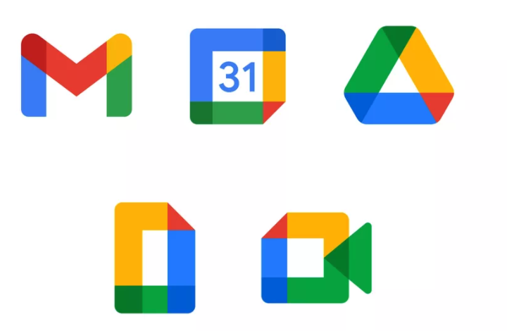
Google released a bunch of new logos and icons for its various Workspace apps in 2020 – to a chorus of disapproval. Users continue to complain about these bafflingly similar designs – but a series of fan-made icon concepts seems to be gaining applause on Twitter.
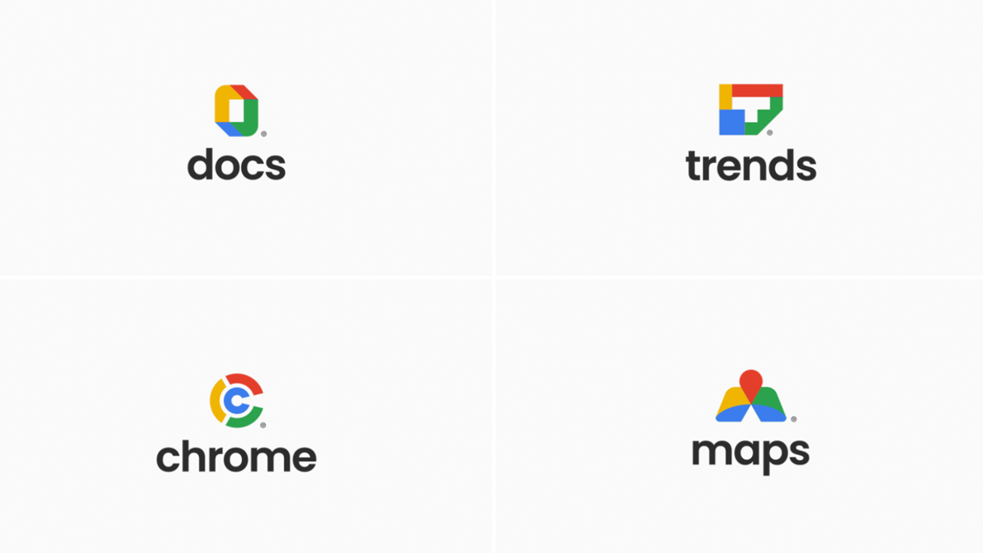
Earlier this week we highlighted Fabian Arbor's awesome Domino's rebrand concept, and the designer is showing no signs of slowing down. Arbor's latest reimagining covers four apps in the Google Workspace suite – but are they better than the originals? (Take a look at our guide to the best logos of all time for more inspiration, or recap on the controversial World Chess Championship logo redesign.)

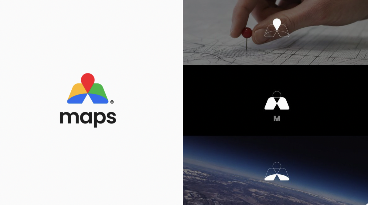
Arbor's designs use the same four-colour scheme as their genuine counterparts, which means when presented together on a user's homescreen, they could arguably be just as confusing. But there's some ingenious design work here – including a Maps logo (below) that integrates a pin icon, the letter 'M' and, of course, the curve of planet earth. It makes even that Domino's logo look simple. The Trends icon, meanwhile, makes brilliant use of negative space.

"I think your Maps redesign is a truly iconic bit of creative branding, up there with Apple and Nike," one user comments, while another adds, "Docs and Maps look so vibrant."

As for the genuine logos (above), Twitter is still complaining about them. Meme account No Context USA recently shared its take on the issue, with the caption 'When designers prioritise aesthetics over usability' – and judging by the many, many comments, the overly similar logos are as confusing as ever.
Google said in 2020 that the new logos are designed to reflect "a more connected, helpful, and flexible experience," and the fact that Google's Workspace apps are "part of the same family". Judging by the continued response from users, it seems the company achieved this a little too effectively. Still, at least Google can take some solace from the fact that it isn't the only brand to confuse users with its overly consistent logos – the same dubious honour also goes to Adobe.
Read more:
Sign up to Creative Bloq's daily newsletter, which brings you the latest news and inspiration from the worlds of art, design and technology.

Daniel John is Design Editor at Creative Bloq. He reports on the worlds of design, branding and lifestyle tech, and has covered several industry events including Milan Design Week, OFFF Barcelona and Adobe Max in Los Angeles. He has interviewed leaders and designers at brands including Apple, Microsoft and Adobe. Daniel's debut book of short stories and poems was published in 2018, and his comedy newsletter is a Substack Bestseller.
