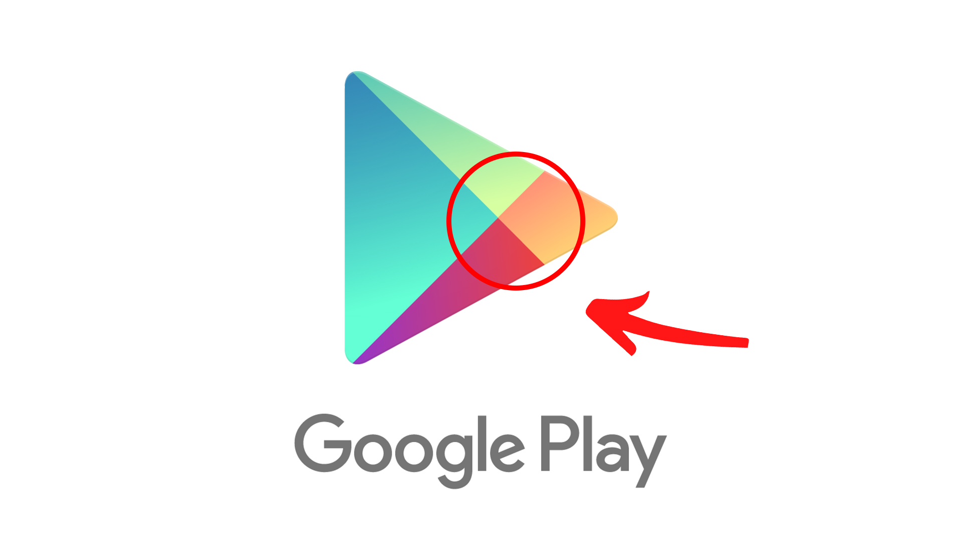
We wish we'd never seen this Google logo design crime
Well, that's our day ruined.

Sign up to Creative Bloq's daily newsletter, which brings you the latest news and inspiration from the worlds of art, design and technology.
You are now subscribed
Your newsletter sign-up was successful
Want to add more newsletters?
We've seen plenty of logo crimes over the years, from confusingly busy designs to unfortunate resemblances. But perhaps the most infuriating issues are tiny nuances that spoil an otherwise spot-on design. And it seems not even the tech giants are immune to such transgressions.
The Google Play logo has been revealed to feature, at very (very) close inspection, an entirely misaligned centre, with the logo's four colours failing to meet at an individual point. The design was shared on Twitter and is now hurting the internet's collective eyes. One of the best logos of all time, this ain't.
pic.twitter.com/mTkRayEFlEDecember 8, 2020
Twitter user ELID00 shared the monstrosity on Twitter last year, and it's still infuriating those unlucky enough to stumble upon it. "This just ruined my life in one image," one user comments, while another adds, "I hate you, I can't unsee this now. Why would you do this to me?" Indeed, it seems a tiny misalignment is a more heinous crime than some of the more dramatic disasters we've seen this year, such as the first logo ever to receive a complaint.
Article continues belowBut fear not – this is one design fail that Google has already put behind it. The Google Play logo was updated in 2016 to a much simpler version of the triangle, with block colours replacing the gradients. And it seems the colours meet in the middle perfectly this time (believe us, we've zoomed in).

That said, Google arguably isn't fairing a whole lot better when it comes to logos in 2021. The company's new Workspace logos, released over the last couple of years, have proved wildly unpopular, with users baffled by the confusing similarities between them.
Still, at least Google hasn't yet done an Amazon, and put out a design resembling the world's most infamous dictator. If you're about to embark on your own project, be sure to check out our guide to logo design – and check out today's best Adobe Creative Cloud deals below.
Read more:
Sign up to Creative Bloq's daily newsletter, which brings you the latest news and inspiration from the worlds of art, design and technology.

Daniel John is Design Editor at Creative Bloq. He reports on the worlds of design, branding and lifestyle tech, and has covered several industry events including Milan Design Week, OFFF Barcelona and Adobe Max in Los Angeles. He has interviewed leaders and designers at brands including Apple, Microsoft and Adobe. Daniel's debut book of short stories and poems was published in 2018, and his comedy newsletter is a Substack Bestseller.
