Is a new Google Play logo on its way?
I hope so.
Sign up to Creative Bloq's daily newsletter, which brings you the latest news and inspiration from the worlds of art, design and technology.
You are now subscribed
Your newsletter sign-up was successful
Want to add more newsletters?
One of the wonderful things about logos is that they're ever-evolving, and we always get excited to see a good rebrand – especially for brands as famous as Google. While the Google logo has been left untouched for now, the Google Play design is a different story.
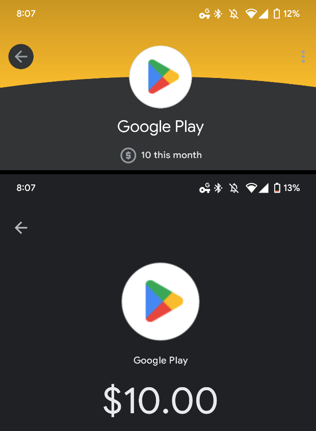
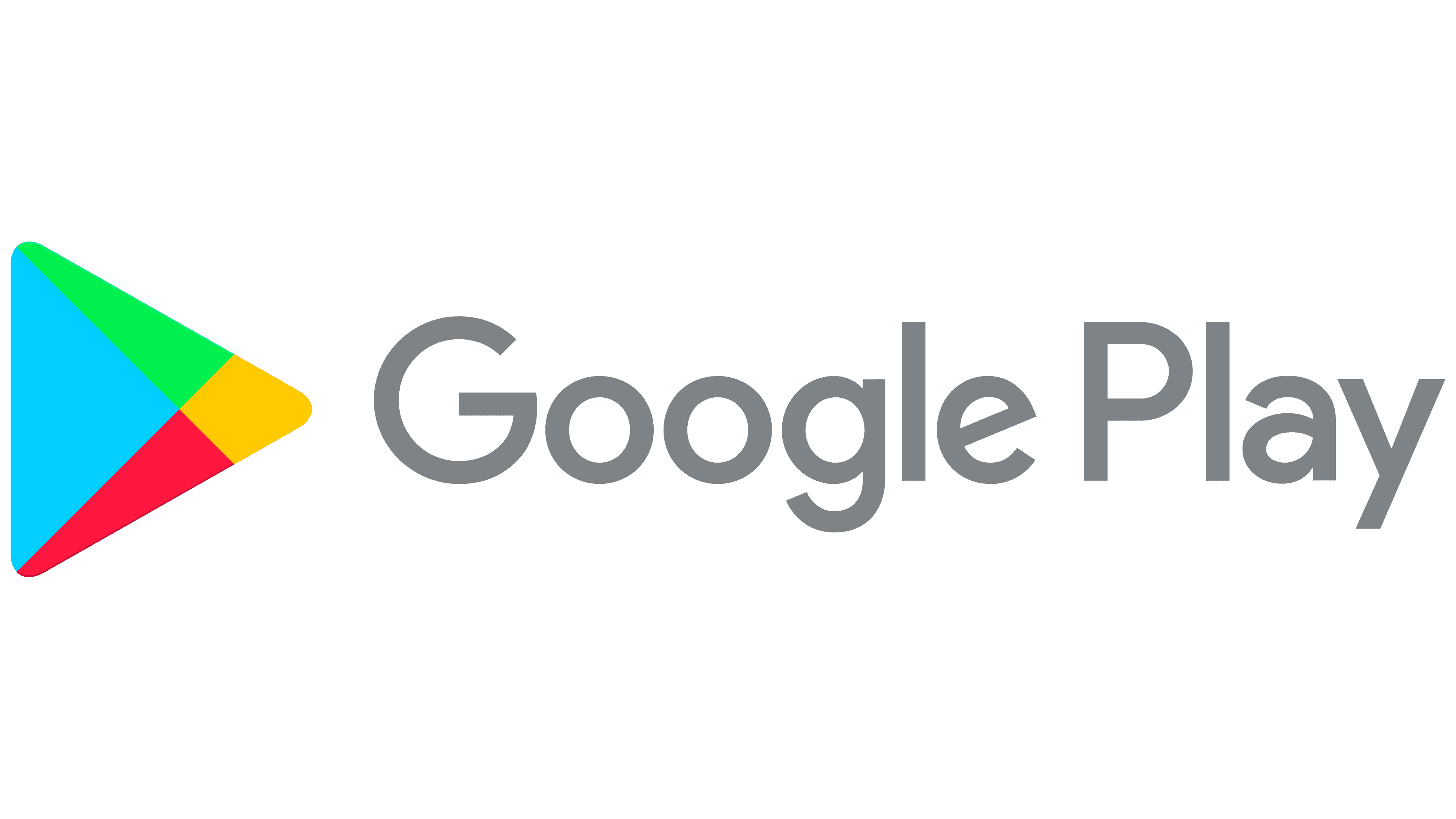
The Google Play Store hasn't had a fresh logo since 2012. Now it looks like the design is getting a fresh lick of paint with some darker shades of the famous red, green, blue and yellow Google colours – and I love it. It's almost as fun as our favourite Google Doodles.

The new logo was spotted by 9to5Google on GPay and Google Pay. The fresh design only appears when users attempt to pay for an app. 9to5Google has said that it is unsure when the logo was first added to the store, or when (or if) it'll be formally released.
Article continues belowWhile the design makeover isn't particularly easy to spot if you weren't looking for it (see below), I think the new colours are kind on the eyes and make a subtle yet nice change to the design. It almost makes me forget about the fact that the logo is hiding that design crime where the triangles in the triangle don't actually align. (see below).

We will have to wait and see if Google chooses to use this darker design as the main Google Play logo. But for now, why not have a go at designing your very own logo with one of the best online logo makers. Or if you'd like to sink your teeth into some more designs, then check out our roundup of the best logo designs of all time.
Read More:
- Burger King delivers a sick burn to the competition
- The Splatoon 3 Nintendo Switch is kind of ugly
- Wait, how many bars are in this optical illusion?
Sign up to Creative Bloq's daily newsletter, which brings you the latest news and inspiration from the worlds of art, design and technology.

Amelia previously worked as Creative Bloq’s Staff Writer. After completing a degree in Popular Music and a Master’s in Song Writing, Amelia began designing posters, logos, album covers and websites for musicians. She covered a range of topics on Creative Bloq, including posters, optical illusions, logos (she's a particular fan of logo Easter eggs), gaming and illustration. In her free time, she relishes in the likes of art (especially the Pre-Raphaelites), photography and literature. Amelia prides herself on her unorthodox creative methods, her Animal Crossing island and her extensive music library.
