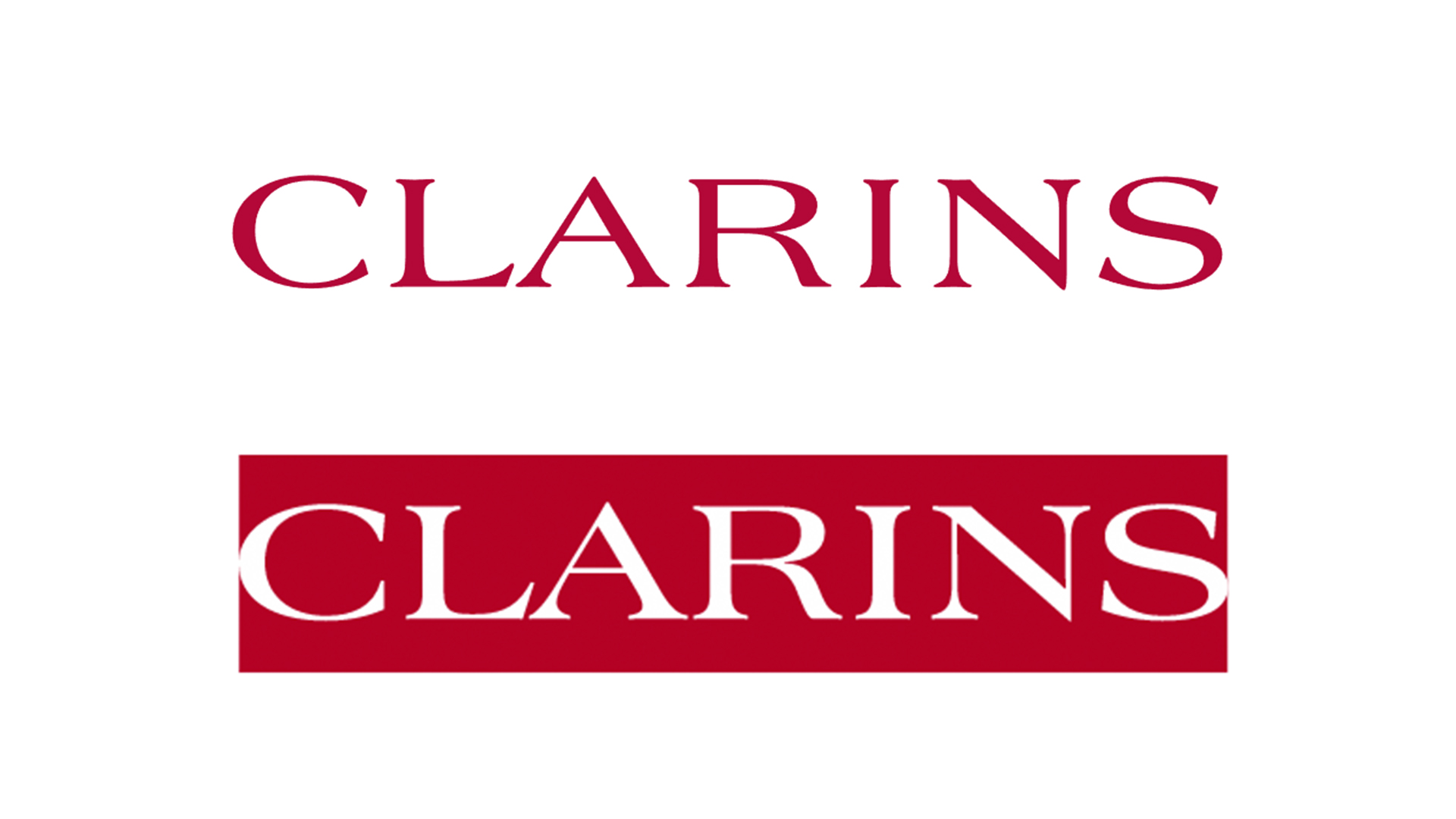
Clarins logo gets a subtle tweak, but is it enough?
There's a new slogan too.
Sign up to Creative Bloq's daily newsletter, which brings you the latest news and inspiration from the worlds of art, design and technology.
You are now subscribed
Your newsletter sign-up was successful
Want to add more newsletters?
Self-care means different things to different people, from meditating to moisturising to sinking into a hot bath. Whatever works for you, one thing's for sure – it's more important now than ever. No wonder skincare sales have soared in the last 12 months. Seizing the moment, luxury skincare brand Clarins has just revealed a brand new logo and slogan for 2021.
Clarins says its new slogan, "Live beautifully," is all about the beauty of everyday moments and the power of nature. Along with the new slogan, the company has revealed an updated logo (below), which sees the Clarins wordmark placed inside a red rectangle. Spoiler alert: if you didn't think the original was one of the best logos ever, the new design is unlikely to blow your mind.

Okay, so it's hardly the most earth-shattering redesign of all time – all we're seeing here is inverted colours and the addition of a rectangle. But hey, there's definitely something bolder about the solid shape, and by retaining the same colour palette and typeface, the new design remains recognisable.
Article continues below"We wanted to have something sharper, like a sticker,” Clarins' global general manager, Katalin Berenyi, said in a press release. “We can put it everywhere. It’s a bit irreverent.” While that last adjective seems a bit of a stretch (even the CIA's new logo is more irreverent than this), the blocky new design is certainly sharper, and will no doubt stand out on the company's packaging.

On a web page introducing the new slogan, Clarins explains that "Live beautifully" is all about "Making life more beautiful, passing on a more beautiful planet”. These words are set against a backdrop of beautiful images of women engaging in "authentic" activities (beaches, hammocks, hugs, etc.) "We had to go back to this outdoor feeling because it’s very Clarins,” says Berenyi. In that case, we hope our 2021 proves to be a little more Clarins than our 2020.
BEAUTY IS IN EVERYDAY MOMENTS✨For more than 65 years, Clarins has offered personalized beauty solutions to make every day feel special. Our sensorial, aromatic, results-oriented products are formulated to boost your mood and empower you with self-confidence.#LiveBeautifully pic.twitter.com/SUSrEtIyskJanuary 25, 2021
While hardly a comprehensive rebrand, Clarins' new logo and slogan are at least a somewhat creative repositioning of its branding. If nothing else, the 'Live beautifully' campaign photography is making us long for a time when we can live a little more, you know, beautifully. For now, we'll just have to make do with slapping on some more moisturiser (after yet another bath).
Still, not every logo redesign has to be a game-changer. Even the subtlest of changes can make a big difference, as is the case with the White House's positively presidential new look. If you're looking for logo inspiration, our logo design guide is a great place to start.
Sign up to Creative Bloq's daily newsletter, which brings you the latest news and inspiration from the worlds of art, design and technology.
Read more:

Daniel John is Design Editor at Creative Bloq. He reports on the worlds of design, branding and lifestyle tech, and has covered several industry events including Milan Design Week, OFFF Barcelona and Adobe Max in Los Angeles. He has interviewed leaders and designers at brands including Apple, Microsoft and Adobe. Daniel's debut book of short stories and poems was published in 2018, and his comedy newsletter is a Substack Bestseller.
