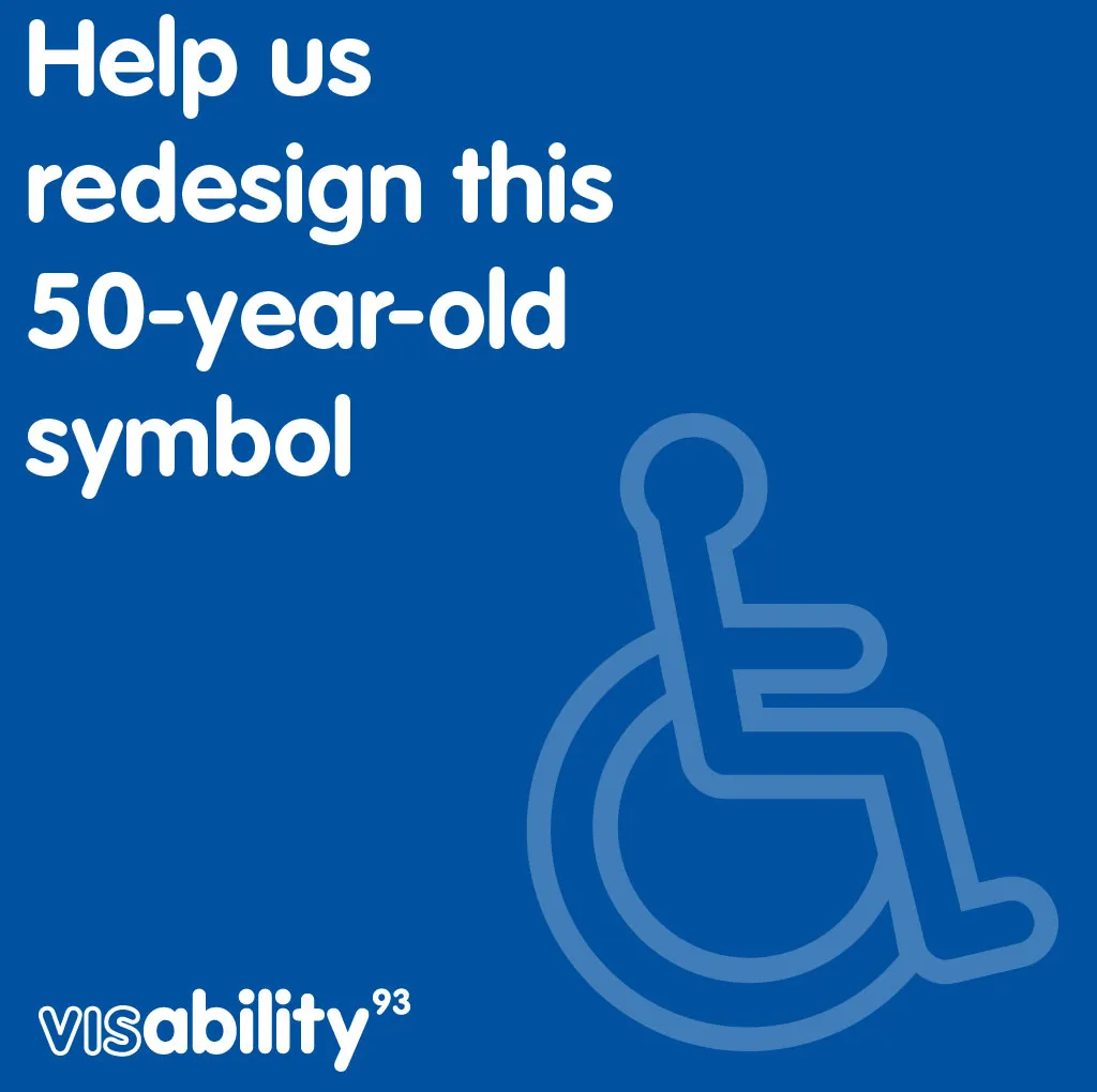
Even the best logos need to be updated to fit in with the modern age, which is why on the 50th anniversary of the International Symbol of Access (ISA) – aka the symbol of a wheelchair user – Visibility93 is calling for a redesign of the logo most of us associate with disability.
In order to start the conversation, Visibility93 has launched a new icon font, with each letter representing a different type of disability, including ADHD, anxiety, lupus and dyslexia. The idea is to inspire the design community to make a new logo that represents lots of different types of disability – both visible and invisible – and to spark conversation and debate about the symbols that should be used to depict disability.

Visibility93 was set up by designers from McCann London, many of whom have relatives or loved ones that have invisible disabilities. Wheelchair users are estimated to make up 5-7 per cent of the disabled population, meaning that at least 93 per cent of the disabled population have invisible or less visible disabilities (hence the name Visibility93). This also means that the current symbol doesn't represent most disabled people.

Dan Howarth, head of art at McCann London, said: "Our ambition is that different communities – whether design, charity, people with disabilities and the public – come together to create a new ISA that is inclusive of all people with disabilities."
The campaign coincides with the UK government announcement that it plans to overhaul the Blue Badge system, enabling people who have invisible disabilities as well as visible ones to have Blue Badges, and therefore access to accessible parking. The Blue Badge scheme is just one potential use for a new symbol depicting disability. A new logo also could help those with invisible disabilities feel more comfortable using accessible spaces.

What do you think of the new symbols?
We think the attempt to reimagine disability is welcome, but the way it's been done is potentially contentious. Some people may find the symbol used to depict the disability they have as offensive – how many of those who have depression, for example, will feel represented by the symbol above? Others may feel left out if their disability is not included.
The use of traditional symbols for men and women – which are arguably fast becoming out of date (if they're not already) – also feels like it could do with a rethink.
But as the team behind these logos say, these symbols are: "in no way a finished set – far from it." And this opening up of conversation and inviting others to become part of a change in the way that we represent disability – and potentially therefore think or talk about it – is definitely a step forward.
"We urge our peers in the design community to get involved, add to them and help evolve the language we use to depict disability," says Howarth. So go ahead, get involved. You can start by downloading the font at the Visibility93 website and following the conversation on Instagram.
Read more:

