Is this the most mesmerising logo ever?
We're loving Perspectiva's hypnotic new identity.

Sign up to Creative Bloq's daily newsletter, which brings you the latest news and inspiration from the worlds of art, design and technology.
You are now subscribed
Your newsletter sign-up was successful
Want to add more newsletters?
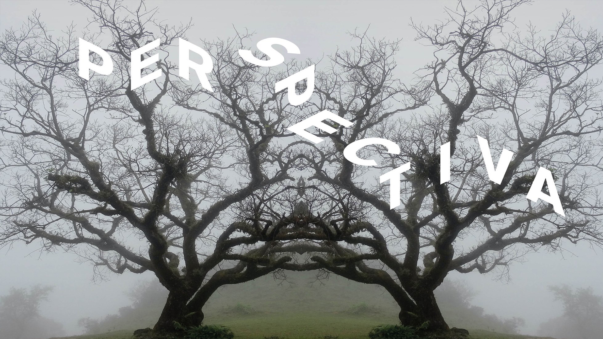
We've seen no shortage of brand new logos and visual identities over the past few months, and many of them can probably be described in one word: minimal. That certainly applies to the new brilliant new typographical logo for social change charity Perspectiva – but a few ingenious visual flourishes ensure that as well as minimal, it's also utterly mesmerising.
There isn't just one logo for Perspectiva, but instead various perspectives on the same design. The animated logo can unfold in numerous directions, designed to capture "the literal idea of multi-perspective". It's hard to pick one favourite, but we can't stop watching the animations side-by-side (below). It's a concept that's definitely up there with some of our best logos.
Our new multi-faceted identity for Perspectiva - a philosophical collective for social change @Perspecteeva pic.twitter.com/csEqjXfUJ8February 2, 2021
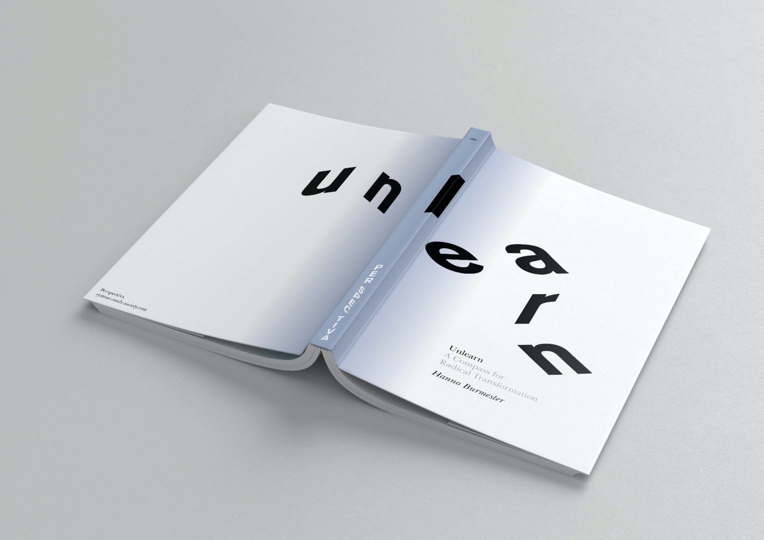
The new identity for Perspectiva, a collective of scholars, artists and activists, was designed by London-based Studio Sutherl&. As well as the logo, the studio created new icons, imagery and even book cover designs (below), all designed to emphasise the "shifts in ways of looking” championed by the charity. "Our charitable purpose is to develop an applied philosophy of education for individual and collective realisation in the service of averting societal collapse," Perspectiva's website reads.
Article continues below"The issues Perspectiva discuss and debate are not simple but multi faceted and multilayered - so the identity needed to reflect that," Studio Sutherl&'s Jim Sutherland told Creative Bloq. "We were therefore trying to typographically articulate the complex notions of multiple perspectives on multiple issues."

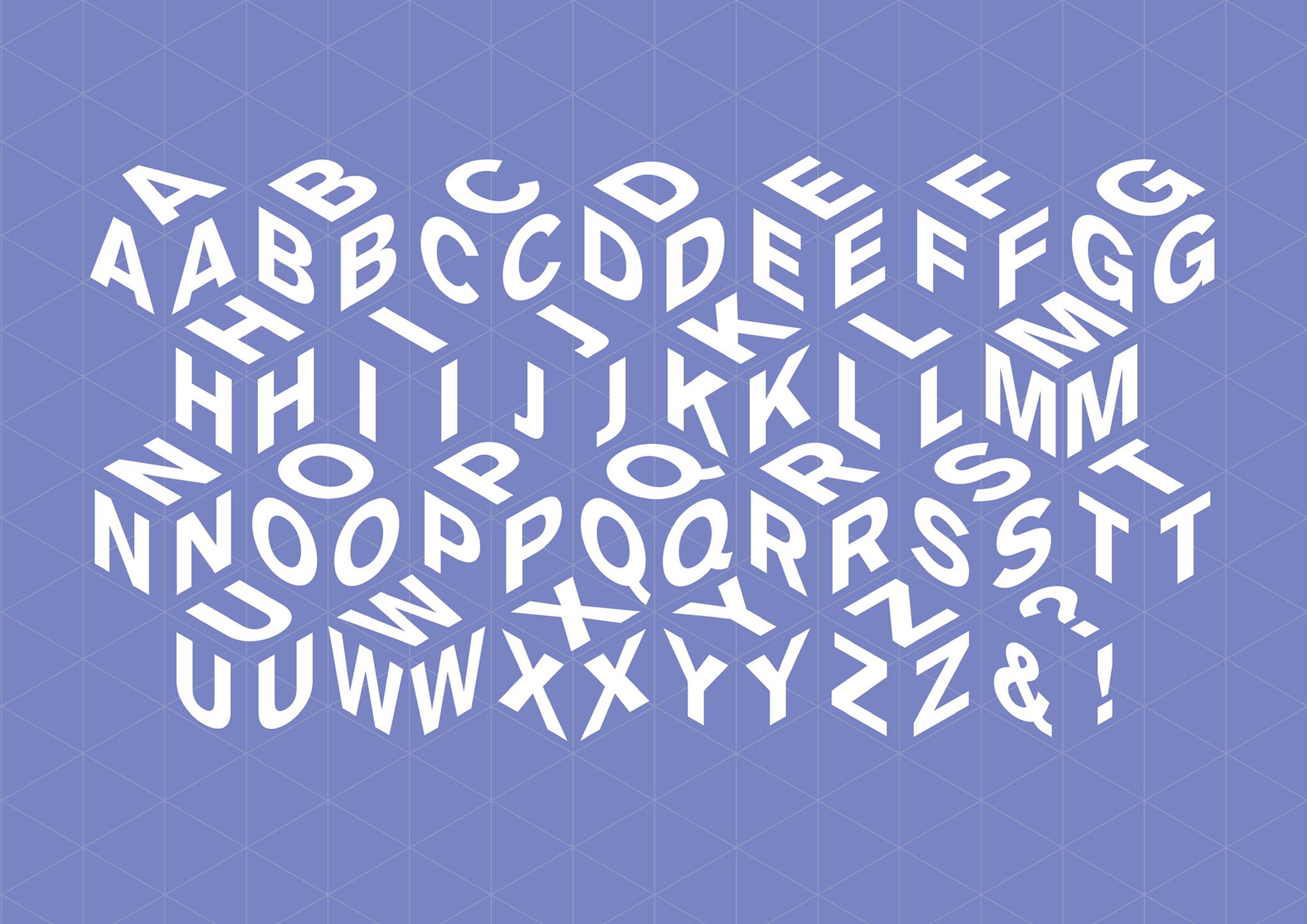
We'd say the studio has done a brilliant job of creating an identity that can be seen from multiple, well, perspectives. It manages to come across as both serious and fun, as well as minimal and complex. We're particularly fond of the bespoke "perspectival typeface", in which each letter exists in three different versions (below) to allow the various logos to unfold on an isometric grid. (Check out our best free fonts if you're looking for more inspiration.)

As this viral Twitter thread recently showed, some users are beginning to tire of overly simplified logos and rebrands. But much like Burger King's sizzling new rebrand, Perspectiva's new identity proves that there's still plenty of room for adventure in the world of minimal design.
Read more:
Sign up to Creative Bloq's daily newsletter, which brings you the latest news and inspiration from the worlds of art, design and technology.

Daniel John is Design Editor at Creative Bloq. He reports on the worlds of design, branding and lifestyle tech, and has covered several industry events including Milan Design Week, OFFF Barcelona and Adobe Max in Los Angeles. He has interviewed leaders and designers at brands including Apple, Microsoft and Adobe. Daniel's debut book of short stories and poems was published in 2018, and his comedy newsletter is a Substack Bestseller.
