This brilliant BBC Philharmonic branding is music to my…eyes?
It’s a symphony of colour.

Sign up to Creative Bloq's daily newsletter, which brings you the latest news and inspiration from the worlds of art, design and technology.
You are now subscribed
Your newsletter sign-up was successful
Want to add more newsletters?
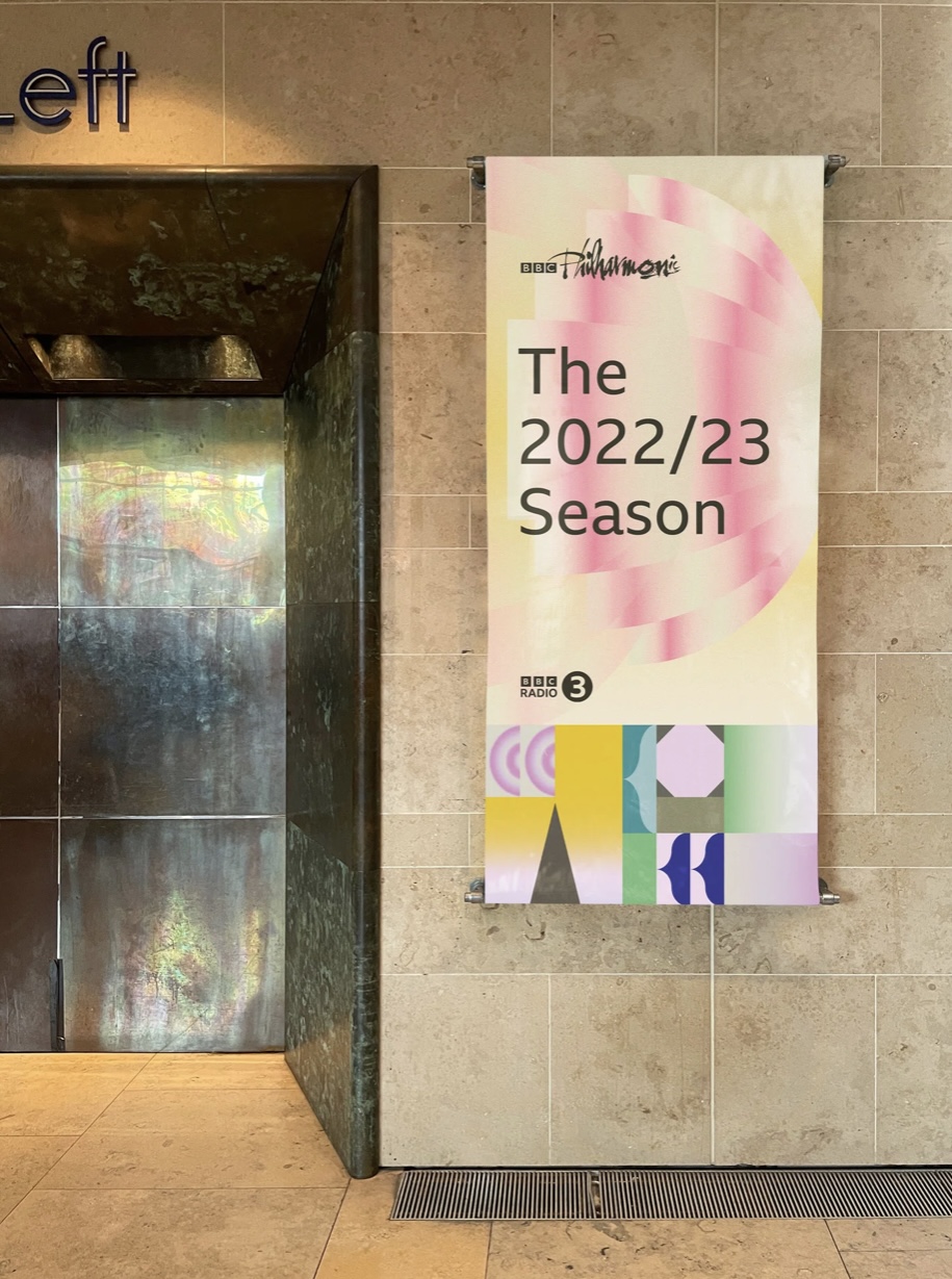
This year the BBC Philharmonic Orchestra is turning 100 years old. To celebrate the centenary of the orchestra, the BBC has given its branding a total refresh – and it is absolutely stunning.
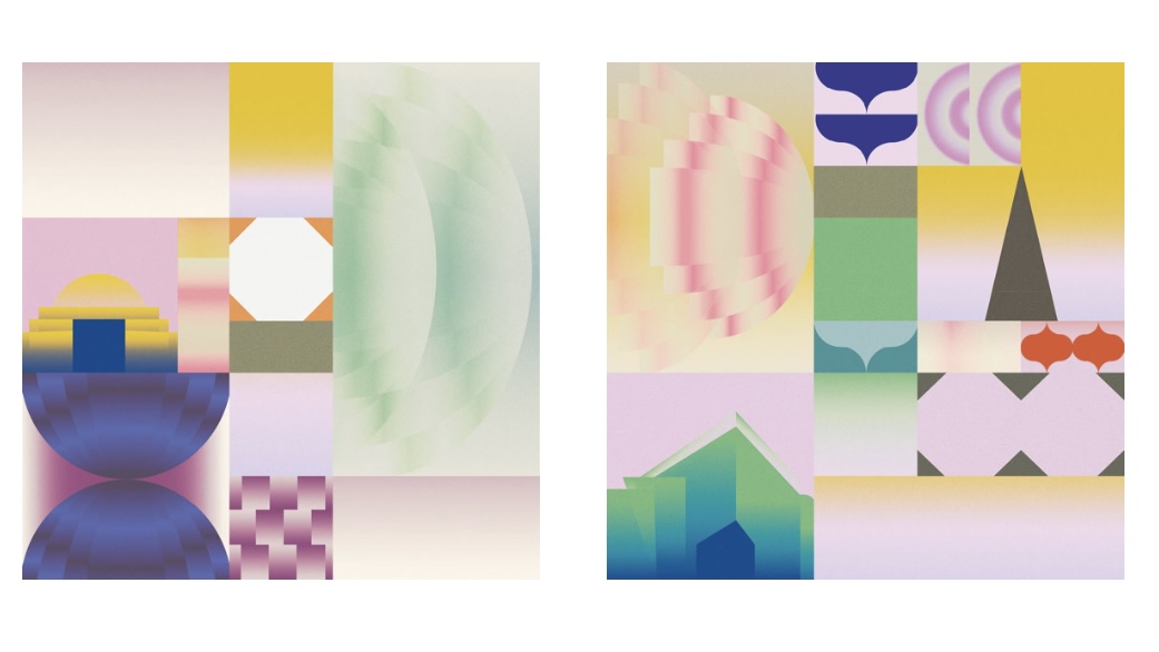
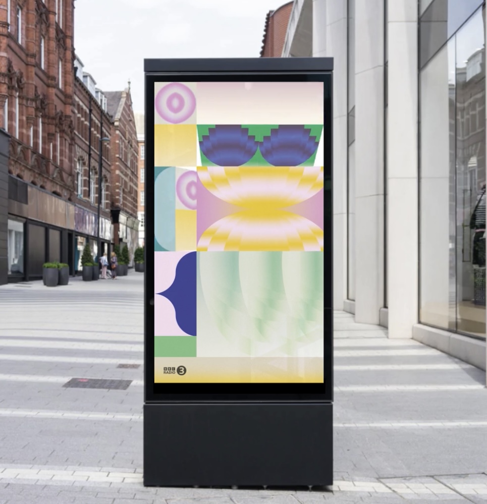
With beautiful pastel colours and gorgeous fuzzy, airbrush-style textures, the Modern Designer's campaign design for the orchestra perfectly encapsulates the delicacy and hubbub of orchestral music. But not only are the designs easy on the eye but the illustrator, Sophie Douala, has also filled the designs with exciting Easter eggs. And if you end up feeling inspired by this campaign and fancy having a go yourself, then make sure you download Photoshop to start your creative journey.

According to Itsnicethat, the campaign takes inspiration from the retro BBC broadcasting cards. Plus, the geometric shapes hidden among all that fuzz are drawing on the likes of instruments and venues like the Royal Albert Hall in London and Bridgewater Hall in Manchester.
Article continues belowLead designer on the project, Jack Kimberley, has explained, "The framework of these cards presented a perfect opportunity to showcase the BBC Philharmonic’s history through a series of illustrations ranging from the abstract to the literal".

With the gorgeous, soft palettes and geometric designs, I love this campaign. It reminds me of the brilliant 90s pastel aesthetic of the brand new Woo website. It’s safe to say that these brilliant designs would avoid our roundup of the worst designs of 2022.
If you’re looking forward to the centenary of the Philharmonic Orchestra, then why not treat yourself to a brand new pair of the best wireless headphones to make sure you’re getting the most immersive experience. Or if you’re feeling inspired by the designs and fancy having a go then why not download Illustrator to kick start your graphic design career.
Read More:
Sign up to Creative Bloq's daily newsletter, which brings you the latest news and inspiration from the worlds of art, design and technology.

Amelia previously worked as Creative Bloq’s Staff Writer. After completing a degree in Popular Music and a Master’s in Song Writing, Amelia began designing posters, logos, album covers and websites for musicians. She covered a range of topics on Creative Bloq, including posters, optical illusions, logos (she's a particular fan of logo Easter eggs), gaming and illustration. In her free time, she relishes in the likes of art (especially the Pre-Raphaelites), photography and literature. Amelia prides herself on her unorthodox creative methods, her Animal Crossing island and her extensive music library.
