New Wasps rugby logo gets a stinging response from fans

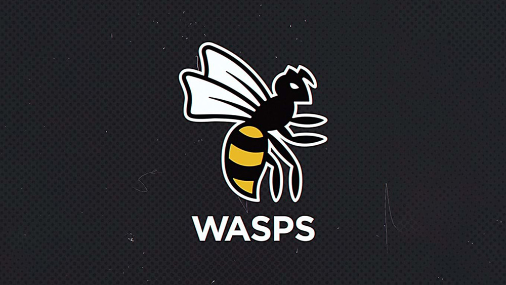
Another sports team logo update; another case of fan fury. Wasps rugby club has unveiled an "evolution" of its logo – and fans hate it. The new identity is intended as part of the Coventry-based club's attempt to bring its different teams together under one brand. It will be used by the men’s and women’s rugby teams, the netball team, the academy and Acton-based amateur rugby club Wasps FC.
The logo will appear on kits, digital channels and at the Coventry Building Society Arena – much to fans' displeasure. See our guide to everything you need to know about logo design to avoid such pitfalls in your own designs.


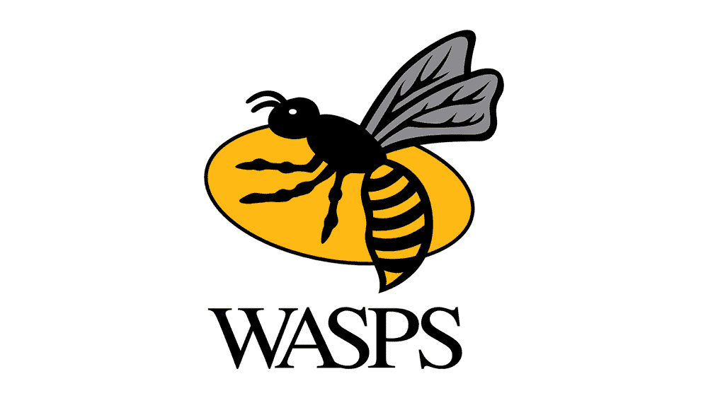
According to the Wasps website: “The evolution of the Wasps’ crest pays homage to the club’s history while looking ahead to its future." It says: "The modernised, simplified design sees a return to the four-legged Wasp in recognition of the club’s original logo, while the rugby ball backdrop has been removed to show that Wasps is now much more than just a rugby club."
Article continues belowEmphasis has also been placed on the fact that the wasp is now facing forwards rather than backwards. Stephen Vaughan, Wasps Group chief executive, said: “The design has history and heritage at its heart but importantly looks ahead to the future of our men’s, women’s, academy, netball and amateur teams. The Wasp at the centre of the new design is forward facing, proud and bold – all values which symbolise the club."
Evolution.#WaspsAlwaysJuly 19, 2021
But fans are very much unconvinced, with some complaining that the new wasp variously looks too cuddly, like an angry cartoon baddy or like it should be holding a walker. Some have suggested that the wasp should be placed at a different angle to make it look like it's in mid-flight rather than walking upright on its back legs.
Chris Howard wrote on Facebook: "The Wasp looks very childish and appears to be sneaking up on someone for a hug." Helen Marsden commented: "I've been looking at this one and off all day and couldn't work out what was 'missing' but now I'm wondering where the critter left its zimmer frame/shopping trolley." It didn't take long for fans to come up with their own interpretations of the logo, like the example below.
"Alright Sting, your round!" pic.twitter.com/TevXnzW92VJuly 19, 2021
Sports fans are notoriously difficult to please with logo updates. Earlier this month, basketball fans in the US were quick to lambast the NBA's 75th anniversary logo. If you're designing a logo, see our guide to choosing the best free logo maker, or see below for the current prices available for an Adobe Creative Cloud subscription.
Sign up to Creative Bloq's daily newsletter, which brings you the latest news and inspiration from the worlds of art, design and technology.
Read more
- These are the hottest logo design trends of 2021
- The 10 best sports logos of all time
- These are the most popular sonic logos of 2021

Joe is a regular freelance journalist and editor at Creative Bloq. He writes news, features and buying guides and keeps track of the best equipment and software for creatives, from video editing programs to monitors and accessories. A veteran news writer and photographer, he now works as a project manager at the London and Buenos Aires-based design, production and branding agency Hermana Creatives. There he manages a team of designers, photographers and video editors who specialise in producing visual content and design assets for the hospitality sector. He also dances Argentine tango.
