Caramel packaging is good enough to eat
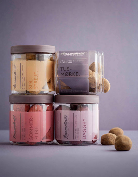
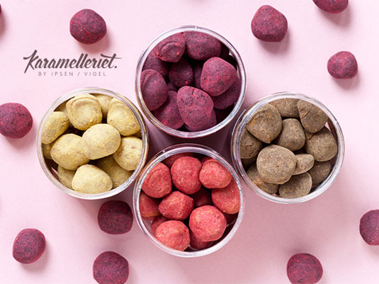
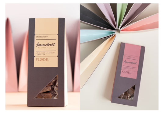
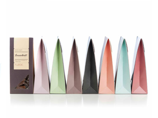
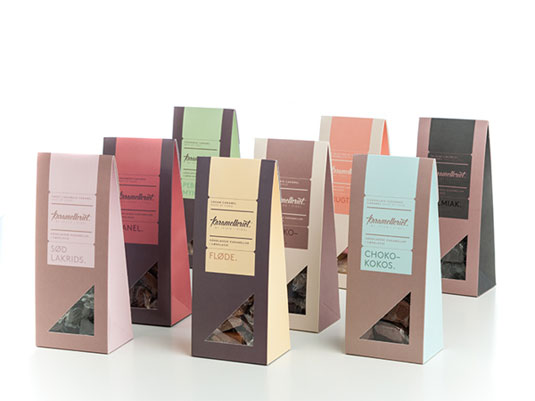
This packaging for caramel craftsmen Karamelleriet is a delicious blend of sophisticated colour and typography.
Sign up to Creative Bloq's daily newsletter, which brings you the latest news and inspiration from the worlds of art, design and technology.
You are now subscribed
Your newsletter sign-up was successful
Want to add more newsletters?
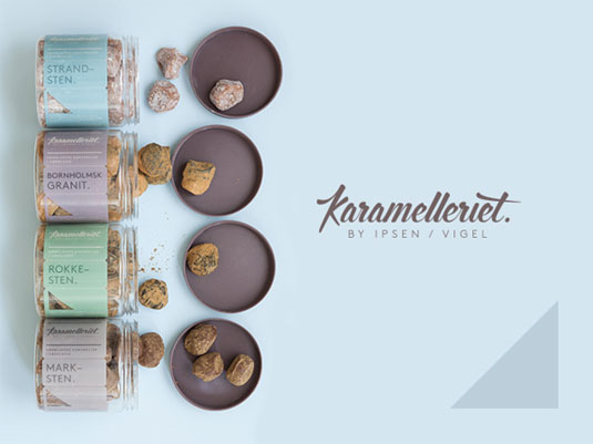
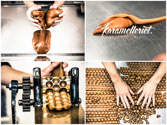
It's imperative that the packaging for a new venture must reflect the attitude and ethos of the product itself. Here, Copenhagen design studio Bessermachen created this frankly beautiful branding and packaging design to reflect the handmade aesthetic of the caramel producing Karamelleriet.
Creating an entirely new visual identity that contains everything from the logo to packaging to display and flyers, Karamelleriet has achieved an expression that is the caramel production worthy.
Working in close collaboration with Karamelleriet, Bessermachen were inspired by the contrasting curves and the simple and elegant expression the finished caramel has. The result is an output of inspirational typography and gorgeous pastel colour themes.
Article continues below 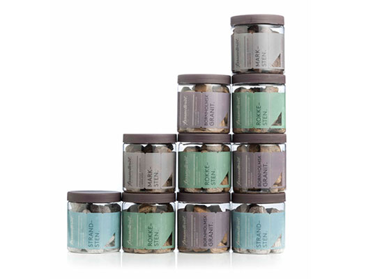
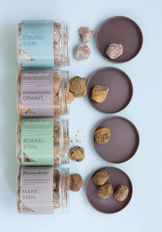
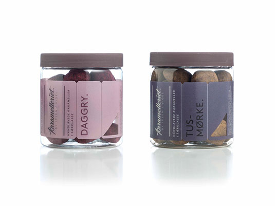
See more work from Bessermachen over on their website.
Like this? Read these!
- Free graphic design software available to you right now!
- Download the best free fonts
- Free graffiti font selection
Have you seen an inspiring new brand of packaging? Let us know in the comments box below!
Sign up to Creative Bloq's daily newsletter, which brings you the latest news and inspiration from the worlds of art, design and technology.

The Creative Bloq team is made up of a group of art and design enthusiasts, and has changed and evolved since Creative Bloq began back in 2012. The current website team consists of eight full-time members of staff: Editor Georgia Coggan, Deputy Editor Rosie Hilder, Ecommerce Editor Beren Neale, Senior News Editor Daniel Piper, Editor, Digital Art and 3D Ian Dean, Tech Reviews Editor Erlingur Einarsson, Ecommerce Writer Beth Nicholls and Staff Writer Natalie Fear, as well as a roster of freelancers from around the world. The ImagineFX magazine team also pitch in, ensuring that content from leading digital art publication ImagineFX is represented on Creative Bloq.
