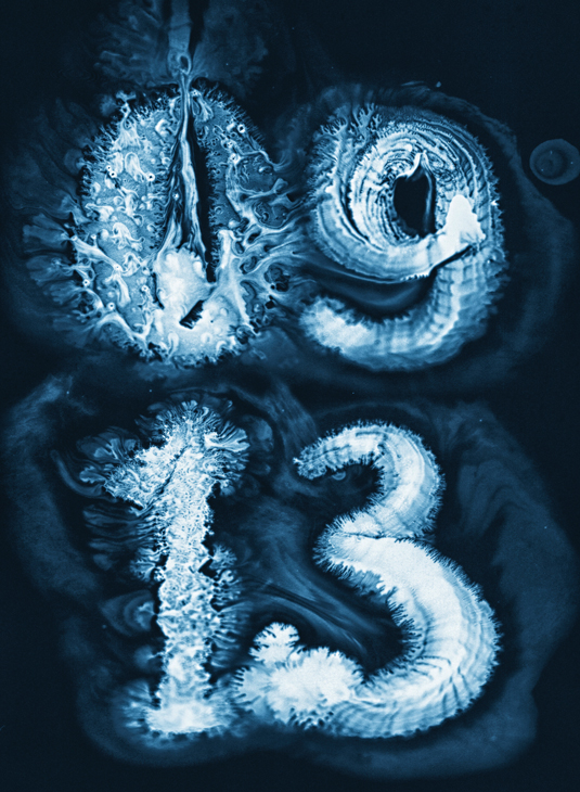
Swirling typography is breathtakingly serene
Russian designer Ruslan Khasanov explains the process behind this beautiful features opener, created for Wired UK.
Sign up to Creative Bloq's daily newsletter, which brings you the latest news and inspiration from the worlds of art, design and technology.
You are now subscribed
Your newsletter sign-up was successful
Want to add more newsletters?

Ruslan Khasanov took over 1,000 shots of the digits seen in his dark, typography-based feature opener for Wired’s September issue. The magazine gave the Russian designer a relatively open brief, specifying only that the issue date, 09 13, should be difficult to read, and highlighting his Liquid Type project as reference.
Dissatisfied with experiments using ink on wet paper, Khasanov hit on the final look after washing his brush and drawing letters on a wet sink surface. “The letters came to life - fine lines instantly flowed, overgrown with patterns like coral, and then disappeared,” he recalls. “The project looks good in static, but in motion - in the tablet version - it reached its full potential.”


This article originally appeared in Computer Arts issue 220.
Article continues belowLiked this? Read these!
- Illustrator tutorials: amazing ideas to try today!
- Create a perfect mood board with these pro tips
- The ultimate guide to logo design
Sign up to Creative Bloq's daily newsletter, which brings you the latest news and inspiration from the worlds of art, design and technology.

The Creative Bloq team is made up of a group of art and design enthusiasts, and has changed and evolved since Creative Bloq began back in 2012. The current website team consists of eight full-time members of staff: Editor Georgia Coggan, Deputy Editor Rosie Hilder, Ecommerce Editor Beren Neale, Senior News Editor Daniel Piper, Editor, Digital Art and 3D Ian Dean, Tech Reviews Editor Erlingur Einarsson, Ecommerce Writer Beth Nicholls and Staff Writer Natalie Fear, as well as a roster of freelancers from around the world. The ImagineFX magazine team also pitch in, ensuring that content from leading digital art publication ImagineFX is represented on Creative Bloq.
