Why choosing fonts is a battle between form and function
Monotype's Steve Matteson examines how fonts are evolving to meet the demands of the 21st century.
Sign up to Creative Bloq's daily newsletter, which brings you the latest news and inspiration from the worlds of art, design and technology.
You are now subscribed
Your newsletter sign-up was successful
Want to add more newsletters?

Fonts, whether physical pieces of metal used to print Gutenberg's bible in 1455, or the software programs loaded on a smartphone to display text messages, are enjoying a rise of awareness outside the relatively small group of designers and programmers who produce them. What was once considered an esoteric expertise is now accessible to anyone with a computer.
The fact of the matter is: fonts are everywhere: in your car, on your phone, your TV and soon in places like your refrigerator (if it's not there already). For this discussion there is a point of clarity to be made between the word font (eloquently defined as the thing that people use) versus the word typeface (the design of the letters you see).
The fact that this awareness of how words 'look' is now becoming mainstream should lead to professional designers of all kinds to take careful note of typefaces they chose and how they use them.
Article continues belowSince typeface designs have an inherent visual language or voice, brands need to be particularly sure the typeface speaks in the right tone and is legible under the conditions it will be used.
Change. Adapt. Change. Adapt again
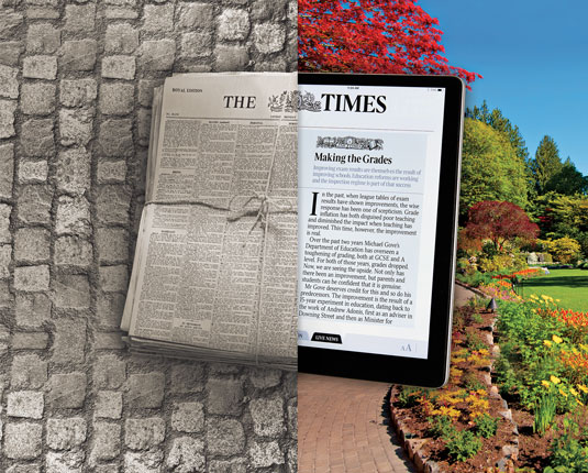
With each change in technology since Gutenberg, technical limitations were overcome to offer the best quality possible for the time. The crude paper and sturdy type forms of the 15th century gave way to smoother paper and more refined, delicate typefaces.
By the 18th century Giambatista Bodoni was producing paper so smooth in finish it was possible to print his characteristically delicate, refined typefaces. The smooth coated papers and faster presses of the 19th century pushed the limits of tiny details and hairlines to the point of decline in aesthetics and legibility. A condition that Frederic Goudy and others later strove to repair with typefaces designed to produce a darker, readable printed page.
Likewise, with each development of screen displays – from CRTs to e-Ink to high resolution LCDs – typefaces and software within the font data have evolved to optimize performance, legibility, and aesthetics.
Sign up to Creative Bloq's daily newsletter, which brings you the latest news and inspiration from the worlds of art, design and technology.

The difference, perhaps being the rate of change with digital products evolving far quicker than early days of print. For example, by the time the first few TrueType fonts were fine-tuned for monochrome black and white CRTs in 1992, displays were moving towards grey scale, anti-aliased technology causing yet another need to optimize the same designs.
E-Paper screens in products like the Amazon Kindle have, in less than 10 years, achieved the resolution of 300 dpi laser printers allowing for new typefaces adapted specifically for reading eBooks.
On-screen brand consistency suffered in the early days of web pages – only a few typefaces were really up to the task of reading in rough pixel resolutions. Verdana and Lucida Sans were carefully designed and crafted to read well on screen. Helvetica and Arial, while crafted for screen, had limited appeal for reading extended text. While these designs were admirable they limited the ability for brands to extend their consistency of message to their web pages.
The brand inside
One of the first efforts to successfully extend brand typography to screen was Nokia in the late 1990s. A typeface was created and optimized for use in mobile phone screens and then used throughout all brand touch points. The consumer reading his or her device screen was fully enveloped in Nokia's branding through consistent typography and carried that brand everywhere.
Soon after Nokia's success, Microsoft, Xbox360 and others followed suit by introducing typefaces specially designed for both a good user experience as well as brand consistency.

With the growing adoption of web fonts (the ability to embed fonts into web pages so the end-user is able to view the page as intended) many more brands are able to carry a consistent typographic message throughout their sales and marketing material.
Companies who do not build products that require an interface typeface do require customers to interface with their website and, therefore, need to choose typefaces carefully.
On message?
With this growing awareness of typefaces and brand messaging people will tend to decide if a company is 'on message' with their typography. The dramatic outcry of Ikea's switch to Verdana from their original corporate typeface is just one example of a change having a negative impact.

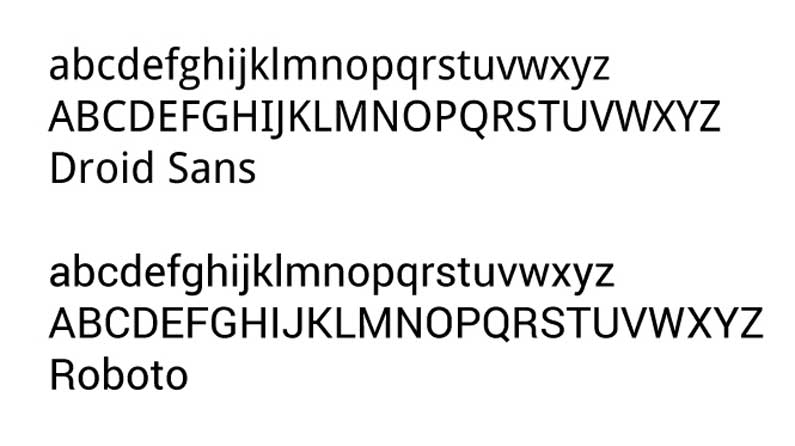
On the other hand, Google's Android platform switching from the original Droid font family to Roboto is raising criticism from the designer community, but the change had no impact on the success of Android products. It may be considered by some critics as an inelegant typeface, but the rest of Android manages to function well.
The brand outside
As fonts are now appearing in fashion products the danger of an ‘off message' typeface becomes even more real. A wearable electronic device becomes a fashion accessory and if it reflects negatively on the individual it won't be a successful product.
The conundrum designers face when it comes to typefaces for these products is the battle between form and function. The device needs to be functional, despite a (typically) very small screen. However, highly legible typefaces for small screens may not convey the fashion intentions of the product.
One advantage to having a wearable device with various typefaces is that the software could change according to the user's mood or fashion. For instance, shifting the motif from casual Friday to evening wear – by selecting an appropriately matching typeface – could be a wave of the future.
With so many questions in a new frontier for the use of fonts, wearable technology's changing landscape could be the biggest challenge to ever face the designer choosing typefaces.
Words: Steve Matteson
Steve Matteson is Studio Type director for Monotype, a leading global provider of typefaces, technology and expertise. He is the designer of the Microsoft Windows Vista system font family Segoe; the Droid font collection used in the Android mobile device platform, and the brand and user-interface fonts used in both the original Microsoft Xbox and the Xbox 360.

The Creative Bloq team is made up of a group of art and design enthusiasts, and has changed and evolved since Creative Bloq began back in 2012. The current website team consists of eight full-time members of staff: Editor Georgia Coggan, Deputy Editor Rosie Hilder, Ecommerce Editor Beren Neale, Senior News Editor Daniel Piper, Editor, Digital Art and 3D Ian Dean, Tech Reviews Editor Erlingur Einarsson, Ecommerce Writer Beth Nicholls and Staff Writer Natalie Fear, as well as a roster of freelancers from around the world. The ImagineFX magazine team also pitch in, ensuring that content from leading digital art publication ImagineFX is represented on Creative Bloq.
