Achieving consistency in your web designs
It's a fine line between consistency and uniformity. UXPin's Jerry Cao explains how to find the sweet spot.
Sign up to Creative Bloq's daily newsletter, which brings you the latest news and inspiration from the worlds of art, design and technology.
You are now subscribed
Your newsletter sign-up was successful
Want to add more newsletters?
Consistent designs feel familiar, and familiar designs are easier to learn. Interestingly enough, designs with short learning curves just naturally feel more usable.
Of course, there's a fine line between consistency and uniformity. You need to know when to break the consistency without leading to design chaos. The key, as is most often the case in design, is balance.

In Tuesday's article, How to design websites that match user expectations, we briefly explained why external consistency is important: ie, how to create web designs that match what users expect based on prior experience (and other designs).
Here, we'll dive a bit deeper into how to stay consistent within your site and across all pages (internal consistency).
Internal consistency
While external consistency can enhance your UI design through meeting user expectations, internal consistency is seen as more of a requirement, and failing to meet it will most likely harm the user experience.
As described in The Guide to Consistency in UI Design, internal inconsistencies are usually only applied to distinguish differences in content or user actions (for instance, different layouts for different forms of content).
Let's look at an example of internal consistency and review a quick checklist.
Sign up to Creative Bloq's daily newsletter, which brings you the latest news and inspiration from the worlds of art, design and technology.
The internal consistency of Reddit
Consistency within your site or app covers both aesthetics and functionality – especially when both are the same. Let's examine the self-proclaimed "front page of the Internet," Reddit.

For starters, all of Reddit's links that lead to outside sites are in blue and in the same big font. This repeated consistency lets users know exactly what they can click on and what will happen when they do. It also takes advantage of external consistency with one of the most well-known web patterns: putting links in blue.
But Reddit's internal consistency goes deeper. Moving your mouse across the page, all internal links (comments, subcategories, users, and share options) will gain an underline when the cursor hovers over them. Thus, the user gets immediate feedback that secondary links are clickable, while some other text is not. While subtle, this consistent use of visuals saves time in explaining the interactions.
How to check for internal consistency
Internal consistency is a thankless feature. Only its absence is noticed.
For example, changing the location of a button on different pages: a user gets used to the Sign In option being in the top right corner, and then they can't find it on a page where it's in the bottom right. Another is the interchanging of Save and Submit – both represent two different functions. One more is certain functionalities only being available on certain pages: if the home page utilizes a drag-and-drop feature, the user will expect all pages to use it.
As a general checklist, try to cover all these bases when dealing with internal consistency:
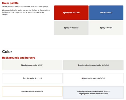
- Colour – An obvious visual cue, keep colors consistent with their function (i.e., green always means Accept and red Reject). A site's overall color scheme as well should not deviate too much from page to page.
- Typography – As with the Reddit example, fonts and flourishes can all be used as visual signals, but only if used consistently. Set apart your headlines, bodies, and secondary texts by giving them each a distinct typography.
- Language – For simplicity's sake, don't change your word selections. If you give the user a choice between Yes and No for one task, don't change that to Accept and Reject for another.
- General visuals – Features like icon sets, buttons, and even clickable links must be consistent to express their function – using two different types of buttons will confuse the user.
- Layout and location – A consistent layout across pages is necessary for users to navigate properly. Inconsistency is acceptable when you're trying to call out different types of content or user actions.
- Interactions – While they may seem like minor details, any inconsistencies among form elements, dialogue boxes, animations, transitions, etc. will feel jarring. One bad interaction can ruin all the prior delightful ones.
If you think all these details are difficult to keep track of, you're right.
That's why many companies – even outside of digital design – use style guides for internal consistency. A style guide is a formalized document that keeps track of the company's proper policies for handling these details. For example, "all headlines should be 12 pt., Arial black, and bolded," or "the company logo must always appear in a 4cm x 4cm box in the upper left-hand corner."

If you'd like to know more about style guides, check out Web UI Best Practices. For, more general references, check out these other online articles:
- Creating Style Guides by Susan Robertson
- Create a Website Style Guide by Steve Fisher
- Writing an Interface Style Guide by Jina Bolton
You can also get started with a beginner's style guide using Medialoot's free UI Style Guide template – fill out what works and tweak the rest.
Takeaway
It's not so much that you're consistent, but how and where you're consistent.
Remember that patterns can save a lot of time because they work off of your users' previous knowledge, so use them every chance you get. If you're entering unchartered territory, try to enlist methods that are intuitively human – understanding the mind of your user will help across the board.
Your users are also expecting your site or app to maintain its own internal consistency, so don't break the rhythm of the experience. Consider the key categories of internal consistency – color, typography, language, general visuals, layout, and interactions – and keep them all in line with a style guide.

To learn more about the types of consistency and inconsistency required for desirable interface design, download the free e-book Consistency in UI Design. Visual examples are analyzed from Amazon, Jawbone, Dolce & Gabbana, and more.
Words: Jerry Cao
Jerry Cao is a UX content strategist at UXPin — the wireframing and prototyping app. To learn more about balancing consistency and inconsistency to create visually exciting designs, download the free ebook Consistency in UI Design.
Like this? Read these!
- 3 free photo search tools that make finding images easy
- Brilliant Wordpress tutorial selection
- Has your website survived mobilegeddon?

The Creative Bloq team is made up of a group of art and design enthusiasts, and has changed and evolved since Creative Bloq began back in 2012. The current website team consists of eight full-time members of staff: Editor Georgia Coggan, Deputy Editor Rosie Hilder, Ecommerce Editor Beren Neale, Senior News Editor Daniel Piper, Editor, Digital Art and 3D Ian Dean, Tech Reviews Editor Erlingur Einarsson, Ecommerce Writer Beth Nicholls and Staff Writer Natalie Fear, as well as a roster of freelancers from around the world. The ImagineFX magazine team also pitch in, ensuring that content from leading digital art publication ImagineFX is represented on Creative Bloq.
