UI design pattern tips: slideouts, sidebars and drawers
In the latest in a series looking at website design patterns, Chris Bank of UXPin looks at slideouts, sidebars and drawers.
Once someone starts using your website or web application, they need to know where to go and how to get there at any point. If they can't navigate through your your application easily, you'll quickly lose them. Thus, designing effective navigation in your web application is crucial.
In this series for Creative Bloq, Chris Bank of UXPin, the UX design app, discusses the importance of navigation design patterns and details examples from some of the hottest websites and web apps today.
You can see previous posts in this series here. Meanwhile, for more examples of web design patterns, download UXPin's free e-book, Web UI Design Patterns 2014.
Article continues belowThe problem
The user needs a way to navigate between different sections of the app without being distracted in each individual section.
The solution

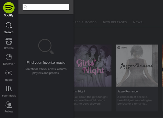
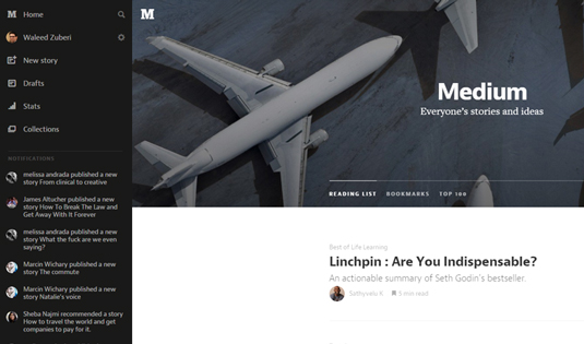
A secondary section of the application – such as navigation, chat, settings, user profiles, etc. – is tucked away in a collapsible panel hidden under the main section when it is not needed. When accessed, it usually either moves the main section aside or slides over it.
Since the slideout is in a separate layer from the main content in the application, there's a lot of flexibility in terms of how content can be laid out inside the drawer – icons, text, and even simple controls are viable options to provide quick access to important actions here.

Often times, the drawer can be hidden under a "hamburger menu" or a simple arrow that indicates there's more content there.
Sign up to Creative Bloq's daily newsletter, which brings you the latest news and inspiration from the worlds of art, design and technology.
It's an easy way to hide all the less important things in a "side drawer" so that you only have to focus on how to distill the most important information in each view.

Examples can be found everywhere. Asana, Spotify (search box), and Facebook (chat boxes).
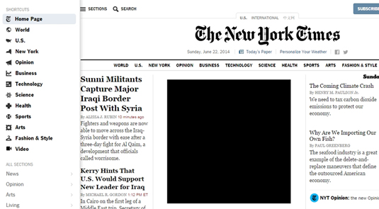
Some more specific examples include Houzz, which has a sub-navigation drawer that disappears as you scroll down and reappears back at the top; and the New York Times, which hides a side drawer that appears on the left when the user clicks the 'sections' button at the top left side of the page.
As you scroll down in Pinterest, an up-arrow button appears for easy navigation back to the top, and in its 'How It Works' page.
Words: Chris Bank
Chris Bank is the growth lead at UXPin, a UX design app that creates responsive interactive wireframes and prototypes.

The Creative Bloq team is made up of a group of art and design enthusiasts, and has changed and evolved since Creative Bloq began back in 2012. The current website team consists of eight full-time members of staff: Editor Georgia Coggan, Deputy Editor Rosie Hilder, Ecommerce Editor Beren Neale, Senior News Editor Daniel Piper, Editor, Digital Art and 3D Ian Dean, Tech Reviews Editor Erlingur Einarsson, Ecommerce Writer Beth Nicholls and Staff Writer Natalie Fear, as well as a roster of freelancers from around the world. The ImagineFX magazine team also pitch in, ensuring that content from leading digital art publication ImagineFX is represented on Creative Bloq.
