Colour trends in web design for 2015
It's the decade of vibrant colour when it comes to web design, says Jerry Cao. But are you on board with the latest trends?
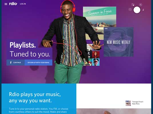
While the way designers use colour changes dramatically based on trends and time periods, we are definitely designing in the decade of vibrant colour.
Red, orange, pink and bright green, blue and purple have become the focal point of web design projects across a variety of industries. Designers are pairing bright colour choices in a way that was almost taboo a few years ago and even straying from the website colour choices dictated by company branding.
The result is a beautiful rainbow of bright, energetic and fun colour that, when used well, provides emotional direction for the design and visually emphasizes on-screen text and graphics. This fearless colour scheme isn't for everyone, but the trend is versatile enough where almost any designer can take advantage of using vibrant colour – from a full page design with a magenta background to kelly green lettering in a black and white design framework.
In this article, we'll explore some of the design techniques described in the free ebook Flat Design & Colours.
Cues from fashion and interior design
The colour of the world around us is one of the strongest influences on our choices in web design. In fact, cues from fashion and interior design seem to have an increasingly strong influence on colour trends across all aspects of design right now.
If you look to the runway and through pages of fashion magazines, colour is everywhere. Neons, bold prints and black and white with colour accents are the height of fashion.
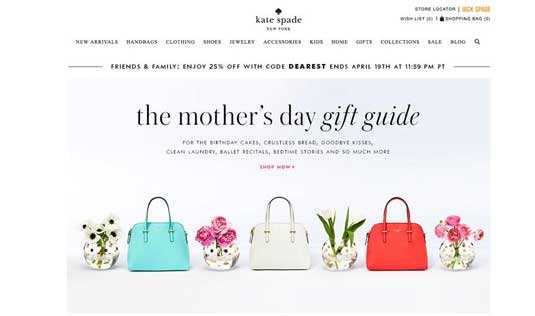
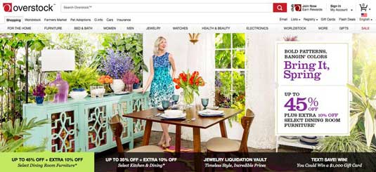
From skirts to bags to polos and even hair extensions, colour blocking (with a pair of bright hues) is near universal. When it comes to your home, colour is also a bold choice from wall colours to the cushions on patio furniture.
Sign up to Creative Bloq's daily newsletter, which brings you the latest news and inspiration from the worlds of art, design and technology.
How colour is used in the physical world translates to the digital world as well. As described in Web Design for the Human Eye, the goal of all design is to connect with the user – the more relatable the presentation, the likelier (and stronger) the emotional connection. colour trends in the real world and in digital projects are inexplicably linked for this reason. As long as colour is a popular trend overall, it will live on for website designers as well.
Flat colour palettes
Two major developments ushered in the emergence of vibrant colour in web UI design – high definition displays and the popularity of flat design. While flat design likely played the stronger role in expanding the use of colour, the technology behind it made the rich hues feasible.
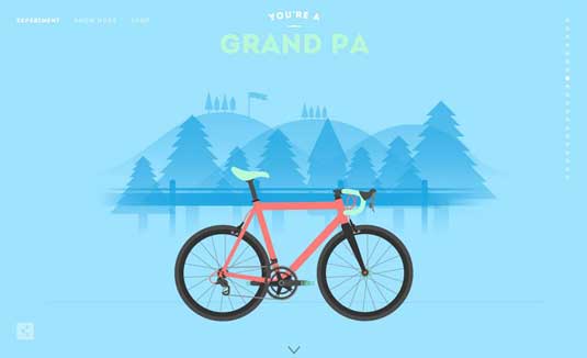
With more pixels per inch on screens, the digital rainbow has greatly expanded to suit our maturing taste in design aesthetics. Monitors of every size, from desktop displays to the iPhone – can actually render all the colour options designers use today.
Designers used to worry about web safe colours (there were just 216 of them) so that all users could see exactly what the designer intended. That concept is dead and buried – W3Schools surveyed users in 2014 and found that more than 98 per cent of users had devices capable of displaying millions of colours, removing technology as a barrier to the creativity of colour trends.
Around the same time Retina and other high definition displays gained popularity, flat design (a trend that is still going strong and evolving) roared onto the scene. One of the key components of the trend was the abundance of bright colour. And while flat outlines were not for everyone, many of the colour choices and emotions users felt when interacting with these hues were highly desirable
Flat colours have evolved and toned down as they adapted to a variety of other projects. These bright, deeply saturated hues are often seen in colour palettes that include one to three colours (rather than the expansive palettes associated with flat design) or to create a strong accent, contrasting element or focal point.
Monotone colour schemes
One of the most popular ways to use vibrant colour, monotone colour palettes use a single colour with a mixture of tints and tones to create a unified yet nuanced visual design.
Vibrant colour lends itself to monotone palettes because it allows the designer to use a bold, maybe even unconventional colour without trying to match it to other colours. As we all know from the complementary, analogous, and triadic colour schemes, choosing multiple colours is one of the most surprisingly complex yet impactful decisions for the web.
Look at Line Quality (below) as an example. Lime green is not the easier colour to pair tastefully with others, but here the dominance of the colour in combination with an image of a Muppet icon in the same hue creates a highly dramatic visual effect.
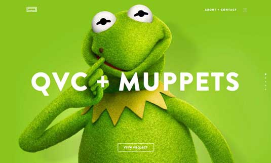
Because the background and foreground image are all one colour, the remaining elements such as the crisp white lettering, the company logo, minimalist navigation and the call-to-action ghost button are still easy to find on the screen even though they are visually muted in comparison.
Monotone colour schemes are one of the easiest and most effective ways to use a lot of colour without falling into the design trap or creating a site that feels chaotic (a common issue with vibrantly coloured web interfaces).
This type of colour scheme also allows a company to use colours in ways that might live outside of their traditional branding without worry of matching or issues with readability.
High contrast colour
Vibrant colour is core to the minimalist design trend as well. Pops of colour provide emphasis and points of entry in stripped-down designs that might otherwise be lacking.
High contrast refers to any colour that is very different from the background. In a minimalist context, you're likely to see any form of colour with high saturation against a black, white or gray canvas. Points of great contrast become the visual center of the design, telling users where to look at what to do in a framework that may otherwise be too simple.
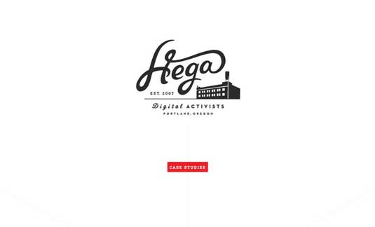
Hega uses colour only for a button in a minimalist design framework, which immediately draws the user's attention where the designer wants. Because the touch of colour contrasts with the white background and black image, the "Case Studies" button clearly communicates a call to action without explicitly urge the user to click.
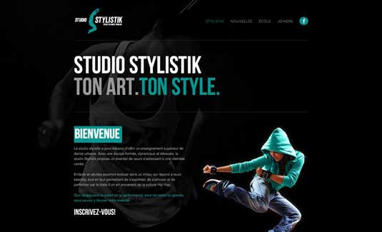
Studio Stylistik uses that same concept with strategic teal lettering, buttons and even the jacket on the model for emphasis against a dark background. By using the same colour applied in different points that form a zig-zag formation, the site retains a unified look while leading our eyes to each point of interest highlighted in teal.
As you can see, vibrant colour isn't useful just for calling out a single element on the page – you can also create a natural vertical rhythm by repeating in moderation according to the human scanning patterns explained in Web Design for the Human Eye.
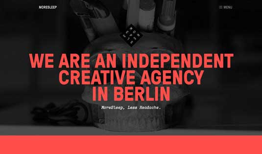
Bold colour works so well because it is, by comparison, a complete opposite of the starkness of minimalist design. More Sleep, above, uses colour brilliantly against a dark background. The coral red is easy to read and draws attention to the words on the screen first and the image behind it afterward.
The thick red line beneath the headline creates visual balance, which is extremely important considering that red communicates passion and even violence. Again, this is why colour can be so tricky: apply too much too strongly, and your design immediately crosses the emotional spectrum and becomes loud and overbearing.
Common colour associations
When it comes to bold colour, it is important to consider a little more than just aesthetics.
Designers need to think about meanings and cultural associations that are connected to certain hues. While these common feelings are not always set in stone, they should be part of the conversation when talking about colour for a design project. Let's examine some of the colour associations:
- Pink: Romance, youth, confidence, sensitivity
- Red: Love, passion, danger, urgency
- Yellow: Fun, optimism, happiness, caution
- Orange: Warmth, ambition, enthusiasm, creativity
- Green: Nature, luck, growth, safety
- Blue: Harmony, tranquility, trust, honor
- Purple: Wealth, power, spirituality, calmness
Beyond 2015
As the overall design trends start to swing back into outlines that are less flat, colour will do the same. Bright, bold colour will stick around and work more as an element on its own, rather than as a supporting piece of another trend.
Designers will return to using some techniques that have fallen out of fashion (such as gradients) and make them captivating again with bright colour.
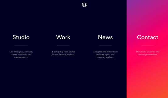
The Impossible Bureau (below) does a beautiful job of this. The site pairs a dark, minimal framework with a hover state featuring a bright purple to pink to orange gradient. Expect to see more designers experiment in this way and use bright gradients for user interface elements or as background patterns.
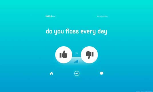
Zample+me (below) uses that same concept with a full-screen bright coloured background gradient.
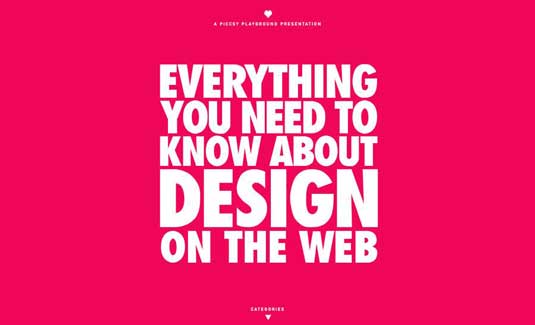
Bold colour is already beginning to emerge as the dominant visual for website design. When combined with bold typography, bright colour creates a stunning visual for websites that do not feature many images or illustrations. Two simple elements work together to create an even more powerful aesthetic.
Bold colour is a technique with lasting power for a variety of design styles. Vibrant hues are attention-grabbing and can add a touch of modern flair to almost any design style.
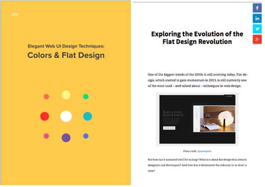
If you'd like to learn more about how to use colour and flat design techinques to create elegant websites, check out the free ebook Flat Design & Colours. You'll find over 40 examples inside.
Words: Jerry Cao
Jerry Cao is a content strategist at UXPin — the wireframing and prototyping app — where he develops in-app and online content for the wireframing and prototyping platform.
Like this? Read these!
- Design jargon explained: 6 colour schemes
- How to choose a colour scheme for your logo design
- Free graphic design software available to you right now!

The Creative Bloq team is made up of a group of art and design enthusiasts, and has changed and evolved since Creative Bloq began back in 2012. The current website team consists of eight full-time members of staff: Editor Georgia Coggan, Deputy Editor Rosie Hilder, Ecommerce Editor Beren Neale, Senior News Editor Daniel Piper, Editor, Digital Art and 3D Ian Dean, Tech Reviews Editor Erlingur Einarsson, Ecommerce Writer Beth Nicholls and Staff Writer Natalie Fear, as well as a roster of freelancers from around the world. The ImagineFX magazine team also pitch in, ensuring that content from leading digital art publication ImagineFX is represented on Creative Bloq.
