7 ways to create attractive user interfaces
Jerry Cao explains how the aesthetics of your website can help users achieve their goals.
There's no denying that visuals are important to interaction design, but exactly how important may surprise you.
While visual representation is often listed as the second dimension of interaction design (the others being words, space, time, and behavior), in many ways it is the first.
But so what? How does all this matter if you don't know how to apply it? In this article, we'll explain seven practical ways to make sure function matches form. If you'd like to learn more tips and tricks, check out the free ebook Winning Over Users With Attractive Design.
01. Follow Hick's law (don't clutter interfaces)
In the 1950s, British psychologist William Edmund Hick proved through experimentation that decisionmaking time was proportionately affected by the number of available options.The more options on the screen, the greater the cognitive load.
Provide too many options and users will even experience decision paralysis.
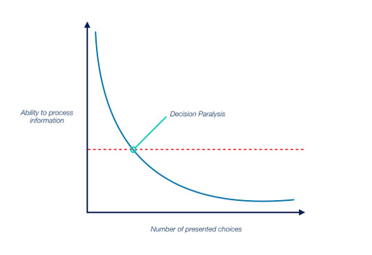
The tricky part is, your users want options… just not too many. Apply Hick's Law to your interface to strike that perfect balance, giving your users enough freedom and choices, but without overwhelming them with a cluttered interface.
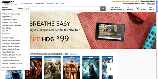
For example, take a look at Amazon. The default page has only a few navigational buttons at the top, and fills the rest of the screen with attractive pictures, all of which promoting – even suggesting – their products.
Sign up to Creative Bloq's daily newsletter, which brings you the latest news and inspiration from the worlds of art, design and technology.
Notice how submenus are hidden until you first trigger the "Shop by Department" menu. If submenus and main menu items were both visible, users would feel overloaded.
Hiding controls until needed controls not just a simpler site, but a more visually appealing one as well.
02. Use the right signifiers
Signifiers can be a designer's best friend, if you know how to use them.
What qualifies as a signifier is any visual cue that suggests, or "signals," an element's function to the user. This could be a pattern icon, such as a magnifying glass meaning "search," to something more explicit, such as clickable text that reads, "Post Your Comment."
We can categorize signifiers into 5 types based on Natasha Postolovski's excellent Smashing Magazine piece:
- Explicit — Obvious signifiers, such as words or pictures showing the function. Frequently applies to calls to action.

- Pattern — These are like Internet shorthand, used on so many sites, their meaning is common knowledge. If you see a sideways triangle icon, you know it means the media is playable.
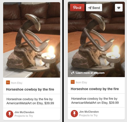
Hidden — Signifiers that come into view under certain conditions, such as dropdown menus or hover controls (like with Pinterest).

Metaphorical — Often combined with other types of signifiers, these are images that suggest function by metaphor, such as a pen icon signifying you can enter text.

Negative — As the name suggests, these signifiers show that something is not available, the most popular being grayed out text.
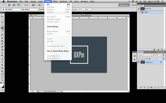
Signifiers make your website feel intuitive and easy-to-use, relying on existing knowledge and common sense to bypass the learning curve of a new system. They are a powerful tool in optimizing your interface, but also in creating a more aesthetic site.
For starters, signifiers helps reduce clutter. Familiar symbols bypass the need for explanations, and can often be minimized and placed out of the way (as with social media menus tucked into the corner). Additionally, each signifier is an opportunity to showcase your unique artistic style.
A magnifying glass is enough to show a search bar – but the look of the magnifying glass is up to you.
03. Know which colours evoke which moods
Ever wonder why most bank logos are blue or why warning signs use red?
These are no accidents, but conscious decisions by people who know the impact the right colour can make.
While each colour produces subtle psychological effects that can even vary based on the hue, here we'll give just a basic overview of only the primary colours:
- Red – alertiveness, power, passion – actually stimulates blood flow looking at it.
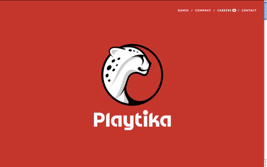
- Orange – playfulness, friendliness, affordability – less stimulating than red, but still energetic.
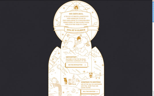
- Yellow – happy, anxious, energetic – also used in warning signs because it catches attention.
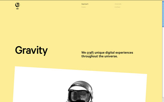
- Green – growth, balance, wealth (U.S.) – the middle colour of the rainbow accurately represents a nice balance.
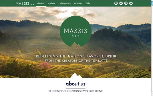
- Blue – trustworthy, inviting, calm – the most popular colour on the Internet, it's trustworthy and calming attributes make it attractive to both financial and social media companies.
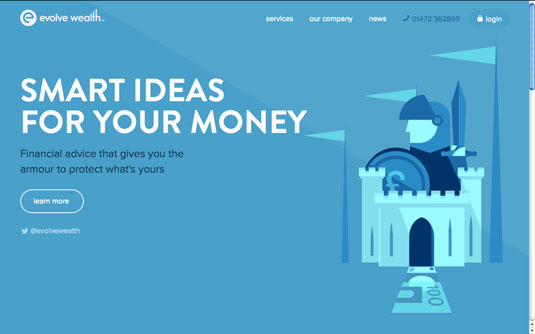
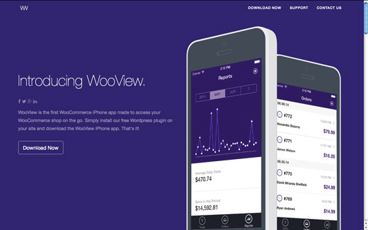
* Purple – mysterious, luxury, creativity – the colour of royalty still holds an air of decadence.
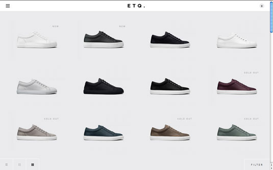
- White – virtuous, sterile, simple – associated with both doctors and holiness, white's also a go-to choice for unobtrusive backgrounds.
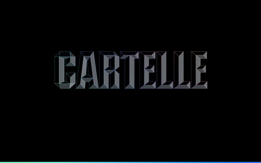
- Black – sophisticated, edgy, dominating – the most powerful colour will give your site an oppressive feelings if overused.
For a more complete explanation of the emotional impact of colours, including more colours and real site examples of each, read the free ebook Colour Theory in Web UI Design.
04. Understand and apply the different types of symmetry
Symmetry is not that simple. Symmetry comes in different styles and degrees (including no symmetry at all), and each has different effects in their viewers.
Like we described in Winning Over Users With Attractive Design, we can classify symmetry into 4 groups:
Horizontal Symmetry – The standard form of symmetry that is typically comes to mind. Both halves of the screen have equal weight and distribution of elements. A safe choice.
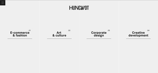
Approximate Symmetry – Here's where it gets tricky. Approximate symmetry uses two halves with the same visual weight, but not necessarily the same layouts or distributions. Usually, this involves one large element next to a collection of multiple smaller elements, as with the example below.
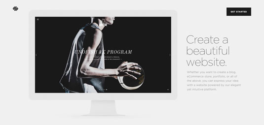
Radial Symmetry – Difficult to apply, but rewarding if you do, radial symmetry uses the center as a focal point and has all sections equal going outward, creating a circular pattern.
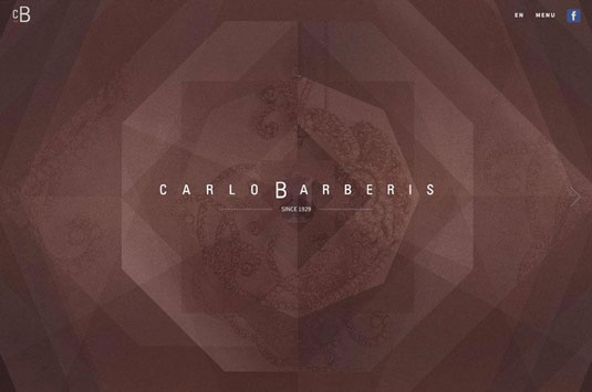
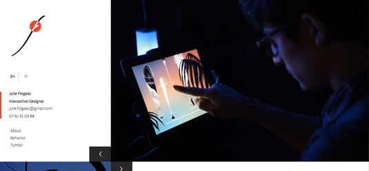
Asymmetry – Purposefully avoiding symmetry. Objects are designed to purposefully counter one another on the screen with shapes, colours and sizes of contrasting styles. This is quite difficult to apply well, and works best for sites going for an edgy or unstable look.
05. Use photos of real people
Usability studies show that people's eyes are drawn to real people.
In fact, photos of people more attention on websites than text, other elements, or photos of other objects.
There is a condition, though, and it's a big one. The pictures must be of "real" people; they cannot appear to be stock. Photos that appear to be generic (even if they're not) have the opposite effect – users tend to tune them out, and look everywhere but the picture.
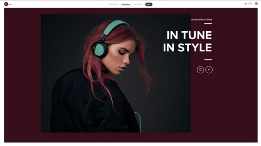
However, if you have authentic pictures of people the user can relate to, these will attract more attention than other images. (Alternatively, a well-chosen stock photo would work.)
06. Maintain consistency
It's not enough to build an attractive interface, you have to maintain it consistently across the entire site. Consistency is a thankless elements. Your users will only take notice when you're not consistent, and they won't be happy.
Inconsistent sites will only frustrate users since elements aren't where they're expected. They'll have to relearn the interface on every new page – if they even stick around that long.
For maintaining consistency within your site, pay special attention to these areas:
- Typography – Typefaces, sizes, spacing, etc. for each element (headings, subheadings, body, etc.).
- UI Elements – Unifying the use of your icons, images, and layouts in general will give your site a unique style and aid usability overall.

- Colour – Assigning certain colours to certain topics or functions can "train" your user, but only if consistent.
Additionally, as we mentioned before with pattern signifiers, at times you should maintain consistency with other sites.
For example, nearly every site on the web places their logo in the upper left corner. Putting your logo in, say, the bottom right, will just confuse your user, and waste time for them if they want to return to the home page. It's better to draw on their preexisting expectations when you can to reduce your site's learnability.
07. Take advantage of white space
It's an easy mistake to think creating a gorgeous interface involves filling up the screen with pretty images. But one of the most visually pleasing elements is nothing at all.
White space – or "negative space" – is simply the absence of other elements. A staple of the minimalist style, white space embodies the minimalist principle of "less is more". As you subtract elements, you emphasize the beauty of what remains.
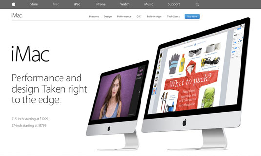
White space influences where your user's eyes go and better defines your visual hierarchy.
Here's some basic ways to take advantage of white space:
- Attention – The more white space around a single element, the more attention it will draw.
- Typography –Spacing creates a comprehensive hierarchy between headings, subheadings, body content, etc.
- Readability – Within blocks of text, proper spacing between paragraphs, lines, and even letters increases readability and therefore comfort.
- Elegance – White space adds an air of luxury and sophistication to your site.
- Grouping relationships – Closer spacing around groups of elements suggest similar functionality, reducing user learnability.
White space is an element like any other, and must be used actively instead of as just an afterthought.
A final note about trust
This should go without saying, but if users don't trust you — i.e., product pictures don't match descriptions — they will turn off emotionally. Include logos of prominent clients, feature testimonials from happy clients, and show off your own team.
Like we previously discussed, personality and social proof are just some of the factors that build trust. After all, people are more likely to find your site attractive if others vouch for you.
For more advice on matching form and function, check out the free ebook Winning Over Users With Attractive Design. You'll find 22 examples deconstructed from companies like Dior, Pinterest, Apple, Squarespace, Hulu, and others.
Words: Jerry Cao
Jerry Cao is a content strategist at UXPin — the wireframing and prototyping app.
Like this? Read these!

The Creative Bloq team is made up of a group of art and design enthusiasts, and has changed and evolved since Creative Bloq began back in 2012. The current website team consists of eight full-time members of staff: Editor Georgia Coggan, Deputy Editor Rosie Hilder, Ecommerce Editor Beren Neale, Senior News Editor Daniel Piper, Editor, Digital Art and 3D Ian Dean, Tech Reviews Editor Erlingur Einarsson, Ecommerce Writer Beth Nicholls and Staff Writer Natalie Fear, as well as a roster of freelancers from around the world. The ImagineFX magazine team also pitch in, ensuring that content from leading digital art publication ImagineFX is represented on Creative Bloq.
