7 famous logos that pass the silhouette test
These brands have mastered the art of memorable simplicity.
A good logo has to work hard these days. It needs to look good on everything from large-scale signage down to social media icons, and the best way to work around these challenges and achieve brand recognition is to use simple and memorable graphic shapes. Logos that depend on fussy, intricate details lose their impact when reduced to a Twitter avatar.
And while most branding systems specify colour palettes, in print a logo design will sometimes be rendered in black and white, in which case it needs to stand out just as much as it does in colour.
One sure-fire way to ensure your logo is fit for purpose is to give it the silhouette test. Convert it to monochrome, and study its outline: is it still instantly recognisable? Read on to be inspired by seven big-brand symbols that are defined by their distinctive silhouettes...
01. Airbnb

While another key part of the identity is its colour – you won't see the Airbnb logo in any colour other than coral – when reduced to black and white there's still no doubt as to which company this represents. And that's not a bad achievement for a company that's still relatively young.
Like any logo design worth its salt, Airbnb's Bélo logo drew all manner of criticism when it was unveiled in 2014. It's the work of DesignStudio, who set out to 'design a marque anyone could draw – something that transcended language and formed the foundation of a new brand', but what caught people's attention was its similarities to other logos and a certain resemblance to female genitalia.
Every new logo design has to run the gauntlet of online critics, though, and five years later the Airbnb logo has risen above the initial mockery and become one of those designs that everyone can recognise instantly. And it's one that works brilliantly as a silhouette; using a simple shape, as DesignStudio did, is a risky proposition, as there are likely to be any number of other brands with a similar design, but thanks to Airbnb's swift rise to global prominence it's had no problems in securing this particular shape as a key part of its identity.
02. Volkwagen
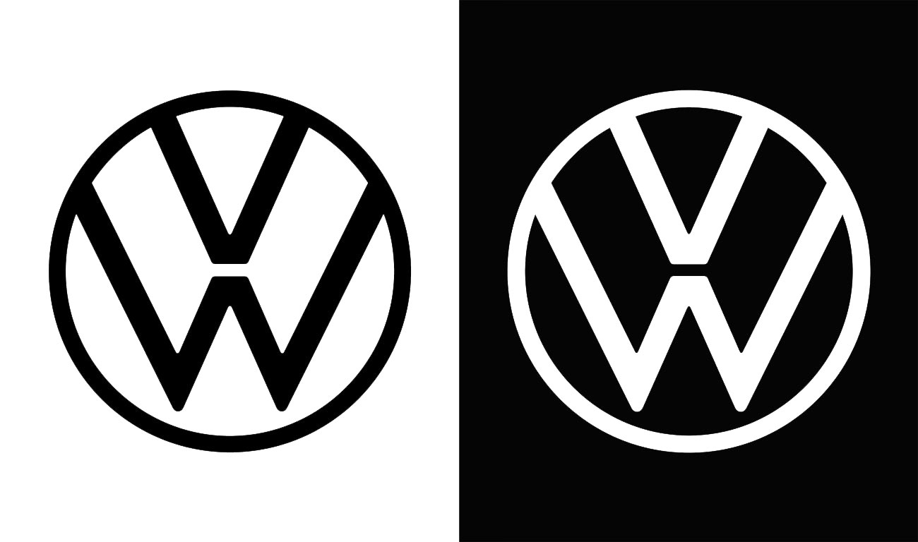
Volkswagen is perhaps fortunate that its initials are an absolute gift for logo designers. VW is a fantastic-looking combination of letters, and with them arranged on top of each other you get a strikingly abstract shape that nevertheless instantly identified the company it represents.
Daily design news, reviews, how-tos and more, as picked by the editors.
It's no surprise, then, that the Volkswagen logo has retained its fundamental elements – the VW monogram in a circle – since 1937. While the styling has been tweaked numerous times over the years, there's been no iteration of the logo that's ever going to leave anyone confused as to what it stands for.
Such a strong visual identity can withstand a lot of mistreatment, and converting the Volkswagen logo into a silhouette has virtually no effect on it. Even the more overdesigned versions of the logo from recent years benefit from the power of that simple VW monogram, while the latest version from this year, with its flat design and thinner lines, takes the silhouette process in its stride.
The new Volkswagen logo is built to be versatile; it has to work on everything from social media icons up to massive corporate signage, and reducing it to monochrome, if anything, strengthens its impact.
03. Apple
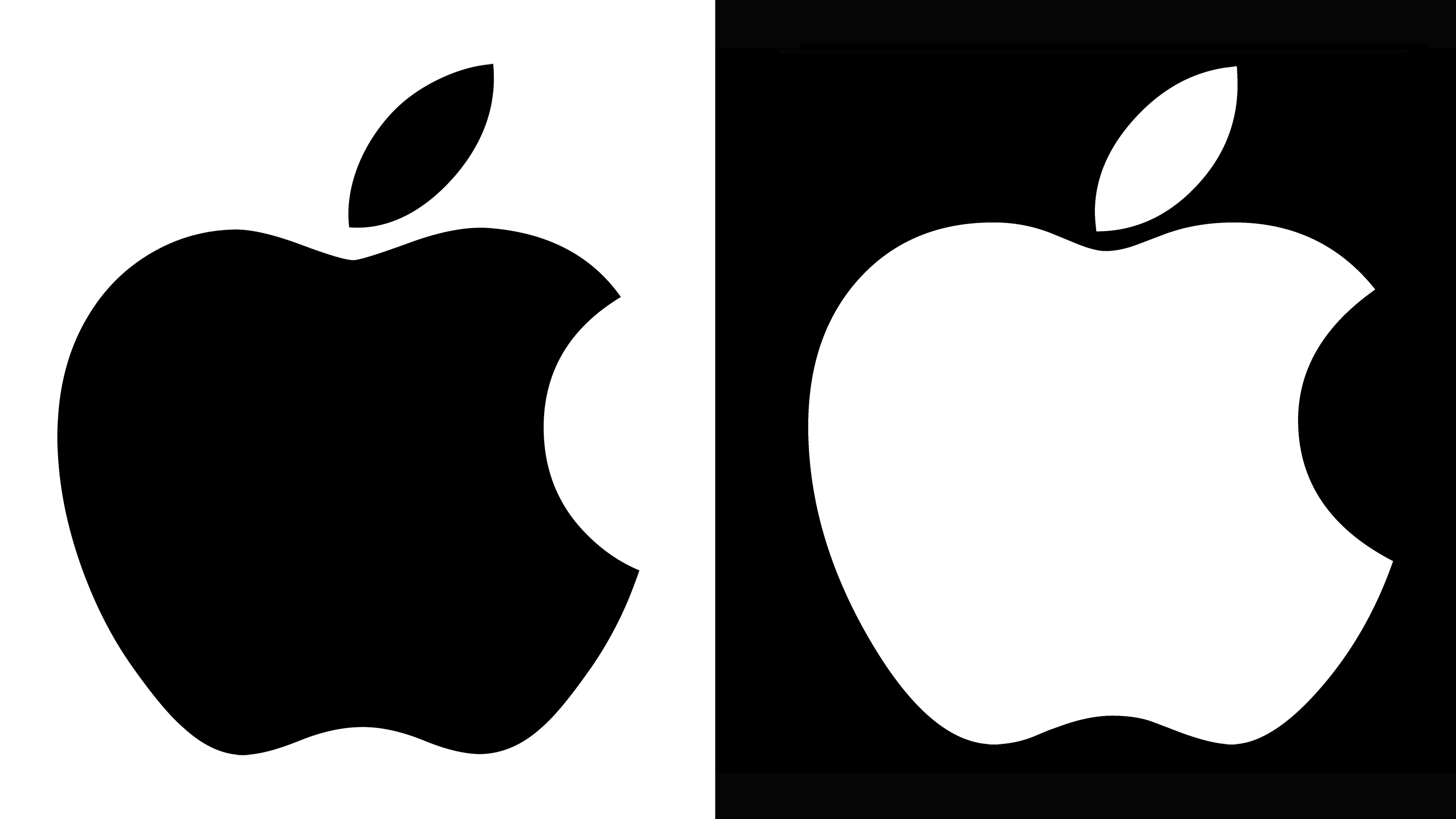
The much-lauded Apple logo features in more than its fair share of best logo roundups, but it has particular reason to be included here.
There are many myths about the bite in the eponymous apple, ranging from Eve's transgressions in the Garden of Eden, to Alan Turing's tragic suicide by biting a fruit laced with cyanide. However, designer Rob Janoff admitted to a much more prosaic reason behind the decision.
An apple with a bite out of it – even shown very small – looks like an apple, and not a cherry. That practical decision demonstrates the importance of having a strong, instantly recognisable silhouette. The accompanying myths just add extra layers of meaning, intentional or not.
Following Steve Jobs' death, Hong Kong-based graphic design student Jonathan Mak took the significance of the bite mark to a whole new level, replacing it with a simple silhouette of Jobs' face.
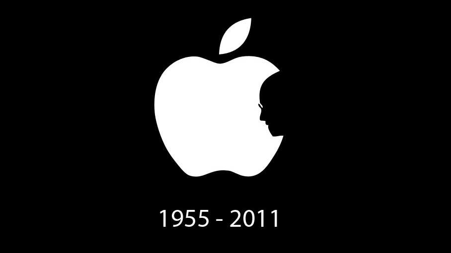
The sombre tribute touched a nerve with Apple's fanbase, and the image went viral globally. Mak was inundated with thousands of messages about his design, and the iconic status of the bite mark was further cemented in public consciousness.
04. Twitter
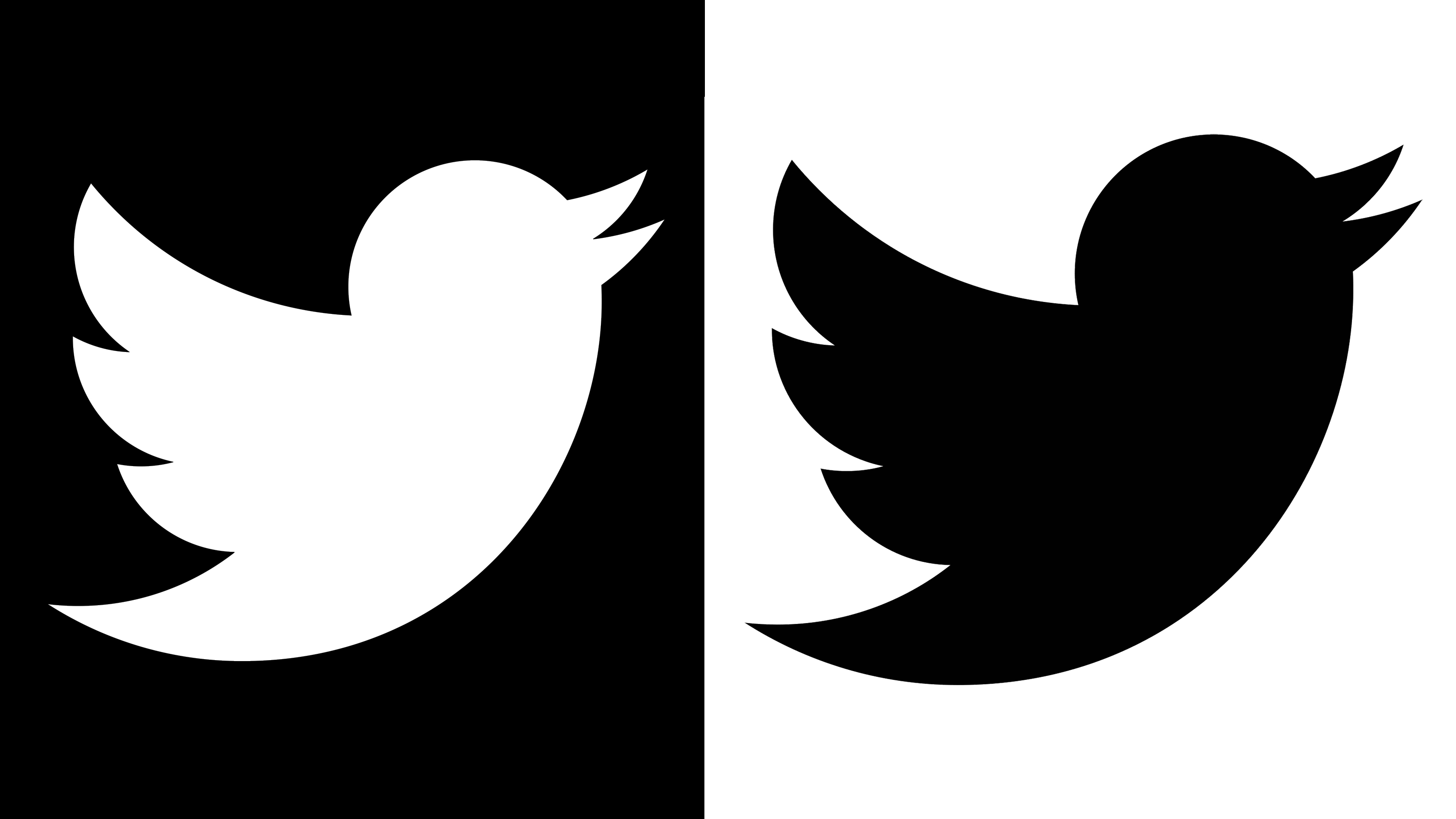
When West was brought on board to help rebrand Twitter back in 2012, much of the focus was placed on how the icon was created. The team even followed the growing trend for using visible construction lines to explain the building blocks of the logo.
Ultimately, the once fairly detailed bird – which in 2006 was depicted sitting on a perch and looking to the left, and later evolved into a more characterful bird in flight, complete with fluffy quiff – was pared right back to a clean, satisfyingly geometric silhouette. In short, it felt like Twitter had grown up.
According to Twitter, the new logo is born from a "love for ornithology, design within creative constraints, and simple geometry", and uses three sets of overlapping circles – representative of how social networks, interests and ideas intersect in your Twitter feed – define the shape of the bird.
05. Playboy

Originally designed by Art Paul, Playboy's cheeky, tongue-in-cheek emblem knowingly plays on the humorous sexual connotations of rabbits, without descending into smut or seediness.
Introduced for the second issue of the magazine in 1953, the now infamous Playboy Bunny has stayed a constant through decades of increasingly liberal approaches to sexuality, as well as the proliferation of pornography – testament to the timelessness of its design.
Its crisp silhouette, with the circular eye punched out of the outline of the rabbit's face, and the bow tie defined with minimal linework, works effectively in monochrome – a palette designed to evoke luxury, professionalism and class.
Whatever your take on the Playboy brand and its place in the modern world, no one can deny the effectiveness of the stylised bunny silhouette that's come to define it.
06. Nike

Another familiar sight on best-ever logos lists, the Nike Swoosh was famously created by design student Carolyn Davidson for the princely sum of $35.
Its simplicity makes its silhouette even more compelling, and like Apple, it is regularly seen in both black and white versions without an accompanying wordmark. The Swoosh must function at all manner of scales and types of application, from tiny on a sponsorship document, to an embroidered logo on a piece of clothing, to huge on a billboard.
While it is widely assumed to be a 'tick', the original inspiration for the Swoosh was in fact the silhouette of a wing – a reference to Nike, the Greek goddess of victory. Regardless of its origins, however, the fact remains that a simple yet ownable shape like this will pass the silhouette test every time.
07. WWF

Our fifth example, World Wildlife Federation, is rather an anomaly on this list, as it shows the limitations of using black and white to represent the actual colours of the thing being depicted, rather than just a relatively abstract shape.
WWF makes clever use of negative space in its famous panda emblem, the black silhouette neatly defining the shape of the face without the need for a hard outline. But when the colours are reversed, while recognisable, the negative image loses the essence of 'panda'.
Situations like this need to be addressed in brand usage guidelines, to make sure the logo is correctly presented.

Back in 2016, Grey London took it upon itself to reinterpret the much-loved WWF emblem. As part of a campaign to raise awareness of climate change, the agency replaced the panda with its considerably more-endangered counterpart, the polar bear.
Using the same basic principle of the black areas defining the white, Grey stripped it right back to an eyes, nose and mouth, so the outline of the bear fades into nothingness, to represent its decline towards extinction.
As part of the campaign, Grey offered the reworked logo to WWF to use for free – but the offer was never taken up. Like the original logo, however, the clever concept had its limitations and the idea falls apart when the colours are reversed.
Read more:

Thank you for reading 5 articles this month* Join now for unlimited access
Enjoy your first month for just £1 / $1 / €1
*Read 5 free articles per month without a subscription

Join now for unlimited access
Try first month for just £1 / $1 / €1

Nick has worked with world-class agencies including Wolff Olins, Taxi Studio and Vault49 on brand storytelling, tone of voice and verbal strategy for global brands such as Virgin, TikTok, and Bite Back 2030. Nick launched the Brand Impact Awards in 2013 while editor of Computer Arts, and remains chair of judges. He's written for Creative Bloq on design and branding matters since the site's launch.
