5 expert tips to design the perfect logo
A clear five-point checklist for creating standout corporate branding.

To produce a successful rebrand, or even to stand a chance of making it onto our prestigious list of the 10 best logos ever, you need to follow the advice of the professionals whenever it pops up. Texas-based graphic designer Armin Vit chronicles thousands of new brand and identity projects every year through Brand New, a division of design firm and publishing enterprise Under Consideration, which he co-founded with his wife, Bryony Gomez-Palacio.
The ex-Pentagram designer has reviewed hundreds of thousands of the world's biggest and bravest branding projects, so who better to explain exactly what does – and doesn't – make the perfect branding?
We caught up with Vit to find out what makes a standout logo. Here are his five top tips…
Article continues below01. Do the gut reaction test
"The first thing I look for when evaluating a new logo or branding project is an initial, aesthetic, gut reaction: do I like it?" Vit explains.
"If I don't – if it requires a lot of explanation to make it make sense – then I won't enjoy it. But from the get-go, if it looks good, smart and well-constructed, then I'm at least interested."
02. Does it work?
"I then look a lot at execution: how it works; how it might work in different contexts. I compare it to what they had before and what other companies in the same industry have. Does it stand out? Does it blend in?" He explains.
"I thought the Airbnb logo was really interesting. They were confident in their process and designers.
Sign up to Creative Bloq's daily newsletter, which brings you the latest news and inspiration from the worlds of art, design and technology.
"Nowadays most icons are taken: the Nike swoosh is taken, the Apple apple is taken – so coming up with a little symbol that can stand for something as big as Airbnb was really impressive."
03. Good logos make sense
"Next, I look at every part of the explanation available from the client or designer. If the idea's good, you read the explanation they give you and think yeah, that makes sense.
"When a logo's good, it's instantly clear and there's a solid, simple explanation behind it."
04. Have courage
"What's the most common pitfall I see brand identity work fall prey to? Sometimes a project doesn't stand out. Either the designer or the client doesn't have the courage to do something different. Or if they chose to do something similar, they didn't have the commitment to it very, very well.
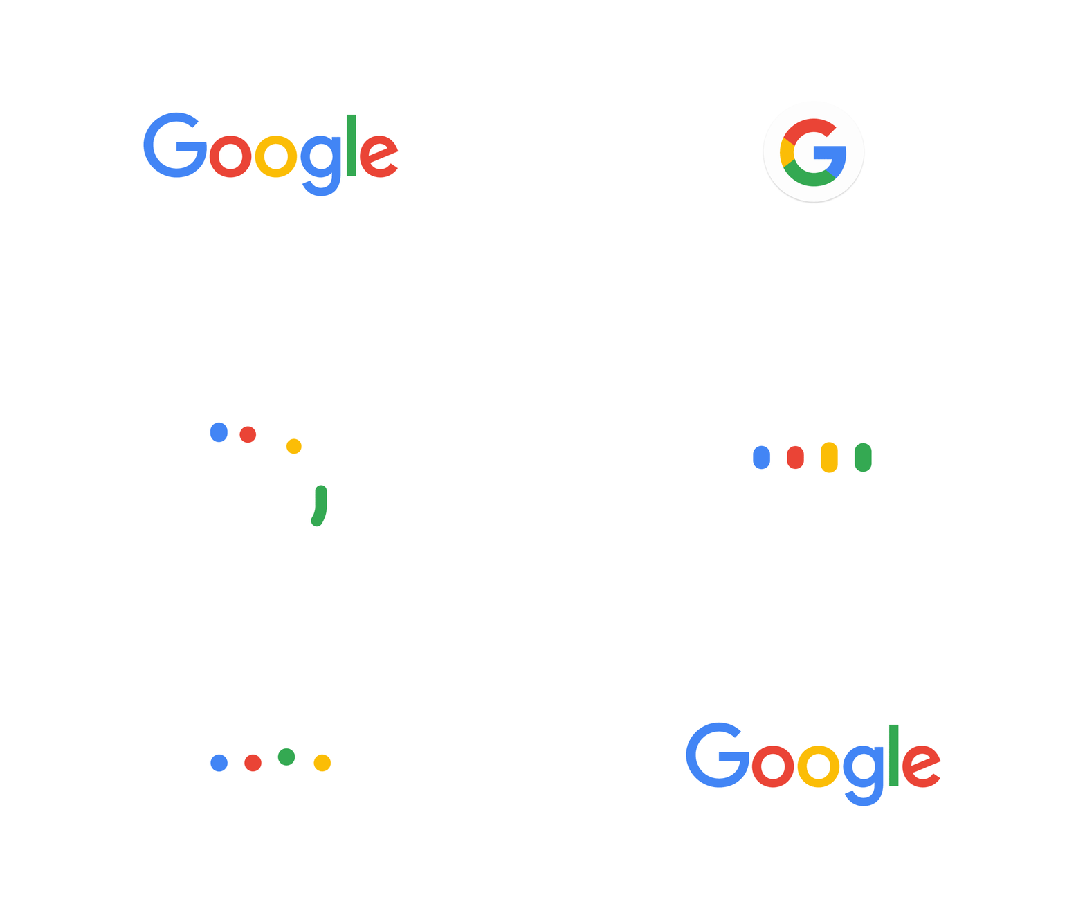
"The 2015 Google logo redesign was really fantastic. Not so much the word mark, but when you look at the whole system behind it and the care that went into it.
"It's a giant company taking a huge leap, going a completely different direction but somehow managing to maintain that quirky DNA they had. That sort of thing stands out regardless of the haters."
05. Take a step back
"The key piece of advice I'd give to a designer or studio tasked with a rebranding project is: when you present your work for the first time, make sure you've looked at it from an outside point of view.
"Everything might make sense to you because you've been involved in the process. But designers and clients can get too involved in their own processes, and forget to step back and see how others are going to perceive it. Take a step back and ask: is this right? Does this work?"
Related articles:

Julia is editor-in-chief, retail at Future Ltd, where she works in e-commerce across a number of consumer lifestyle brands. A former editor of design website Creative Bloq, she’s also worked on a variety of print titles, and was part of the team that launched consumer tech website TechRadar. She's been writing about art, design and technology for over 15 years.
