iOS 6 vs iOS 7: vote for your favourite icons
Skeuomorphism battles flat design in this showdown between the familiar iPhone icons and Jonathan Ive's controversial iOS 7.
Sign up to Creative Bloq's daily newsletter, which brings you the latest news and inspiration from the worlds of art, design and technology.
You are now subscribed
Your newsletter sign-up was successful
Want to add more newsletters?
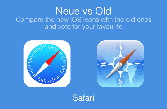
"iOS 7 is the biggest change to iOS since the introduction of iPhone," says Apple CEO Tim Cook, but what does the online audience think of each individual icon's transformation to flat design under Jonathan Ive? There's only one way to find out, and that's the Neue vs Old website's poll.
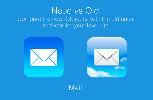
Neue vs Old - a clever play on iOS 7's use of Helvetica Neue font design (already a controversial element of the redesign) - allows visitors to choose their favourite icon design from a list of the familiar preloaded apps' iOS icons.
You can then see how your choices stack up against other voters, and vent your spleen in the site's comments section and on social media. There will be much tinkering to iOS 7 before its release later this year, but this is a fun way to compare the designs and take a reading of which way the wind of public opinion is blowing...
Article continues below 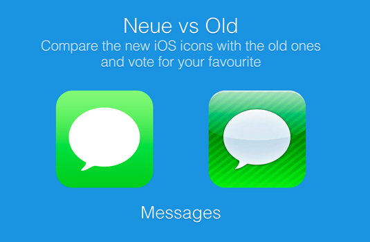
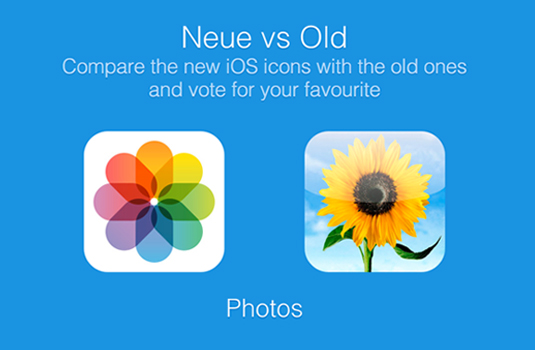
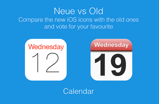
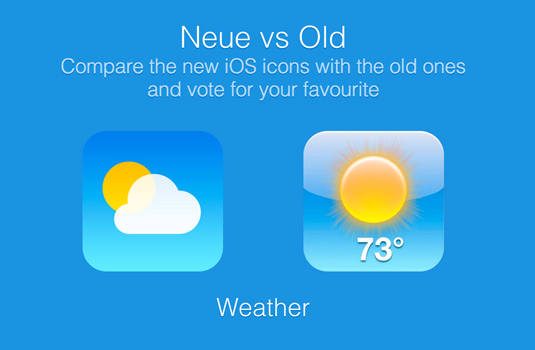
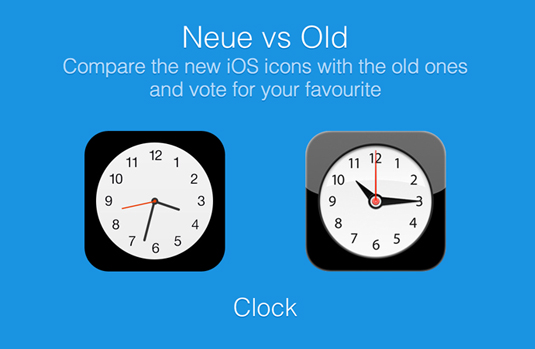
[via The Mac Observer]
Liked this? Read these!
- The best free iOS 7 resources on Dribbble
- 10 things designers need to know about iOS 7
- How to build an app
- Download the best free fonts
Which do you prefer, iOS 6 or iOS 7? Are some icon revamps more successful than others? Let us know in the comments below!
Sign up to Creative Bloq's daily newsletter, which brings you the latest news and inspiration from the worlds of art, design and technology.

The Creative Bloq team is made up of a group of art and design enthusiasts, and has changed and evolved since Creative Bloq began back in 2012. The current website team consists of eight full-time members of staff: Editor Georgia Coggan, Deputy Editor Rosie Hilder, Ecommerce Editor Beren Neale, Senior News Editor Daniel Piper, Editor, Digital Art and 3D Ian Dean, Tech Reviews Editor Erlingur Einarsson, Ecommerce Writer Beth Nicholls and Staff Writer Natalie Fear, as well as a roster of freelancers from around the world. The ImagineFX magazine team also pitch in, ensuring that content from leading digital art publication ImagineFX is represented on Creative Bloq.
