Beautiful sea creature illustrations lift restaurant branding
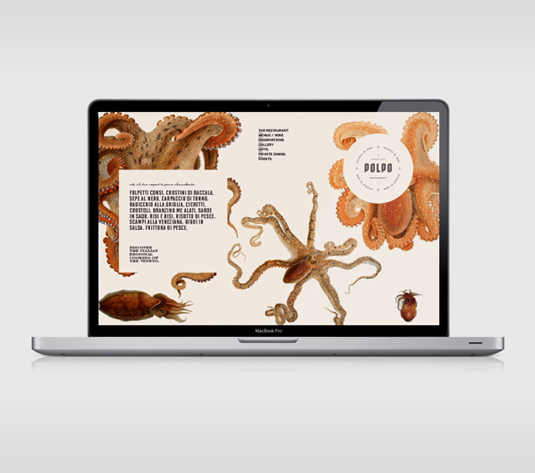
Vintage images, beautiful typography and sea creature illustrations form tasty new brand identity for conceptual Italian restaurant, Polpo.
Sign up to Creative Bloq's daily newsletter, which brings you the latest news and inspiration from the worlds of art, design and technology.
You are now subscribed
Your newsletter sign-up was successful
Want to add more newsletters?
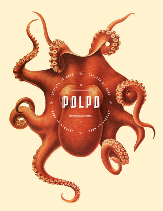
Graphic designer Richard Marazzi is the man behind this elegant branding work for Polpo, a conceptual Italian restaurant that specializes in Venetian fare with a focus on seafood.
"Polpo means octopus in Italian and is a staple in Venetian cuisine and a speciality of the house," Marazzi comments on Behance. "From playing with historical images that were used in textbooks before the invention of photography, a playful image style with a modern design was created."
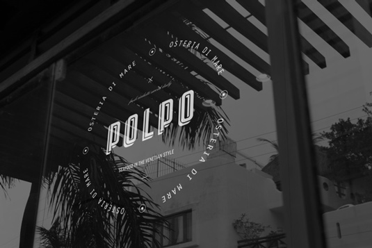
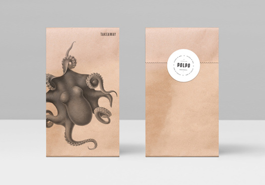
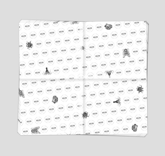
It's clear a lot of time, talent and, for a conceptual project, an impressive amount of detail has gone into this project. We particularly enjoyed the elegant menu design, as well as the simple, but stylish takeaway bags and food wrapping paper - all held together with an intricate octopus illustration. Just beautiful.
Article continues below 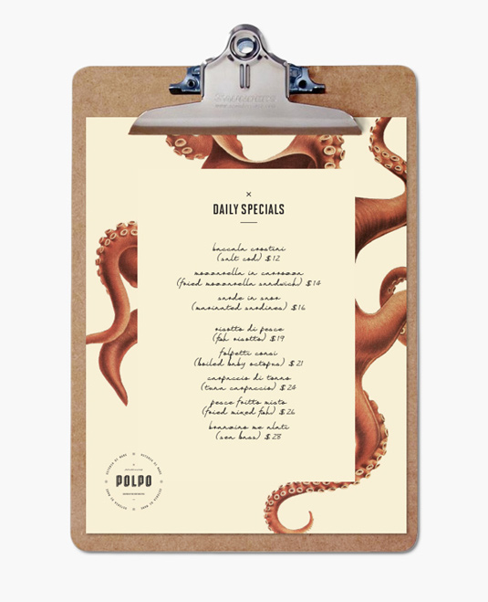
Liked this? Read these!
- The designer's guide to working from home
- The best collage maker tools - and most are free!
- The designer's guide to special characters
Sign up to Creative Bloq's daily newsletter, which brings you the latest news and inspiration from the worlds of art, design and technology.

The Creative Bloq team is made up of a group of art and design enthusiasts, and has changed and evolved since Creative Bloq began back in 2012. The current website team consists of eight full-time members of staff: Editor Georgia Coggan, Deputy Editor Rosie Hilder, Ecommerce Editor Beren Neale, Senior News Editor Daniel Piper, Editor, Digital Art and 3D Ian Dean, Tech Reviews Editor Erlingur Einarsson, Ecommerce Writer Beth Nicholls and Staff Writer Natalie Fear, as well as a roster of freelancers from around the world. The ImagineFX magazine team also pitch in, ensuring that content from leading digital art publication ImagineFX is represented on Creative Bloq.
