How Firstborn's website redesign subtly breaks expectations
The top agency's site redesign has personality and grit.
Sign up to Creative Bloq's daily newsletter, which brings you the latest news and inspiration from the worlds of art, design and technology.
You are now subscribed
Your newsletter sign-up was successful
Want to add more newsletters?

Firstborn is a full service agency specialising in areas ranging from digital strategy to web design and content strategy. And its own recent website's redesign is a real gem.
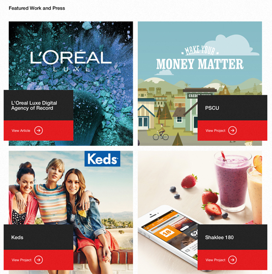
It has personality and grit whilst maintaining a clean and modern aesthetic, which vice president and executive creative director Dave Snyder says was one of the project's creative goals.
The large typography is mixed with a sharp, bright red colour palette, helping the redesign feel more bold and powerful than before. Captivating graphics and images of the agency's work are emphasised, taking up large portions of the screen. It makes a real statement.
Article continues belowThe site's interactions are fun while being snappy enough to not hinder the experience
Beyond aesthetics, what I love most about the site is the balance and grid. The site breathes with beautiful white space amongst all the imagery and typography, meaning all the elements flow perfectly.
And while the studio could have kept a more 'boxy' grid approach to styling various areas, it subtly broke expectations by balancing call to action buttons, animations and fades, all executed with the level of polish you'd anticipate from this team.
"The previous site really revolved around the work we do – and that's a huge indicator of the mentality here at Firstborn. However, we wanted to add a bit more around the people and what grounds our approach to that work," explains Snyder.
Words: Brian Hoff
Sign up to Creative Bloq's daily newsletter, which brings you the latest news and inspiration from the worlds of art, design and technology.
Brian is the founder and creative director of Brian Hoff Design, a Philadelphia-based boutique digital agency creating web and mobile platforms and products. Follow him on Twitter at @behoff.
Like this? Read these!
- The best free script fonts
- Free graffiti font selection
- 50 great parallax scrolling websites
- Why your website needs a landing page
Have you seen any amazing new sites or portfolios? Let us know in the Comments!

The Creative Bloq team is made up of a group of art and design enthusiasts, and has changed and evolved since Creative Bloq began back in 2012. The current website team consists of eight full-time members of staff: Editor Georgia Coggan, Deputy Editor Rosie Hilder, Ecommerce Editor Beren Neale, Senior News Editor Daniel Piper, Editor, Digital Art and 3D Ian Dean, Tech Reviews Editor Erlingur Einarsson, Ecommerce Writer Beth Nicholls and Staff Writer Natalie Fear, as well as a roster of freelancers from around the world. The ImagineFX magazine team also pitch in, ensuring that content from leading digital art publication ImagineFX is represented on Creative Bloq.
