How Brand Nu created a payment card's identity from scratch
With little more than a name to work with, Radim Malinic at Brand Nu created a colourful identity for multi-currency pre-payment card Mintlet.
Sign up to Creative Bloq's daily newsletter, which brings you the latest news and inspiration from the worlds of art, design and technology.
You are now subscribed
Your newsletter sign-up was successful
Want to add more newsletters?
Mintlet is a new pre-paid, multi-currency payment card aimed at travellers. Supporting a range of foreign currencies at launch, the idea is that it could potentially become a replacement for traveller's cheques.
The card will be sold in shops including Boots, Tesco and Morrisons. Users can load money onto it using an app or via Payzone, and if they lose the card they can simply log on and disable it. Mintlet uses the MasterCard system, which is normally associated with credit cards, but essentially this works in the opposite way - the user can only spend the money they've actually put on it.
The client knew what the product needed to do from day one. They knew it was going to be called Mintlet and they had been working on putting the necessary infrastructure in place behind the scenes. On the visual side, though, they were pretty much at the starting line when they contacted me - Mintlet head Leon Leondiades sent an email enquiry after seeing my design portfolio online. At that point, they had the name, but no actual visuals.
Article continues below 
I told Mintlet I would be interested in helping them to find the right designs and solutions that would speak to a wider demographic, and they really liked the sound of that. They could see that, as well as having something to bring to the table from a visual point of view, I also had an understanding of what they needed to achieve. The brief was very open and they were very receptive to ideas.
When starting an identity project, I always begin by putting myself in the customer's position. What would I like? What would appeal to me if I saw it on the shelf? I knew the kinds of shops it was likely to be sold in and I knew the concept would appeal to travellers, so that was my starting point.
Project at a glance
From the starting point of just a name, Radim Malinic explains how he created Mintlet’s brand identity.
01. Initial ideas
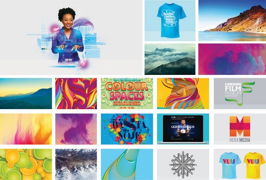
The client didn't have any solid ideas of what they wanted, so I started with a moodboard - a PDF of colourful pictures that summed up where I thought the art direction should go. I felt we had the opportunity to create something with the longevity of the product in mind.
Sign up to Creative Bloq's daily newsletter, which brings you the latest news and inspiration from the worlds of art, design and technology.
02. Logo tests
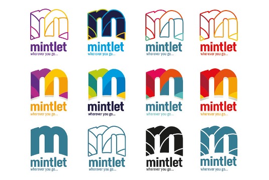
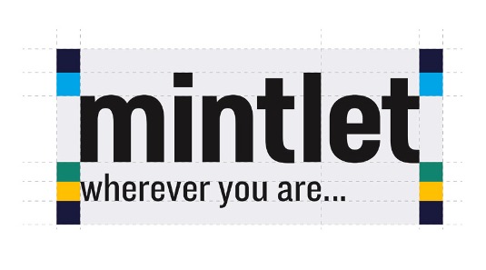
Once we agreed on the art direction, which was colourful, vibrant and energetic, I created one logo design and produced a series of test versions. We needed something as easily recognisable as the MasterCard logo, and it needed to be flexible, colourful and fun to look at.
03. Material world
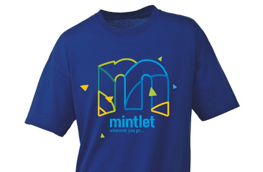
I like to put ideas onto a T-shirt, so I created a mock-up. It sounds nonsensical - why would you put a financial logo on a T-shirt? But it really worked. I was showing how the logo would look in different scenarios and giving the client a complete solution from the start.
04. Picking the palette

I played around with colours and tried to go from using basic colours to something brighter and more ownable and customisable. We decided to use the blue, yellow and green palette for the brand colours - everyone agreed because we felt this would speak to the chosen demographic.
05. Clear not corporate
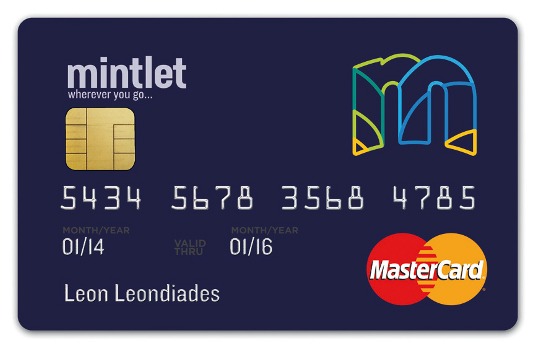
The typography was created with clear legibility and modern curves in mind, so it didn't look corporate or alienate the customer. I believe there are two sides to a logo: you've got the icon device, and the font. Both need to be strong - the font needs to be confident and authoritative on its own.
06. A versatile logo

I didn't necessarily think that the logo would work so well as an outline right at the start. I wanted to symbolise rolling hills and the sunrise in an abstract way in the shapes I used - the aim being to insinuate a sense of positivity about what will happen when you use the card.
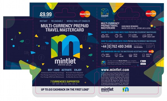
07. Packaging design
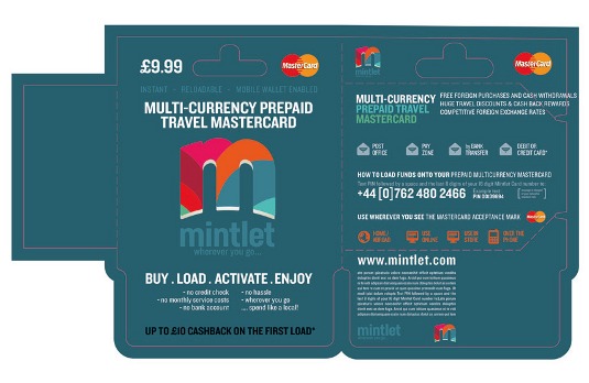
Once the logo and colours were agreed, I moved on to creating the packaging. It took a while before I was happy with it, as I needed to strike the right balance between the branding and other elements. I ended up deleting everything I'd done so far and starting again with a blank canvas.
08. Full visual system
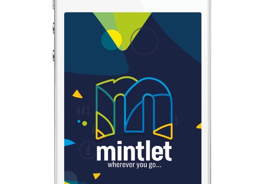
The idea of using small particles came from the T-shirt mock-up I created at the start of the project: they're taken from pieces of the logo. With that concept in place, I could perfect the packaging and card designs, and show how the visual system would work in other media.
09. Ready to launch
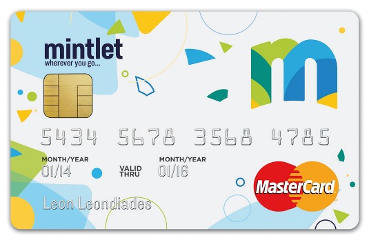
Everything was signed off at the end, to ensure the client was 100 per cent happy with the full package. I created four card designs using the particle device, and the client also has the plain navy blue card that I designed earlier in the process. The white card will go on sale first, in March 2014.
Words: Radim Malinic
This article originally appeared in Computer Arts issue 222.
Liked this? Read these!
- Create a perfect mood board with these pro tips
- The ultimate guide to logo design
- Free graphic design software available to you right now!

The Creative Bloq team is made up of a group of art and design enthusiasts, and has changed and evolved since Creative Bloq began back in 2012. The current website team consists of eight full-time members of staff: Editor Georgia Coggan, Deputy Editor Rosie Hilder, Ecommerce Editor Beren Neale, Senior News Editor Daniel Piper, Editor, Digital Art and 3D Ian Dean, Tech Reviews Editor Erlingur Einarsson, Ecommerce Writer Beth Nicholls and Staff Writer Natalie Fear, as well as a roster of freelancers from around the world. The ImagineFX magazine team also pitch in, ensuring that content from leading digital art publication ImagineFX is represented on Creative Bloq.
