How a top design agency used typography to help beat cancer
Behind the scenes on how Re: Sydney rebranded the Australian Cancer Research Foundation.
When tasked with refreshing the identity for the Australian Cancer Research Foundation, agency Re: Sydney merged a meaningful typographic approach with an equally powerful tone of voice. Award-winning designer Alex Creamer walks through the brief…
The Australian Cancer Research Foundation (ACRF) receives no government funding and relies solely on private donations. In 2014, ACRF was facing some challenges as far as getting donations.
It needed to create a more consumer-facing brand to reach a broader audience and compete in the sector, and wanted to resonate with a younger audience.
The ACRF had also recently purchased a top-level domain, '.CancerResearch', so another part of the brief was asking us whether we could incorporate that into the identity.
They felt that this top-level domain could help push the company into a much bigger space, where they became the hub for cancer in Australia and potentially globally. So it was a good opportunity for them, both financially and visually. Here's what we did…
01. From old to new
The previous ACRF identity was straightforward, with a crab as the cancer reference, and a simple sans serif font. The colours were muted and their tonality reflected a sense of grieving and loss. So the new identity needed to communicate much more – that the foundation is a force for good.
02. Positive allusions
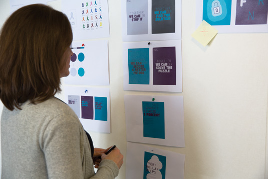
The central idea is the notion that a world without cancer is a world without cancer research. We wanted to be bold and catch the attention of people, but didn't want to allude to death too much.
Sign up to Creative Bloq's daily newsletter, which brings you the latest news and inspiration from the worlds of art, design and technology.
The copywriter was involved right from the start, as a lot of the brand is built upon that tone of voice idea.
03. Tone of voice
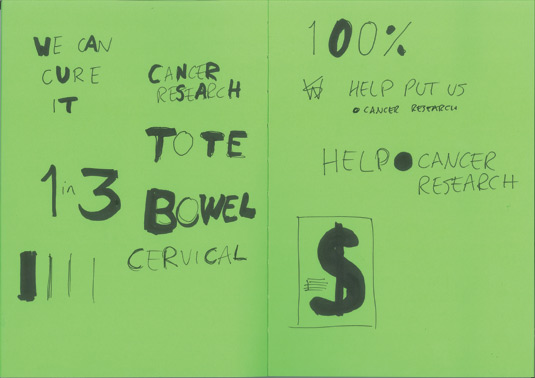
We always get the copywriter involved right from the start, especially with charity brands. A lot of the output they work with day-to-day is on a smaller scale, so having a strong tone of voice was very important for them to translate the brand across other touch points.
04. Typographic approach
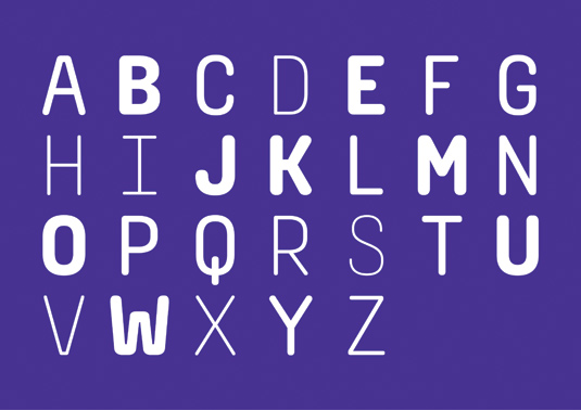
Quite early in the process, we came up with a distinctive typographic approach to reflect the central idea of the identity. We wanted to create a typeface of varying weights to represent how some cancers are close to disappearing, while others remain still very visible.
05. Bespoke type
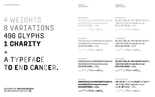
We commissioned Paris-based typographer Mathieu Réguer to create the bespoke typeface which we felt needed to encompass a variety of weights.
At our request, Réguer then built an algorithm into the typeface, allowing letter weights to alternate depending on the letter preceding it.
06. Strong logo
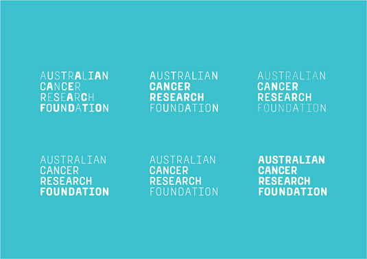
The logo is a simple stacked 'Australian Cancer Research Foundation'. We included the top-level domain .CancerResearch in much of the material, as a sign-off to the messaging.
The full stop symbolises the end of cancer, which ties in nicely with the identity. It's definitive and strong.
07. Bold colours
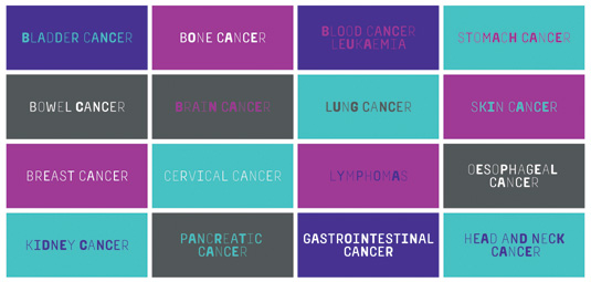
The original colour was a light green-aqua. We needed to be much bolder, so we punched that up to a teal colour.
The colour lavender represents cancer in all its forms, so we chose a vibrant purple to complement the teal, and the pink makes sure the palette was bright and flexible enough.
08. Human identity

The human element of the identity was incredibly important. The illustrative style – created by junior designer and illustrator Olivia King – is friendly, organic and hand-drawn, and incorporates 'smile in the mind' ideas that relate to the messaging of the overall identity.
09. Strength and defiance
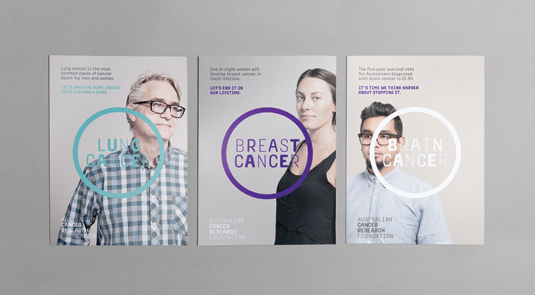
For the photography, finding the right tone was also crucial, to add warmth and compassion to the imagery. The photography strives to capture real people with a sense of strength and defiance, without overtones of sadness or pity. It was important to find that middle ground.
The full version of this article first appeared inside Computer Arts issue 244: Earn More as a Designer – packed full of financial tips for creatives – on sale now.
Liked this? Try these...
- The designer's guide to making budgets work
- How to set every design project budget in 4 steps
- Download the best free fonts

The Creative Bloq team is made up of a group of art and design enthusiasts, and has changed and evolved since Creative Bloq began back in 2012. The current website team consists of eight full-time members of staff: Editor Georgia Coggan, Deputy Editor Rosie Hilder, Ecommerce Editor Beren Neale, Senior News Editor Daniel Piper, Editor, Digital Art and 3D Ian Dean, Tech Reviews Editor Erlingur Einarsson, Ecommerce Writer Beth Nicholls and Staff Writer Natalie Fear, as well as a roster of freelancers from around the world. The ImagineFX magazine team also pitch in, ensuring that content from leading digital art publication ImagineFX is represented on Creative Bloq.
