Delicious branding for farmer co-operative
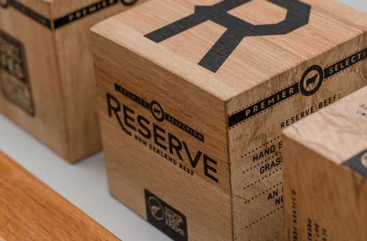
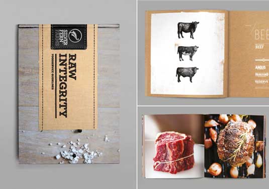
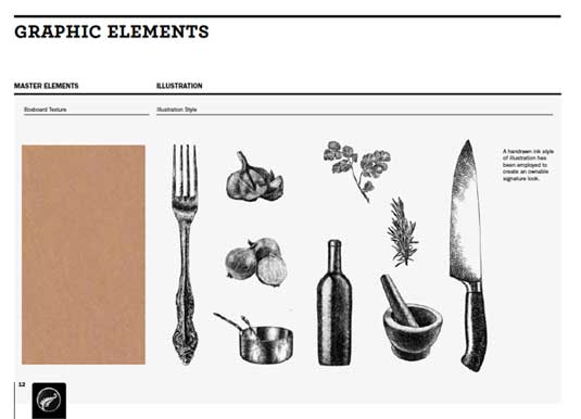
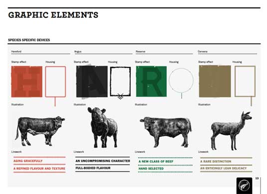
Designer Matt Hammond combines beautiful type, textures and illustrations in branding for New Zealand-based farmer cooperative.
Sign up to Creative Bloq's daily newsletter, which brings you the latest news and inspiration from the worlds of art, design and technology.
You are now subscribed
Your newsletter sign-up was successful
Want to add more newsletters?
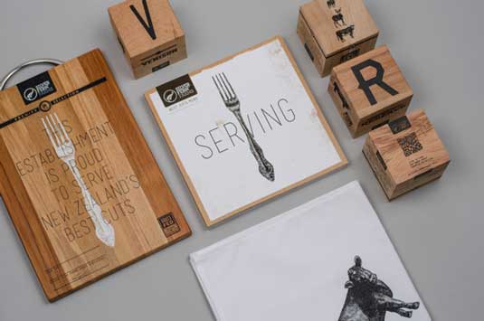
From the looks of it, graphic designer Matt Hammond was inspired by the expression 'eat with your eyes' when developing this new identity for Silver Ferns Farm foods.
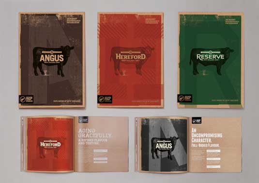
Completed at Designworks, Hammond created the delicious design to showcase the company's venison and beef products, with communications sent directly to chefs and restaurants.
Everything from the layout to typography and colour combinations has been well planned in this design, showcasing the company's products beautifully. We particularly like the organic feel all the various elements bring to this gorgeous design.
Article continues below 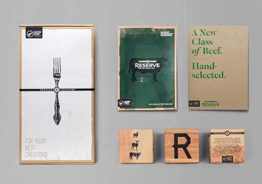
Liked this? Read these!
- Food art: jaw-dropping examples of culinary craft
- The ultimate guide to designing the best logos
- Create a perfect mood board with these pro tips
Have you seen any inspirational identity design recently? Let us know in the comments!
Sign up to Creative Bloq's daily newsletter, which brings you the latest news and inspiration from the worlds of art, design and technology.

The Creative Bloq team is made up of a group of art and design enthusiasts, and has changed and evolved since Creative Bloq began back in 2012. The current website team consists of eight full-time members of staff: Editor Georgia Coggan, Deputy Editor Rosie Hilder, Ecommerce Editor Beren Neale, Senior News Editor Daniel Piper, Editor, Digital Art and 3D Ian Dean, Tech Reviews Editor Erlingur Einarsson, Ecommerce Writer Beth Nicholls and Staff Writer Natalie Fear, as well as a roster of freelancers from around the world. The ImagineFX magazine team also pitch in, ensuring that content from leading digital art publication ImagineFX is represented on Creative Bloq.
