This new brand identify mixes art deco with contemporary flair
Kokoro & Moi has created an exciting new brand identity for Finnish food company Fazer.
Sign up to Creative Bloq's daily newsletter, which brings you the latest news and inspiration from the worlds of art, design and technology.
You are now subscribed
Your newsletter sign-up was successful
Want to add more newsletters?
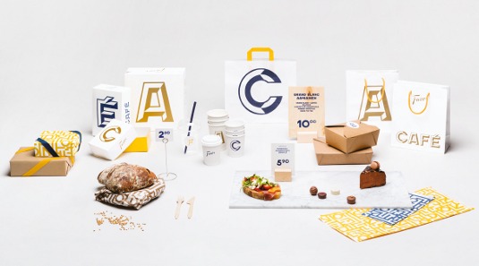
Kokoro & Moi created an identity for Finnish food company Fazer café, including brand story, logo design, custom typography and print materials. It worked with interior architects Koko3 on the spatial work and fashion label Samuji on staff uniforms.
We first got involved with this project when the team at interior design studio Koko3 asked us to join them in the pitch. We had worked with them before, for clients such as Nokia and the Helsinki Regional Transport Authority, and we had been looking out for more projects that we could work on together. This was the perfect opportunity.
We developed everything from the brand story through to all of the individual applications. Koko3 was in charge of the spatial design while we looked after the branding side, with Fazer café as our joint client. The fact that we had worked together before made for a very natural process.
Article continues belowThis project was essentially about Fazer's heritage and history being married together with contemporary international flair. The brand's heritage is one of its advantages within a competitive market – Fazer is over 100 years old. We needed to create something new and fresh within the brand, while still retaining that existing capital.
We also had to consider the service context. There are different touchpoints for different customers, from those who come in for lunch or a glass of wine, to people buying bread or a cup of takeaway coffee. These multiple touchpoints needed to be taken care of within the service design, and the entire brand identity had to appeal to a wide audience.
The brief was created in a very collaborative way, together with Fazer. We conducted a number of workshops with various people from the company, from business developers to restaurant chiefs and chefs, after which the final brief was created. We believe in working closely with the client and its end users to create something together. It's a joint process and it's key to ensure our decisions make sense to the client.
Kokoro & Moi's art director Timo Ilola walks us through the development process
Sign up to Creative Bloq's daily newsletter, which brings you the latest news and inspiration from the worlds of art, design and technology.
01. City insights
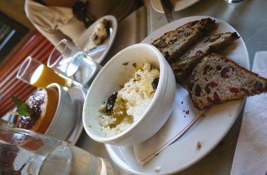
Koko3 invited us to join the project during the pitch stage. We worked with the interior design studio and the client to lay the foundations for the project, doing insight studies and workshops in Helsinki and New York. We had regular meetings with Koko3 to update each other and the client.
02. Creating the brief
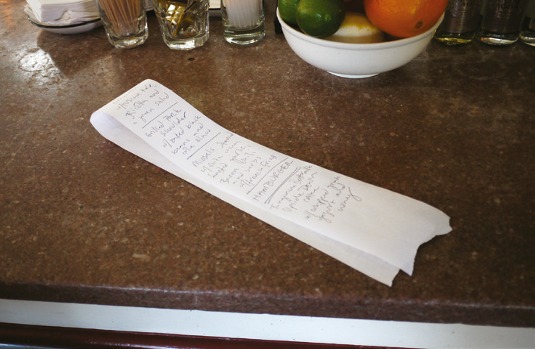
Establishing the brief was a collaborative process, which we worked on together with Fazer. We conducted workshops with various people from within the company, after which the final concept was created – and we moved towards one visual direction in a very dynamic and iterative way.
03. Sign of the times
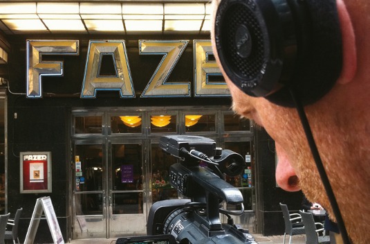
We went on to develop the brand story, brand promise and tone of voice. Our research into Fazer's history led us to identify the creative potential in the original art deco signage outside its first café in Kluuvikatu, Helsinki, which formed the basis for two new custom typefaces.
04. Deco details
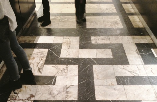
As well as the historic sign, the café at Fazer Kluuvikatu and its art deco design provided us with considerable inspiration and references for this project. The geometric floor patterns inspired the graphic element, and we used the marble and brass elements in the interior.
05. Visual identity
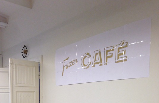
We asked the client to approve the concept, and then went on to create the rest of the visual identity including the custom typefaces and other type choices, and the colour palette, patterns, layouts and materials. Koko3 took the lead in creating the spatial identity.
06. Custom typography
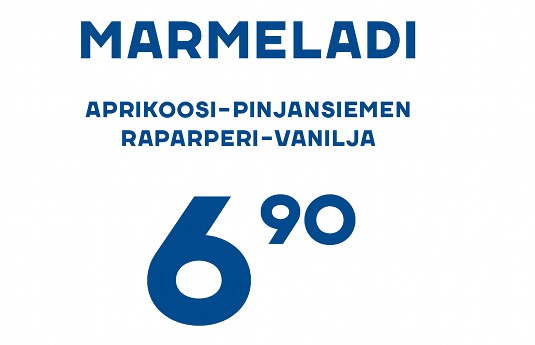
We created a pair of custom typefaces, Fazer Grotesk and Fazer Chisel, taking inspiration from the art deco sign outside the Kluuvikato café. More and more people are using custom type for branding and taking the opportunity to create something the client owns.
07. Daylight shades
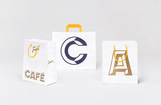
The colour palette combines existing Fazer brand colours – the gold and its trademarked Fazer Blue – with some lighter colours. We wanted the palette to have a 'daylight' feel, so we chose a yellow and a shade of reddish magenta, which we used sparingly but effectively.
08. Material world
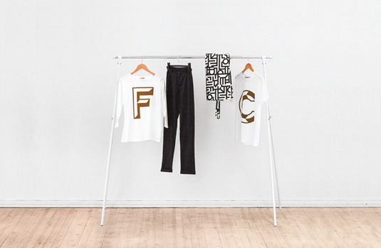
We then created all print materials from takeaway packaging and shopping bags to menus and posters, and designed the uniforms in collaboration with Finnish fashion label Samuji. We worked with Fazer's in-house procurement team to identify the best materials and processes.
09. Open for business
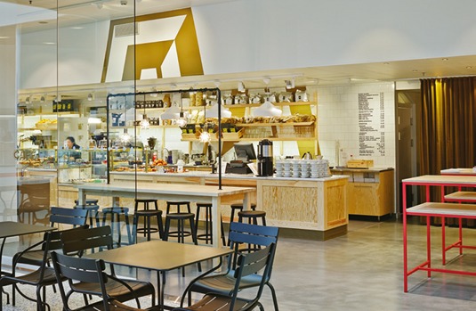
Six cafés have opened so far, and Fazer is planning to launch lots more. The brand is looking to expand into different markets, so there's plenty of work still ahead. It's a huge company and lots of people were involved in the project, so we needed to keep everyone informed.
Words: Teemu Suviala and Timo Ilola
This article originally appeared in Computer Arts issue 227.

The Creative Bloq team is made up of a group of art and design enthusiasts, and has changed and evolved since Creative Bloq began back in 2012. The current website team consists of eight full-time members of staff: Editor Georgia Coggan, Deputy Editor Rosie Hilder, Ecommerce Editor Beren Neale, Senior News Editor Daniel Piper, Editor, Digital Art and 3D Ian Dean, Tech Reviews Editor Erlingur Einarsson, Ecommerce Writer Beth Nicholls and Staff Writer Natalie Fear, as well as a roster of freelancers from around the world. The ImagineFX magazine team also pitch in, ensuring that content from leading digital art publication ImagineFX is represented on Creative Bloq.
