Reinvent a destination brand identity in 10 steps
How dn&co and digital pioneer Poke collaborated on the redevelopment of the London 2012 media centres.
Sign up to Creative Bloq's daily newsletter, which brings you the latest news and inspiration from the worlds of art, design and technology.
You are now subscribed
Your newsletter sign-up was successful
Want to add more newsletters?
When development joint venture iCity pitched to recycle the former media centres used during the London 2012 Games, it needed to present a credible brand, marketing vision and an identity. Poke founding partner Tom Hostler explains the design brief…
Poke and dn&co were partnered by the client in 2013, because iCity wanted a progressive approach to destination branding – but also the local expertise of a Shoreditch-based digital company.
iCity, as it was then called, is on the fringes of Hackney, one of the most creative boroughs of London, but also one of the poorest. That's why there was such an emphasis on how to launch the brand in a sensitive and appropriate way.
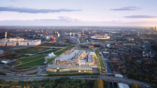
The East End community is very successful, and the entire commercial property world is focusing on it – you've got to change the conversation if you want people to pay attention. So we came up with the strapline, 'London's Home for Making'.
While the rest of the property world is throwing around general terms of technology, no one was throwing their arms around a large but disparate group of companies – makers who are developing products in the fourth generation of the internet, the Internet of Things.
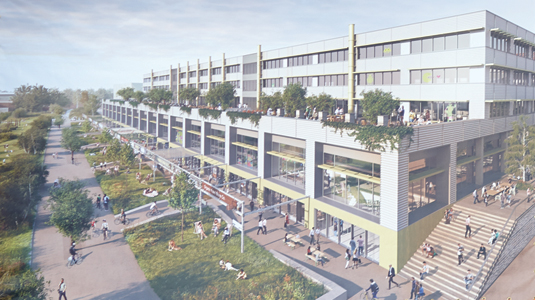
If you shine a light on that creative economy, and create a campus-like destination at affordable prices, in an agreeable architectural design, you can create a spiritual home for people who lacked a centre of gravity.
Any identity work needs to speak of, and to, those people. They are the disruptors and innovators, so you need a name and identity which is challenging and reflects the values that they embrace.
Sign up to Creative Bloq's daily newsletter, which brings you the latest news and inspiration from the worlds of art, design and technology.
Page one of our pitch was how terribly cringe-worthy iCity was as a name. It had to be taken quietly out the back and shot. It was a bad Apple pun. They got that very quickly and that's exactly why they wanted a more disruptive approach.
Here, dn&co creative director Patrick Eley runs through the thinking behind Here East's disruptive identity...
01. Brain storm
Together with Poke, we started by thinking about the strategic concept, putting together ideas about what we wanted the place to stand for. You want the design to reflect the aspirations of a place, so doing that initial thinking was key to getting the design working in the right way.
02. Bold name
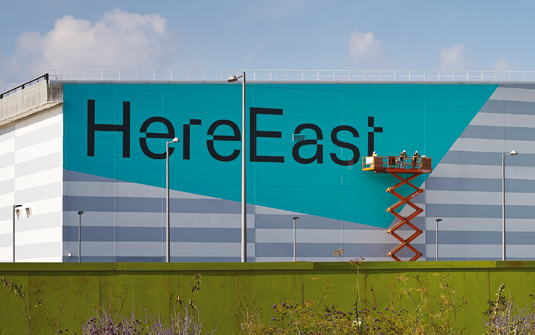
The name was also key. We wanted an identity that had flexibility to it, something generative. 'Here' is a really important word and concept, and then it can be extended – to 'Here Rio', 'Here West' and so on. The name was quite bold. It's not a very obvious name for a place like this.
03. Disruptive identity
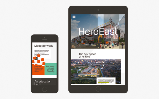
Early on, we came up with the idea of the identity being dynamic. It was about wanting something that had a kinetic, disruptive quality to it. We could then apply that to all aspects of the identity itself, such as colour or typography, but not necessarily put all of them together.
04. Inspired pattern
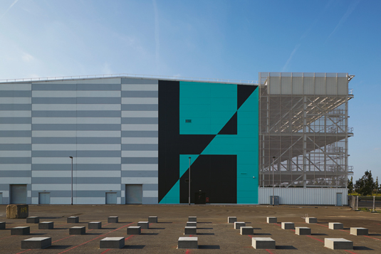
There was a huge amount of collaboration between us, Poke and the architects. The dynamic H, for example, was inspired by a pattern that the architect was using. We created the logo by dragging a point of the type over on itself, creating a perfect disruption of the letterform. [Head to page two to find out how the logo was developed.)
05. Digital heritage
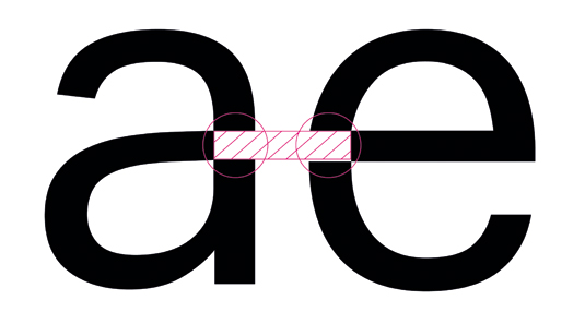
For the font we wanted something that felt like it had a digital heritage, but not something that felt too obvious. The connectivity of the space has always been really important but we didn't want to labour the digital aspect too much. So we took a font and disrupted it ourselves.
06. Sublte disruption
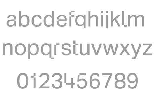
We were given permission by Dalton Maag to disrupt Aktiv Grotesk, and worked with Colophon on the details. We didn't want every character to be affected. It needed an element of subtlety – something with that disruption quality, but that didn't disturb the readability too much.
07. Colour combination
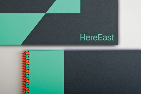
The identity colour had to reflect the architecture, so orange was important, but it couldn't be just about the architecture. We looked at maker brands and colours associated with them. We wanted to find something that fits in the middle of all those but feels like its own piece.
08. Highlights
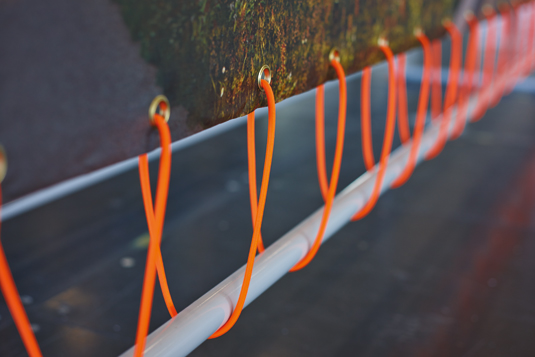
That's why the green became so dominant – it has a hint of the digital and the technical. And then the orange is used as a fluorescent highlight that is picked out in little ways. The green and orange are quite strident and go well with each other, but they are also opposite.
09. Scroll effect
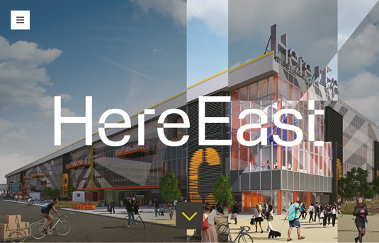
The website design by Poke focused on making the Here East disruption responsive and scalable: keeping aspects of the design element alive regardless of what device or screen size it is viewed from. The scrolling effect brings to life the 'big business meets small business' aspect of Here East.
Tom Hostler on rolling out the new brand…
The first phase of the development will open late summer and the other half will open the following summer. We've developed an identity, a positioning and tone of voice, and all the usual deliverables a branding project needs.
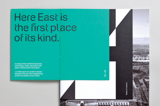
We're now in marketing execution mode, helping to let the buildings, and that's being done through traditional means. So dn&co co-founder Joy Nazzari and her team are creating brochures and on-site experiences [details on page two], while we have created a website that helps sell the scheme.
The brand is far more than a marque on a piece of paper; it's a set of experiences that you may have digitally, physically through a site visit, or tangibly in a piece of print. The things that this scheme does say as much about it as the business cards given.
We're also doing a lot of content-based marketing. We've created two amazing films, one of which is very eye-catching and features an animatronic robot. To develop a launch film, you need to turn to the community that you're representing. So we've used a combination of Poke, Nexus and John Nolan studios to create a short that features the kind of work that represents some of the firms around here.
In addition, we're starting to think about what the tenants' experience will be like – for example, how do digital disruptors come into work? Do they carry a card round their neck on a lanyard, or do we do something funky with smartphones?
All that has to be designed and thought out as a whole experience. The aim is to have a living, breathing brand – from the voices you hear in the lifts, to the clothes the receptionist will be wearing, to the briefs, to the taxi drivers on how to find it – it's a massive branding beast.
So in a very conservative world of property marketing, that kind of idea took a lot of guts on the part of the client to get on board.
Next page: develop a disruptive logo in five steps

The Creative Bloq team is made up of a group of art and design enthusiasts, and has changed and evolved since Creative Bloq began back in 2012. The current website team consists of eight full-time members of staff: Editor Georgia Coggan, Deputy Editor Rosie Hilder, Ecommerce Editor Beren Neale, Senior News Editor Daniel Piper, Editor, Digital Art and 3D Ian Dean, Tech Reviews Editor Erlingur Einarsson, Ecommerce Writer Beth Nicholls and Staff Writer Natalie Fear, as well as a roster of freelancers from around the world. The ImagineFX magazine team also pitch in, ensuring that content from leading digital art publication ImagineFX is represented on Creative Bloq.
