The secrets behind the rebranding of a Moscow coffee shop
Maxim Goudin and Illarion Gordon's branding for Double B Coffee & Tea benefited greatly from the collaborative nature of their workflow and the low-poly vision of the design.
Sign up to Creative Bloq's daily newsletter, which brings you the latest news and inspiration from the worlds of art, design and technology.
You are now subscribed
Your newsletter sign-up was successful
Want to add more newsletters?
The brief: Double B Coffee & Tea is a Moscow-based chain of coffee shops that was in need of some branding to match its individual approach. Working on a pro bono basis, Maxim Goudin and Illarion Gordon took on the challenge of creating a suitable brand identity that would carry across a logo design, packaging, cups and posters.
The client is a Moscow-based coffee shop chain called Double B Coffee & Tea. The name is quite obscure, coming from the initials of 'Babushka Batman'. The Double B guys really care about their stuff; I've never seen that kind of dedication in any coffee company in Moscow. They import, roast, sell, brew - and they are really good at it. For me, that meant that the branding should do the same for their image. The goal was to create a brand outstandingly different from anything else on the market.
Double B needed many elements, as you can imagine: logo, packaging, cups, posters; the whole nine yards. However, we enjoyed complete freedom with the brief, because the work was done on an absolutely philanthropic basis. The client could not afford to hire us for this job, but I saw it as an opportunity to make something really interesting.
Article continues belowDouble B relied on my expertise as an art director, and I tried very hard to remain as critical of my own work as I possibly could. To get to the point we're at now took probably eight to 10 months. It's an ongoing project - gradually we've enhanced the branding scheme and some of the ideas are still being refined.
Sketching it out
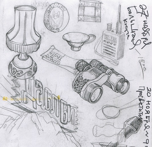
At the start, I spent hours thinking really hard and drawing ideas in my sketchbooks. I love to work with real materials, and there is nothing as good as pencil on paper. I scanned all the sketches in at 300dpi to put in Illustrator. Then we began the tracing process, and then refining - there was endless refining.
Babushka Batman
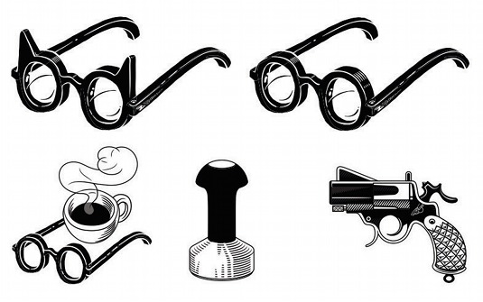
The symbol for Double B is a mix between Babushka (which means 'grandmother' in Russian) and a bat. It's a bit of an in-joke by now, but the client seemed to love it immediately, so we kept it. I continued down this path, but the outcome was not as satisfying as it was on paper, and the idea, really, didn't fit at all.
A rethink
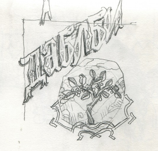
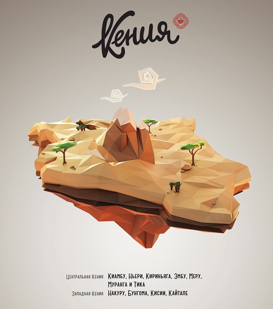
Next came my first attempts at a new design, which turned out miserably. I wanted to have some kind of mountain that represented the non-blended type of coffee. I even tried to do a small acrylic piece of Mount Kenya to print on the back of a pack itself. Finally, I hit upon the idea of using low-poly illustrations.
Sign up to Creative Bloq's daily newsletter, which brings you the latest news and inspiration from the worlds of art, design and technology.
The low-poly approach
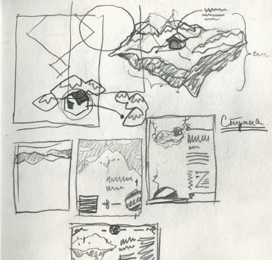
Once I'd settled on that approach, I took the project to Maxim. I drew some rough sketches of the ideas that I'd had for the 3D illustrations, and that was it - he instantly understood the concept and started modelling. He is a real artist in 3D, needing no feedback during his work - the final designs were perfect.
Mock-ups
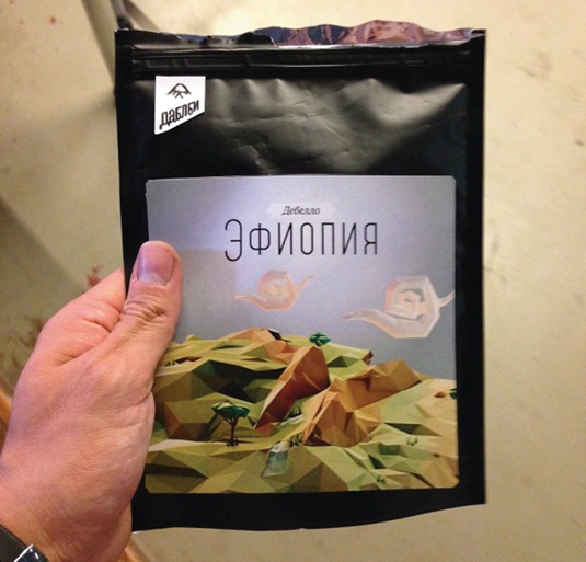
Mock-ups formed the next stage. I took some real black coffee packs and stuck on a lot of printed versions of the design. I also created a whole new font for the stickers, but then discarded it. It was an ordeal to find a way to fit the final workings into the design, because they are really beautiful by themselves.
Stripping things back
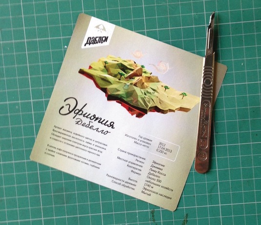
When I'd reached a point where I felt I was finally getting there, I consulted my colleagues about the design. We went on to strip out any items that drew attention away from the main image. Max and I discussed every step of the branding. It was a rare feeling of collaboration, in that there wasn't any one dominant opinion.
Stickers and posters
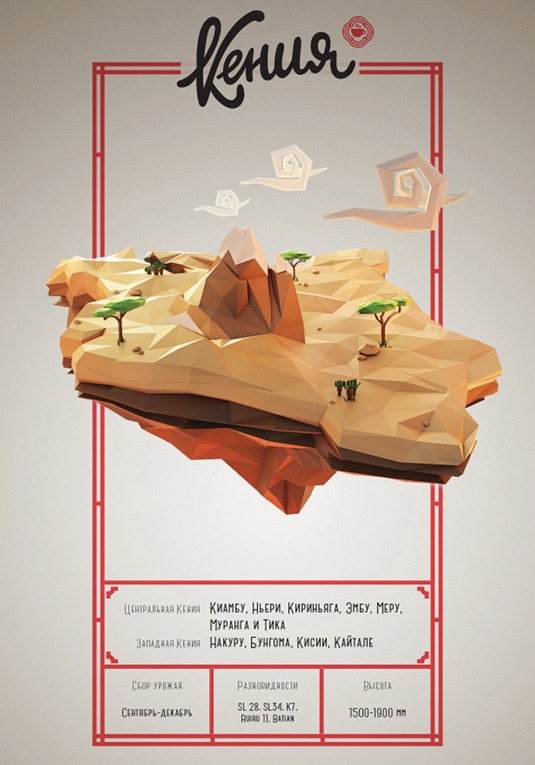
At last, the final stickers and posters were then complete. They precisely matched how I had imagined them when doing the original illustrations. They go together well with the lettering and the various small, sketched animals that I added here and there. We have some similar stuff in mind for Double B in the future.
Words: Illarion Gordon
Illarion Gordon is a designer, typographer, calligraphy artist and illustrator located in Moscow. His career spans some 15 years, during which he has designed illustrations, lettering and print work for clients in Russia and around the world.
This article originally appeared in Computer Arts issue 221.
Liked this? Read these!
- Create a perfect mood board with these pro tips
- The ultimate guide to logo design
- Illustrator tutorials: amazing ideas to try today!

The Creative Bloq team is made up of a group of art and design enthusiasts, and has changed and evolved since Creative Bloq began back in 2012. The current website team consists of eight full-time members of staff: Editor Georgia Coggan, Deputy Editor Rosie Hilder, Ecommerce Editor Beren Neale, Senior News Editor Daniel Piper, Editor, Digital Art and 3D Ian Dean, Tech Reviews Editor Erlingur Einarsson, Ecommerce Writer Beth Nicholls and Staff Writer Natalie Fear, as well as a roster of freelancers from around the world. The ImagineFX magazine team also pitch in, ensuring that content from leading digital art publication ImagineFX is represented on Creative Bloq.
