Inspired branding for new fashion label
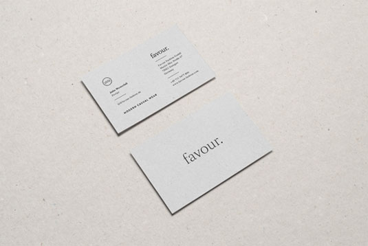
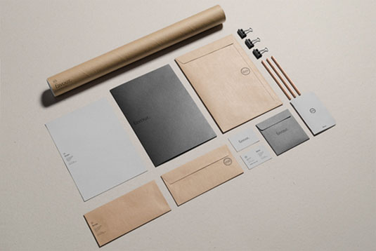
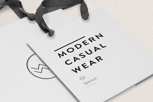
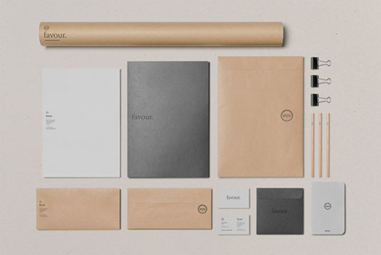
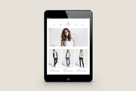
This bare-boned branding using minimal colour and typography to showcase their range.
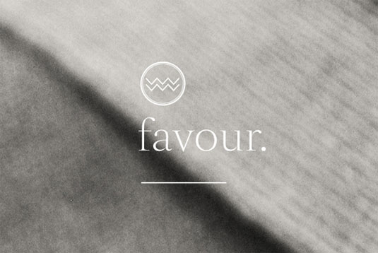
Launching an entirely new label is a daunting task. From the logo design to the typography to the colour scheme, getting everything right is hugely important.
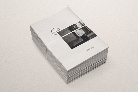
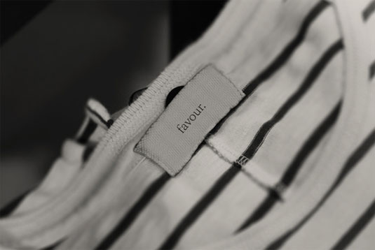
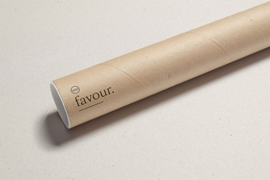
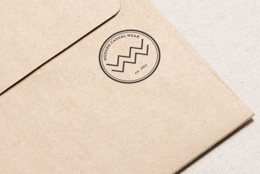
This branding for new fashion label Favour strips everything back to basics. Using a minimal colour scheme and simple typography, they let the logo design speak for itself.
Designed by German based studio Woodlake Design, Favour is a modern casual wear brand aimed at women in their thirties. Another great example of the 'less is more' principle being applied intelligently and effectively.

See more inspiring branding over on Woodlake Design.
Like this? Read these!
- Free tattoo fonts for designers
- Create a perfect mood board with these pro tips
- The ultimate guide to logo design
What do you make of this branding? Let us know in the comments box below!

Thank you for reading 5 articles this month* Join now for unlimited access
Enjoy your first month for just £1 / $1 / €1
*Read 5 free articles per month without a subscription

Join now for unlimited access
Try first month for just £1 / $1 / €1
Daily design news, reviews, how-tos and more, as picked by the editors.

The Creative Bloq team is made up of a group of art and design enthusiasts, and has changed and evolved since Creative Bloq began back in 2012. The current website team consists of eight full-time members of staff: Editor Georgia Coggan, Deputy Editor Rosie Hilder, Ecommerce Editor Beren Neale, Senior News Editor Daniel Piper, Editor, Digital Art and 3D Ian Dean, Tech Reviews Editor Erlingur Einarsson, Ecommerce Writer Beth Nicholls and Staff Writer Natalie Fear, as well as a roster of freelancers from around the world. The ImagineFX magazine team also pitch in, ensuring that content from leading digital art publication ImagineFX is represented on Creative Bloq.
