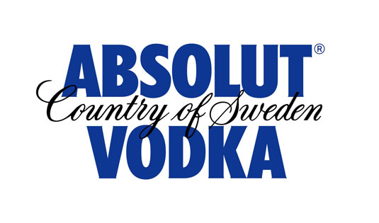
There's something missing from Absolut Vodka's new logo design
Absolut Vodka have decided to drop a few things for their new logo design. Do you like their new look?
Sign up to Creative Bloq's daily newsletter, which brings you the latest news and inspiration from the worlds of art, design and technology.
You are now subscribed
Your newsletter sign-up was successful
Want to add more newsletters?

Some of the best logos ever created in the world are also some of the most minimal. Ridding themselves of any frills or fuss, the designs remain instantly recognisable. Absolute Vodka have decided to go down the same route by redesigning their logo for a more minimal look.
Featuring a new typeface, the logo now simply reads 'Absolut' followed by a full stop. Leaving the 'Country of Sweden' and 'Vodka' aspects behind, this logo will now be the company's master identity. global director of Design Strategy at Absolut, Anna Kamjou, said: "The brand has become so iconic that we no longer needed the full three-line logo to convey ourselves.

"By removing 'Country of Sweden', and 'Vodka', we’re putting the focus on the most important part of the brand - Absolut. The word itself not only means the perfect, the complete, and the ultimate, but it also means the open-ended, infinite and indefinite."
Article continues below[via The Spirits Business]
Liked this? Read these!
- Free tattoo fonts for designers
- Create a perfect mood board with these pro tips
- The ultimate guide to logo design
What do you think of Absolut Vodka's new look? Let us know in the comments box below!
Sign up to Creative Bloq's daily newsletter, which brings you the latest news and inspiration from the worlds of art, design and technology.

The Creative Bloq team is made up of a group of art and design enthusiasts, and has changed and evolved since Creative Bloq began back in 2012. The current website team consists of eight full-time members of staff: Editor Georgia Coggan, Deputy Editor Rosie Hilder, Ecommerce Editor Beren Neale, Senior News Editor Daniel Piper, Editor, Digital Art and 3D Ian Dean, Tech Reviews Editor Erlingur Einarsson, Ecommerce Writer Beth Nicholls and Staff Writer Natalie Fear, as well as a roster of freelancers from around the world. The ImagineFX magazine team also pitch in, ensuring that content from leading digital art publication ImagineFX is represented on Creative Bloq.
