Micro trends: Typographic influences
FranklinTill reveals the seven key styles that are inspiring typographers, and how they’re being used in exciting new ways
Sign up to Creative Bloq's daily newsletter, which brings you the latest news and inspiration from the worlds of art, design and technology.
You are now subscribed
Your newsletter sign-up was successful
Want to add more newsletters?
We’re not interested in trends for their own sake. For many designers, the very word ‘trend’ is something of a taboo, conjuring up images of blind imitation of whatever’s hot at any given time, rather than encouraging genuine innovation and independent creative thought.
Rest assured, you won’t find any of that here. Rather than looking at seasonal, fleeting trends, FranklinTill focuses on longer-lasting movements that have genuine impact on creative professionals.
“Here, we aim to provide a visual essay of the emerging aesthetic directions within typography,” explains FranklinTill’s co-founder Caroline Till. The agency is continually scouring magazines, blogs, websites and exhibitions to stay abreast of new developments and stylist movements. “We also contact designers and agencies direct, to seek out work that feels not necessarily new, but ‘fresh’ and relevant,” she goes on.
“We believe that trend forecasting is essentially mapping correlations and patterns. This is our starting point – to observe and analyse correlation, and then start to question why a particular pattern is emerging. As usual, our main aim throughout these pages is to celebrate the key designers and studios that are responsible for driving these nascent typographic movements.”
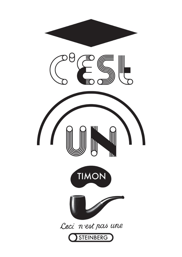
1: Modular kits
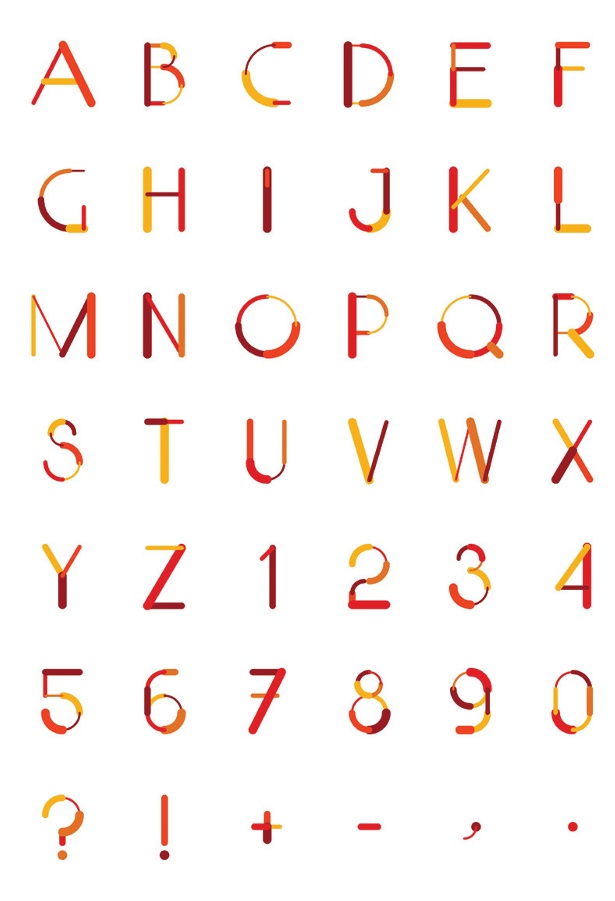
Designers are creating unique systems to allow users to design their own typefaces. Known as modular construction kits, these must be self-assembled, giving users the ability to test and play with typefaces. They come in hybrid forms and create fonts through combining different elements.
Article continues below 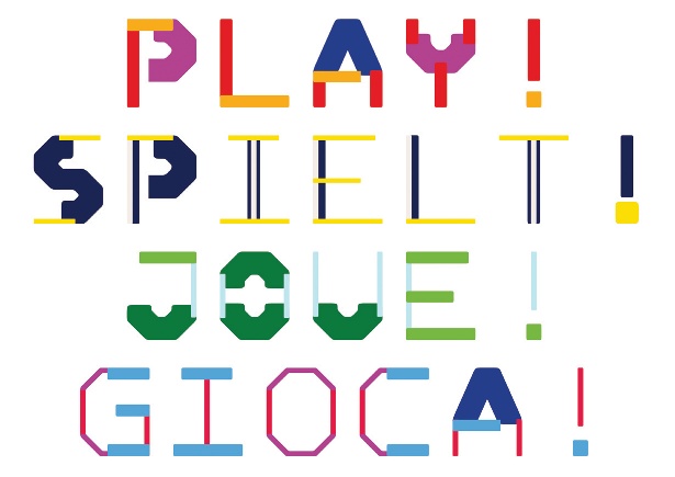
A great example is the Modono project by Christine Gertsch, a modular construction kit that offers many possibilities for graphic designers. It is a monospaced family consisting of four weights, separated into four fragments each (horizontal, vertical, diagonal and corners). All of them are based on the same skeleton, and can therefore be recombined and coloured at will.
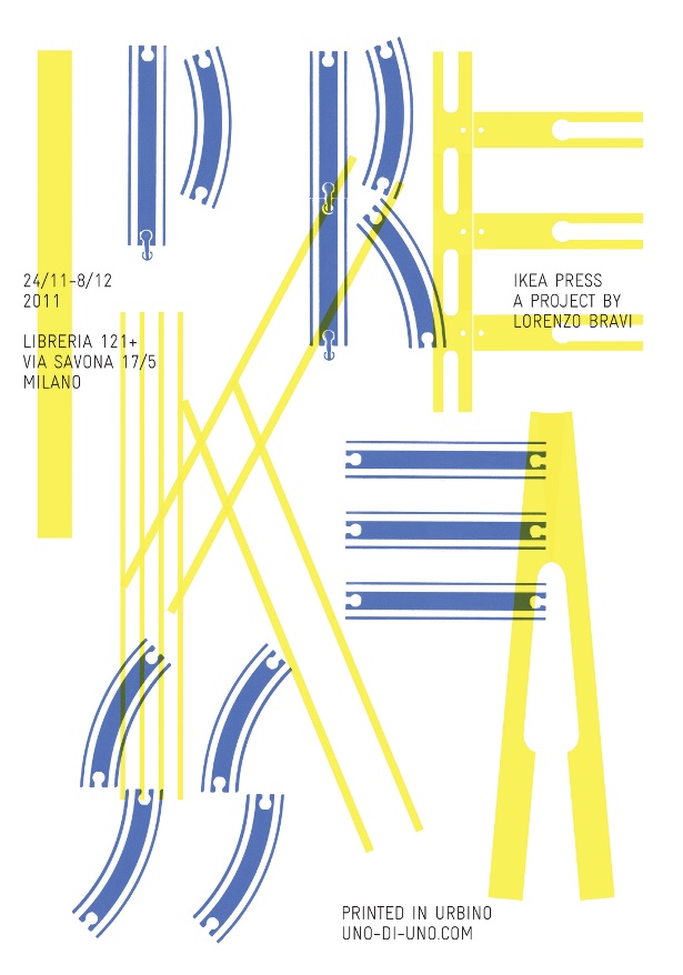
Lorenzo Bravi’s 1/1 alphabet is a collection of letterpress printing experiments. Different parts of IKEA products are used as printing dies in place of the traditional wooden printing letters – so a stool or a door can be used to impress their outline, and toy railtracks become typographic compositions. They are then re-assembled back into their original objects, which gives them back their functionality, but also leaves them with a sign of the printing process so they become unique industrial products in their own right.
Sign up to Creative Bloq's daily newsletter, which brings you the latest news and inspiration from the worlds of art, design and technology.

The Creative Bloq team is made up of a group of art and design enthusiasts, and has changed and evolved since Creative Bloq began back in 2012. The current website team consists of eight full-time members of staff: Editor Georgia Coggan, Deputy Editor Rosie Hilder, Ecommerce Editor Beren Neale, Senior News Editor Daniel Piper, Editor, Digital Art and 3D Ian Dean, Tech Reviews Editor Erlingur Einarsson, Ecommerce Writer Beth Nicholls and Staff Writer Natalie Fear, as well as a roster of freelancers from around the world. The ImagineFX magazine team also pitch in, ensuring that content from leading digital art publication ImagineFX is represented on Creative Bloq.
