Micro trends: Typographic influences
FranklinTill reveals the seven key styles that are inspiring typographers, and how they’re being used in exciting new ways
Sign up to Creative Bloq's daily newsletter, which brings you the latest news and inspiration from the worlds of art, design and technology.
You are now subscribed
Your newsletter sign-up was successful
Want to add more newsletters?
3: Calligraphic
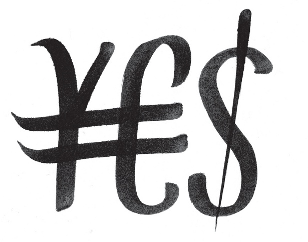
Fonts are being developed using old calligraphic techniques, imitating hand-inked lettering. Capitalising on the new trend for craftsmanship, designers are recreating the visual style of a hand-written personal letter, giving the impression of time, effort and skill, and combining historical basics with a new approach.
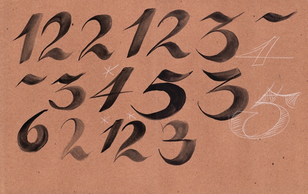
Lecturer Adam Oostenbrink uses new methods to teach his students the art of calligraphy. Through using all kinds of reference material – even YouTube videos – every lesson is a new step in discovering lettering and technique.
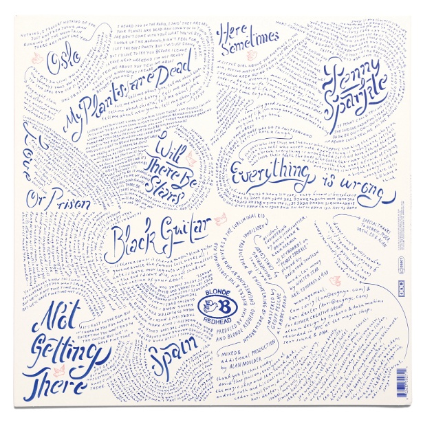
Erik Marinovich achieves fresh visual content through playing with typography. His Friends of Type website is updated daily with original typographic design and lettering. He and the blog contributors aim to log ideas, express themselves, and inspire each other and readers. A guest designer is featured in the last week of every month; someone they think will elevate their work and the site through their contribution. The site is in effect a sketchbook, an archive, and a collaborative dialogue dedicated to celebrating typography.
Jakob Runge tries to create a connection between contemporary, geometrical typography, historical blackletter and fashionable didones with his Fracmetrica typeface. His starting point was a combination of two influences: simple and stunning Tannenberg, and the didone Bodoni poster. With its high contrast in width of horizontal and vertical strokes, Fracmetrica’s letters are based on shapes that are realisable in an isometric 60° grid. Accordingly, the name refers to this concept: frac(tur)-(geo/iso-)metric-a.
Article continues below 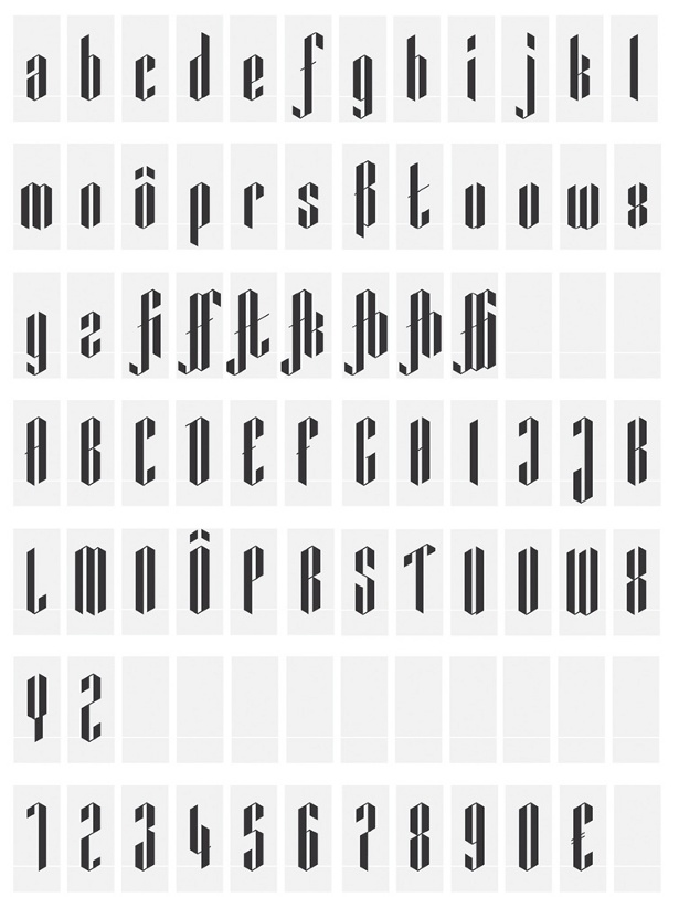
Sign up to Creative Bloq's daily newsletter, which brings you the latest news and inspiration from the worlds of art, design and technology.

The Creative Bloq team is made up of a group of art and design enthusiasts, and has changed and evolved since Creative Bloq began back in 2012. The current website team consists of eight full-time members of staff: Editor Georgia Coggan, Deputy Editor Rosie Hilder, Ecommerce Editor Beren Neale, Senior News Editor Daniel Piper, Editor, Digital Art and 3D Ian Dean, Tech Reviews Editor Erlingur Einarsson, Ecommerce Writer Beth Nicholls and Staff Writer Natalie Fear, as well as a roster of freelancers from around the world. The ImagineFX magazine team also pitch in, ensuring that content from leading digital art publication ImagineFX is represented on Creative Bloq.
