Micro trends: Typographic influences
FranklinTill reveals the seven key styles that are inspiring typographers, and how they’re being used in exciting new ways
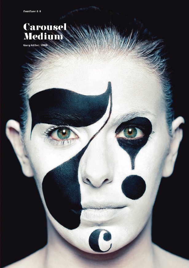
7: Didone revival
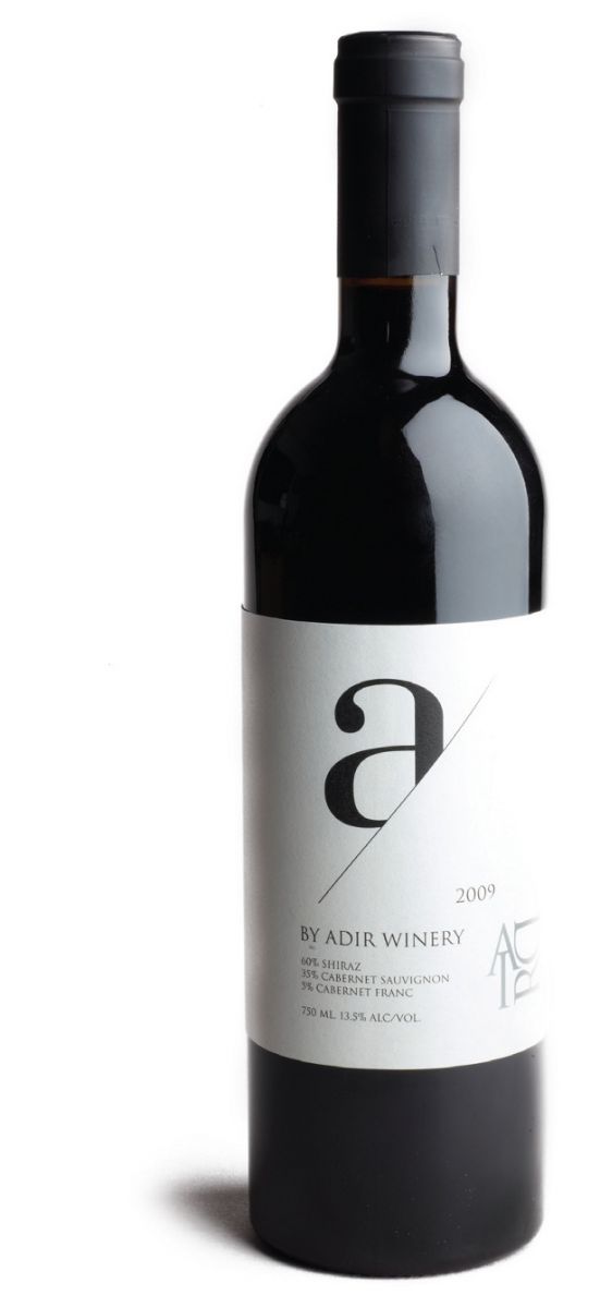
The classic Didot type is having a renaissance. Modern designers are creating a contemporary equivalent, maintaining its elegance and femininity and referencing its classic French style and typographic heritage.
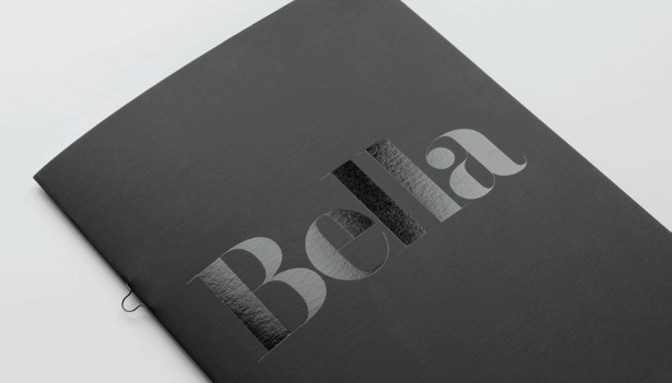
Rick Banks’ Bella typeface interprets the classic Didot style, based on letterforms by Herb Lubalin, John Pistilli and Jan Tschichold. Featuring extremely thin hairlines, Bella is best suited for use at large display sizes. “I’ve always loved the ridiculous thin hairlines that featured a lot in New York in the 60s and 70s,” explains Banks of his inspiration. “Herb Lubalin and Louis Dorfsman were masters at hand-drawing thin hairlines. There aren’t that many digital fonts that deal with these extreme hairlines, possibly due to the complexity of creating them in FontLab.”
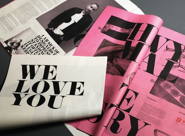
DesignUnit’s branding for Kilsgaard Eyewear is based on simplicity, and includes a branded newspaper featuring elegant Didot typefaces. This illustrates the label’s commitment to stylised, feminine design. Similarly, design duo Marc and Anna developed a newspaper called Tent Directory featuring the font F37 Bella – chosen because it was playful, yet still provided a strong sense of identity. They used a serif headline font, which had a heavier downstroke without being overwhelming.
Article continues below 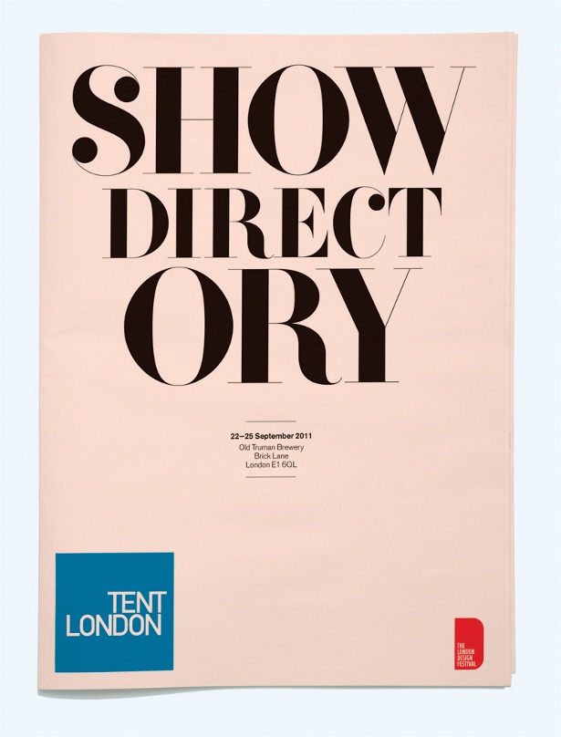
Sign up to Creative Bloq's daily newsletter, which brings you the latest news and inspiration from the worlds of art, design and technology.

The Creative Bloq team is made up of a group of art and design enthusiasts, and has changed and evolved since Creative Bloq began back in 2012. The current website team consists of eight full-time members of staff: Editor Georgia Coggan, Deputy Editor Rosie Hilder, Ecommerce Editor Beren Neale, Senior News Editor Daniel Piper, Editor, Digital Art and 3D Ian Dean, Tech Reviews Editor Erlingur Einarsson, Ecommerce Writer Beth Nicholls and Staff Writer Natalie Fear, as well as a roster of freelancers from around the world. The ImagineFX magazine team also pitch in, ensuring that content from leading digital art publication ImagineFX is represented on Creative Bloq.
