Secrets of The Independent's bold new redesign
With a new font set, prominent white space and a vertical front page masthead, The Independent's redesign is a dramatic update. We take a look behind the scenes.
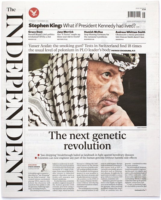
The Independent has unveiled a radical redesign, completed by the British paper's in-house team and Matt Willey - notably celebrated for his work on magazines including Port and Elephant, as well as the recently redesigned RIBA Journal.
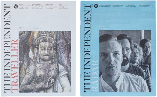
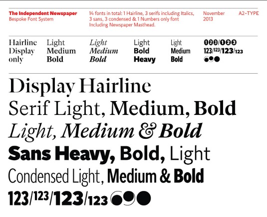
The revamp includes a clean, bespoke font set by A2/SW/HK's Henrik Kubel, fewer variances in story length, prominent white space and an innovative, vertically run masthead on the front page. It's a bold new direction, in places more akin to a monthly literary magazine than national newspaper, but does it deliver newsstand cut-through - and will it be enough to reverse dramatically falling sales?
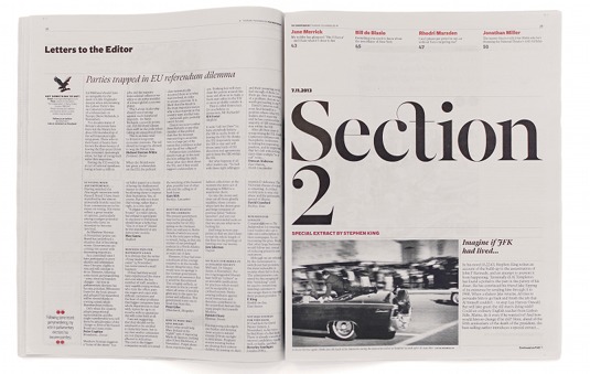
The paper's new design, its third since 2010, took three months - and Willey worked closely with head of creative Dan Barber and Stephen Petch, art director of the Sunday New Review. According to editor Amol Rajan, the aim was to recreate the 'classic with a twist' design of its 1986 launch, and radiate "the feeling of a broadsheet in compact form."
Article continues belowStarting from the type and designing upwards, the paper has been entirely restructured and simplified throughout. Willey commissioned Kubel to produce a bespoke new font family comprising Indy Sans, Indy Serif, Indy Condensed and Indy Hairline sets, each carrying light, medium and bold weights. Kubel hadn't worked on a newspaper project before, and could bring a more hardworking approach to a font family intended to work across multiple mediums in varying point sizes, from web listings to front-page headlines.
While The Independent retains its compact format, a fresh editorial strategy informed the redesign. Willey says that stories are now mainly short news-in-briefs or longer features, with less mid-length content. This enabled the team to contrast the story lengths, creating more clean space on each page.
Nowhere is this more prominent than on the front page, where the new masthead placement is intended to allow the lead image and headline room for impact. However, the new layout presents a common editorial design challenge: by positioning the picture story directly above the lead story, there is a danger the two could be perceived as connected, placing increased pressure on the main headline to create the necessary visual hierarchy.
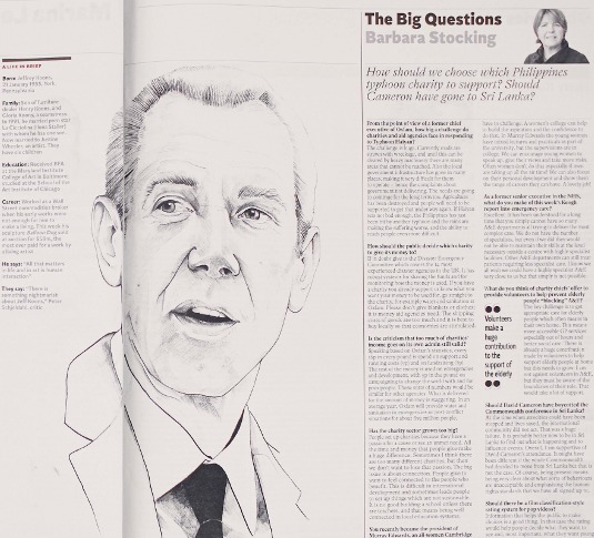
Overall, though, the new design is a confident move that, while adding to the 'magazine' feel, provides the sophistication demanded by the brief. Crucially, it succeeds in setting The Independent apart from its competitors on the busy UK newsstand.
Sign up to Creative Bloq's daily newsletter, which brings you the latest news and inspiration from the worlds of art, design and technology.
The new design is also practical; intended to make the production process as smooth as possible for sub-editing teams on tight deadlines. Captions have more flexible word counts, for example, making page fitt ing easier. As Willey points out, the brief was for bold sophistication, but the challenge of creating a sustainable product was core to his interpretation.
"It felt important to do something confident, clean, and sophisticated," he explains. "But it also had to be something that could be built better, more easily put together and with more understanding - something that could be sustained."
This article originally appeared in Computer Arts issue 222.
Liked this? Read these!
- Create a perfect mood board with these pro tips
- The ultimate guide to logo design
- Download the best free fonts

The Creative Bloq team is made up of a group of art and design enthusiasts, and has changed and evolved since Creative Bloq began back in 2012. The current website team consists of eight full-time members of staff: Editor Georgia Coggan, Deputy Editor Rosie Hilder, Ecommerce Editor Beren Neale, Senior News Editor Daniel Piper, Editor, Digital Art and 3D Ian Dean, Tech Reviews Editor Erlingur Einarsson, Ecommerce Writer Beth Nicholls and Staff Writer Natalie Fear, as well as a roster of freelancers from around the world. The ImagineFX magazine team also pitch in, ensuring that content from leading digital art publication ImagineFX is represented on Creative Bloq.
