Pro tips to help you find your inner artist
Donato Giancola reveals the secrets of his painting process and offers advice on getting creatively inspired and keeping your passion flowing.
07. Initial layers
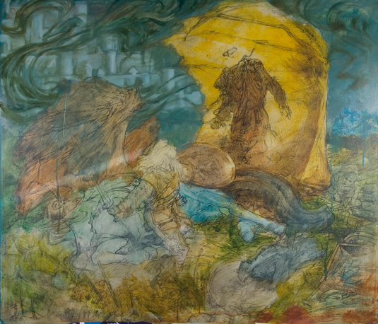
With the transfer of the drawing completed, the messy work can begin – and I mean messy. The cartoon drawing, typically fixed beneath a layer of clear acrylic gesso or matte medium, holds key landmarks to the work allowing for a liberal play of colour and texture.
I'm conservative in my approach, but the need to carefully follow a contour is out the window as I slosh around the paint and feel what my image needs for a colour direction.
08. Meditation
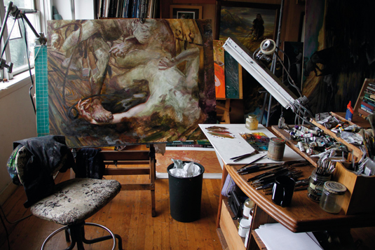
Time slows down now as I break out the minimalist music of Steve Reich or Philip Glass to set my mind to intimate, repetitive tasking. Filling in links on a suit of chain mail or similar is about careful observation and patience.
Take Yoda's advice here and concentrate on where you are now, what you are doing. Forget about emails and suchlike. Focus on what the art needs from you and give it back.
09. Second passes

I find that practice tends to lead to perfection, so here I plan to rework any critical area if it falls short on the first pass. Let each part breathe for a while as you move onto other areas of the work.
After the entire image receives its first layers, you can better assess the balances needed to harmonise the painting and come back in for a second, third and even a fourth reworking. I usually plan on making at least three passes on a main figure's body and face, that’s even after I attempt to make it perfect the first time.
10. Exaggerated colour
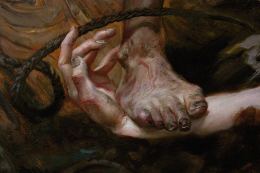
Enter the mind of an impressionist such as NC Wyeth and try to visualise colours in the shadows. I've learned from impressionists and realists, such as Peter Paul Rubens, when it comes to exaggerating colour in the cracks of objects, folds of skin and cast shadows.
Sign up to Creative Bloq's daily newsletter, which brings you the latest news and inspiration from the worlds of art, design and technology.
The use of colour in these areas helps me describe a shadow by replacing a dark shadow with a complementary contrasting colour higher in value. It's hard to describe, but easier to understand visually!
11. Glazing
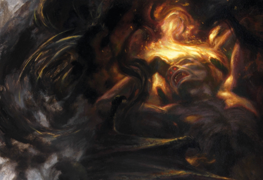
Glazing has traditionally been used to describe the process in which a small amount of pigment is suspended in a larger amount of medium, creating the visual effect of tinting an image without completely obscuring the lower surface. Paints are composed of varying pigments, and can range wildly as their application as a glaze. Digital technology allows nearly all brushes and colours to be easily manipulated as glazes and endlessly modified until flattened.
Oh, how I envy the digital artist for this! I use glazes during the entire painting process, providing saturation increases, opaque fogging effects and darkening tints to unify objects and shadows. Glazes are an exciting way to get messy again without sacrificing your image's structural integrity.
12. I see dead people…
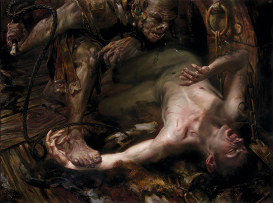
As a commercial artist, it's easy to get caught up in the swirl of your client’s needs – following the art order to the letter and implementing change suggestions from marketing directors – and in doing so losing your artistic voice. My professional career has been strengthened by solving client's problems while at the same time injecting more of my own voice into the art.
My first images for Magic: The Gathering incorporated hands that I love to paint, and now I illuminate anticlimactic moments portraying protagonists as vulnerable and non-heroic.
These may not be the perfect solution for my commercial clients, but for better or for worse my work has become recognisable for these traits. I feel an intense need to push in this direction – clouding my vision with dead or near-dead figures as elements of composition as if they were normal.
Pro Secret: Hard-earned cash
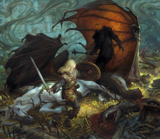
Be willing to spend money to place your best work forward – be that through framing, a quality portfolio or a special leave-behind booklet. If you're deciding between the £15 plastic portfolio or the £75 leather bound one, spend the extra money.
It will make your images look more professional, and make you want to fill it with quality art. When you're willing to spend money on your own work, others are more likely to do so with commissions or purchases.
Words: Donato Giancola
Much of Donato's art has deep historical roots linking the past to the contemporary. Through his teaching, exhibitions, live demonstrations and educational films the artist aims to reflect the role that science fiction and fantasy plays in modern culture. This article originally appeared in ImagineFX magazine issue 91.
Like this? Try these...
- How to break into book illustration
- Top tips on making it as an illustrator
- Free Photoshop actions to create stunning effects

The Creative Bloq team is made up of a group of art and design enthusiasts, and has changed and evolved since Creative Bloq began back in 2012. The current website team consists of eight full-time members of staff: Editor Georgia Coggan, Deputy Editor Rosie Hilder, Ecommerce Editor Beren Neale, Senior News Editor Daniel Piper, Editor, Digital Art and 3D Ian Dean, Tech Reviews Editor Erlingur Einarsson, Ecommerce Writer Beth Nicholls and Staff Writer Natalie Fear, as well as a roster of freelancers from around the world. The ImagineFX magazine team also pitch in, ensuring that content from leading digital art publication ImagineFX is represented on Creative Bloq.
