Behind the scenes of Google's new type system
Monotype’s epic digital typeface Noto for Google spans 100 writing systems and 800 languages.

Sign up to Creative Bloq's daily newsletter, which brings you the latest news and inspiration from the worlds of art, design and technology.
You are now subscribed
Your newsletter sign-up was successful
Want to add more newsletters?
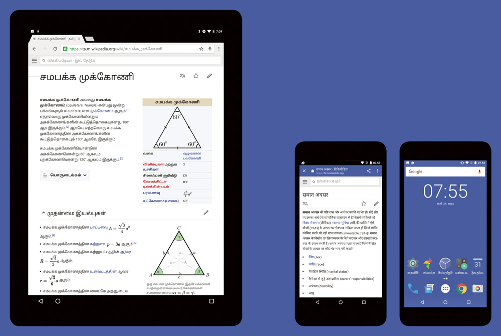
When Android first launched as a mobile platform, I designed its typefaces Droid Sans and Droid Serif. These web fonts were extended to include quite a few languages, and I created several scripts in the same style. After the launch, there was a strong desire at Google to go for global coverage, so that there would no longer be any ‘tofu’ characters, the blank boxes people get if they try to search in a language that isn’t supported by their operating system.
At first the brief for Google Noto was to create one typeface, with one character for every unicode point. But we soon realised we also needed a bold to show emphasis in text copy or on buttons on the UI , and an italic too. Later, we also added a serif, because Google wanted to be able to set formal documents in a serif typeface. Many writing systems don’t have the notion of serifs – instead they have height and low contrast – so that was an interesting process.
The team and I were already familiar with many writing systems, but Kamal Mansour in our California office reached out to his network of linguists across the world, who had very specific, and rare, script knowledge. Some languages didn’t even exist in written form, such as Fulani, a language from western and central Africa for which the Adlam writing system has been invented. So we sought out people creating writing systems for spoken languages: something we’d never even thought about at the beginning of the project.

Language lesson
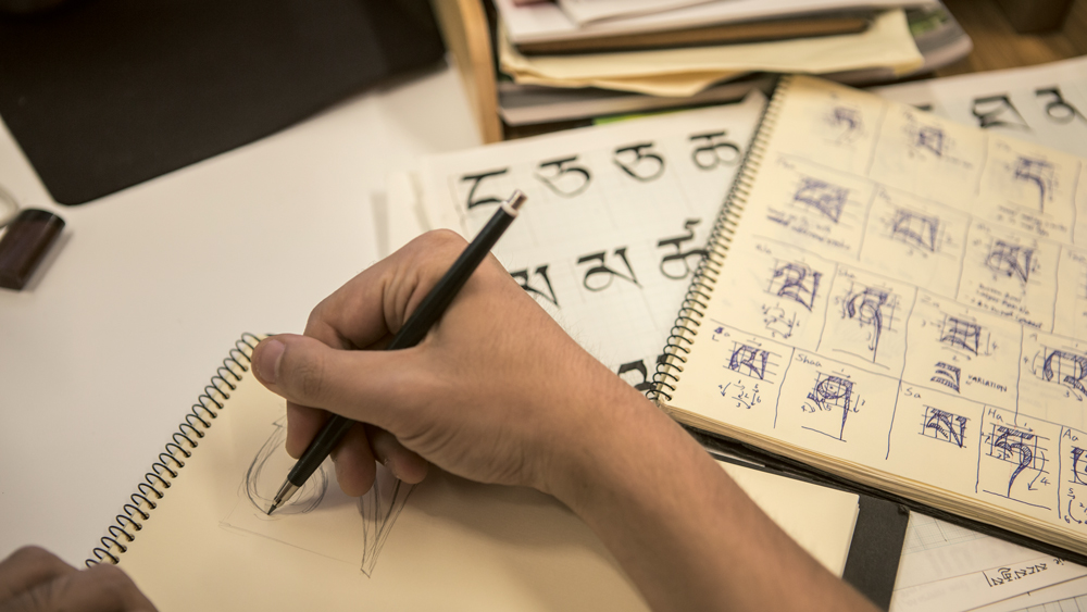
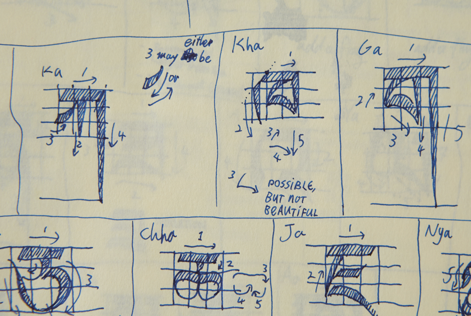
If there was a designer who was interested in tackling a specific language or writing system, they’d take on that one. The approaches were different depending on the language. For example, Toshi Omagari really zoomed in on Tibetan, immersing himself in the script with the help of Tibetan monks and Buddhist scholar Shojiro Nomura, and made the language’s first digital typeface. Tibetan is heavily influenced by the writing process, so he really had to start from the ground up. On the other hand, for the more familiar writing systems, many of us worked on multiple scripts. For example, I did the Greek and Cyrillic, and worked a little on Arabic and Thai with a team of five designers.
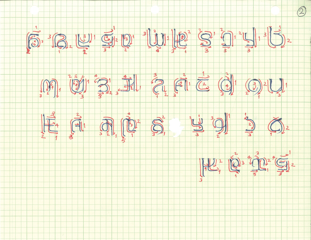
Article continues belowEvery designer works differently – many will work straight on screen. But my belief is that the end result reflects the tools that were used to create it. I don’t like typefaces that look too mechanical in their form, like they were copyand- pasted using perfect squares and circles and then rotated on a computer screen. I draw the key shapes as much as possible; then from there I can work on screen and be more expeditious. I think this approach lends itself to a project like this, because many of the scripts only have a handwritten history.

In Latin we often use the H,O,V and n,o,v as starting points because they give you the diagonal and the round shape; they’re the reference characters. We used Latin to establish the proportions and colour for the rest of the typeface, so we did those characters first. We wanted Noto to be comfortable to read, to be a bit casual, and to have the same weight, colour and legibility regardless of the language. If you sub a paragraph of Latin and then of Bengali, you want them to have the same greyness or blackness on a page.
We really emphasised openness of forms – a characteristic that was pivotal in making every script feel like it belonged to the same family. The stroke endings of lower-case ‘e’ or the top stroke of lower-case ‘a’, for example, are repeated throughout Noto, so if there’s something similar in Bengali then it would use the same terminal shapes.
There was a lot of collaboration with Google in order to make sure we were providing high-quality and culturally sensitive designs. They initiated their own internal review, asking employees and friends to offer their opinions on the work. There are some really bright people at Google who are very passionate about languages, so they helped cross-check what we were doing. In some cases, there was enough done digitally that an outside reviewer could just work on the data directly, rather than drawing something up from scratch.
Sign up to Creative Bloq's daily newsletter, which brings you the latest news and inspiration from the worlds of art, design and technology.
Into the wild

A lot of people describe releasing a typeface as ‘abandoning’ it. There’s a compulsiveness that type designers have when refining details, but eventually you just have to let it go. It became even more apparent with this project because if we held on to things too long it would just not get completed. We had to stick to the schedules.
I don’t dabble in the comments sections too much, but we’ve had a lot of positive feedback throughout the design process, even before the announcement. For example, the Cherokee Nation wrote a very touching note. It was great to know that we had satisfied their expectations and represented the culture with a typeface they liked. It’s satisfying to know you’ve done justice to a culture that’s struggling to hold on to their writing system so they can teach future generations.
This article was originally published in Computer Arts magazine issue 261; buy it here.
Related articles:
