Playful branding for The National Trust
Click Design's campaign for the British charity is designed to entice visitors to explore, enjoy, savour and touch.
Sign up to Creative Bloq's daily newsletter, which brings you the latest news and inspiration from the worlds of art, design and technology.
You are now subscribed
Your newsletter sign-up was successful
Want to add more newsletters?
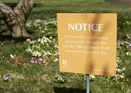
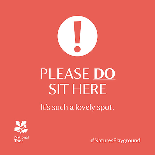
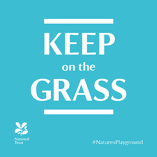
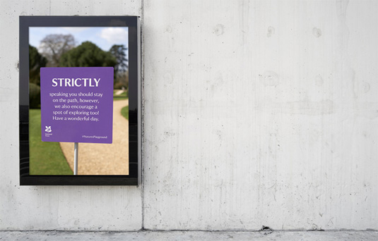
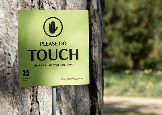
Top brands often have to come up with a unique and inventive way of enticing customers. This campaign for The National Trust - a British charity that protects historic houses and gardens and opens them to the public - puts a playful twist on the kind of park signage that is often unfriendly, officious and borderline aggressive.
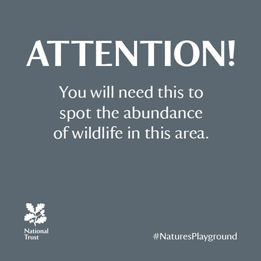
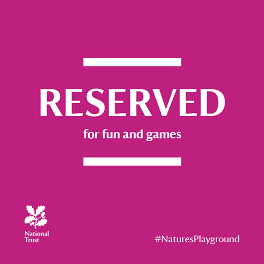
Developed by agency Click Design, a series of nine signs were created which, at first glance, look like warnings or instructions not to do something - but actually they encourage the opposite. The inclusion of a hashtag (#NaturesPlayground), encourages visitors to share their experiences and post pictures of their visit on social media.
We love this playful take on an often all-too-serious approach to instructional signage. The simple colour scheme and typography design is a perfect approach to a clean, consise and effective brand.
Article continues below 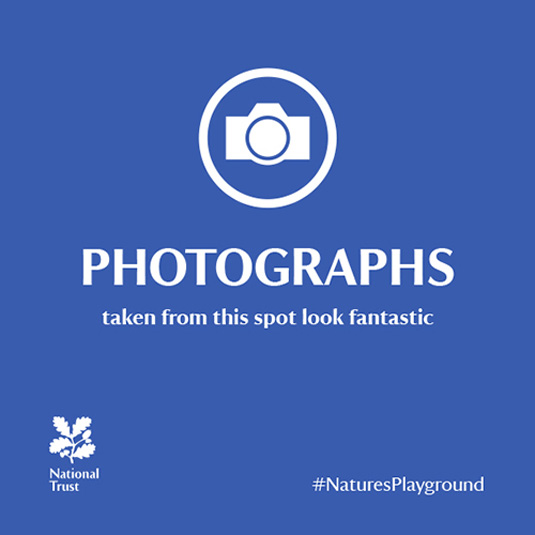
For more information, head to The Click Design.
Like this? Read these!
- Brilliant Wordpress tutorial selection
- Free tattoo fonts for designers
- Free Photoshop actions to create stunning effects
What do you make of 'Nature's Playground'? Let us know in the comments box below!
Sign up to Creative Bloq's daily newsletter, which brings you the latest news and inspiration from the worlds of art, design and technology.

The Creative Bloq team is made up of a group of art and design enthusiasts, and has changed and evolved since Creative Bloq began back in 2012. The current website team consists of eight full-time members of staff: Editor Georgia Coggan, Deputy Editor Rosie Hilder, Ecommerce Editor Beren Neale, Senior News Editor Daniel Piper, Editor, Digital Art and 3D Ian Dean, Tech Reviews Editor Erlingur Einarsson, Ecommerce Writer Beth Nicholls and Staff Writer Natalie Fear, as well as a roster of freelancers from around the world. The ImagineFX magazine team also pitch in, ensuring that content from leading digital art publication ImagineFX is represented on Creative Bloq.
