Create a busy city scene in Illustrator
Discover how to bring some dynamics and atmosphere to a graphic city scene with this step-by-step guide.

Sign up to Creative Bloq's daily newsletter, which brings you the latest news and inspiration from the worlds of art, design and technology.
You are now subscribed
Your newsletter sign-up was successful
Want to add more newsletters?
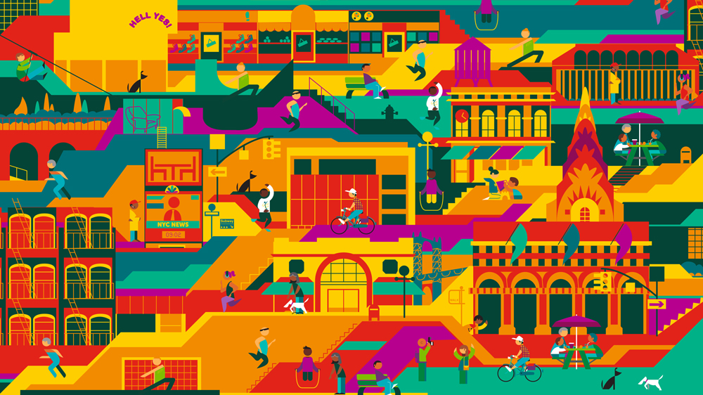
The best city is a busy city, but that busy atmosphere isn’t an easy thing to capture successfully. However with some simple how to draw tips you can bring your city scenes to life, fill the architecture with detail... and you won't have to spend weeks on it.
In this tutorial we’ll be looking at putting together a bustling street scene in Illustrator – part of Adobe's Creative Cloud. We'll be constructing architecture, adding figures, placing street furniture and signage and experimenting with my favourite thing: colour.
Step 01.

How you begin your artwork is up to you. You might choose to start from a pencil sketch, draw straight into a tablet or go straight into Illustrator and build it in vectors from scratch. I started with a pencil sketch and traced the linework using the Pen and Shapes tool in AI.
Article continues belowStep 02.

If you’re not not keen on drawing – or you're looking for a quick shortcut – then go ahead and trace a photo. Use the Shape tools to build it up from back to front, so the layers in AI are in the right order. So firstly the basic wall (the furthest object away), then details on the wall, and so on, working your way forward to window frames and doors.
Step 03.

City scenes can have thousands of windows. Don’t vector them one by one, just illustrate one at first in linework, then add colours. Group all the elements together by selecting each part and clicking cmd+G. I work really efficiently by copying and pasting that one window.
Select the window group, hold shift+alt and move it in the direction you need using the arrow keys. Then release the alt key and keep clicking shift+arrow key until the next window is in place. Repeat until you form a row of windows, then group all those windows together and create a new row below. Keep copying until you've filled your building with identical windows.
Step 04.

While creating buildings, always consider how your city composition will come together. In a real city, the landmarks or eye-catching buildings are rarely next to each other. Create spaces around these key buildings, and fill these gaps with smaller buildings, generic houses or shops.
Sign up to Creative Bloq's daily newsletter, which brings you the latest news and inspiration from the worlds of art, design and technology.
I start building my city from the top of the artboard and work down, so the layers are building up from the bottom (or furthest away if you’re using perspective) to the top layer (the foreground).
Step 05.

Unless you’re creating a ‘rooftops’ scene, ensure you create some ground space throughout, places to put people, cars and so on. I recommend breaking away from any realism in the composition/perspective here – I layer up the buildings with blocks of colour in front and behind to create the roads and walls. These can be as simple as you like (basic rectangles work perfectly fine), since you’ll be adding plenty of elements on top to bring the scene to life.
Step 06.

With all the buildings ‘built’, let's add some colour. First tip: don’t use realistic colours. The majority of buildings are similar greys and browns, and that doesn’t excite anybody. You can create a palette that ‘feels’ like a city without using the exact shades you'd find in real life.
So if you’re going for an edgy urban jungle, play with some rich greens, dirty greys and natural wood tones. If you’re going for a sunny contemporary city, try mixing hot pinks and oranges with deep teals and cool turquoise.
Step 07.

Your streets are looking a little empty, so it's time to bring it all to life. We need to add figures, signs, vehicles, furniture, lights, mailboxes and everything else. I create these separately from my city scene at first, drawing them all out individually then artworking them in a new Illustrator file. If you build up a good stock of assets, they can be reused for future illustrations.
Step 08.

It's important to ensure any figures are all in proportion to each other. I find it's best to start with the same size circle for every figure’s head – children and babies included. The disproportionate head-to-body ratio on children seems to looks more child-like than when the head is smaller.
Feel free to copy and paste figures and recolour a few variations of each figure. This is an efficient way to build up lots of different people for the scene.
Step 09.

Position your assets all over your city scene. Consider how these assets might be placed realistically – for example, don’t place two of the same traffic lights or signs next to each other, and repeat streetlights at equal distances (use the copy and paste technique from step 3). Street furniture is likely to be found in a picturesque spot, beside a park or landmark.
Place people in groups, pairs and individually. I often give people a story – a parent and child walking home from school, or two colleagues jogging together.
Step 10.

To finish up, throw some special location-specific details in there. If you’re illustrating an actual city, illustrate some posters, signs or flags that emphasise the location. Or if you’re illustrating a generic city, but want a particular vibe, get some slogans or advertisements that help convey your message. A city scene like this is built up of many, many details, from window frames to dog walkers, but every one of them brings something to the dynamic, busy atmosphere of your city.
Related articles:

