Create portrait art in Corel Painter
We run through a pro's portraiture process in Painter 2017, Corel's natural media art software.
Sign up to Creative Bloq's daily newsletter, which brings you the latest news and inspiration from the worlds of art, design and technology.
You are now subscribed
Your newsletter sign-up was successful
Want to add more newsletters?
09. Build up the figure
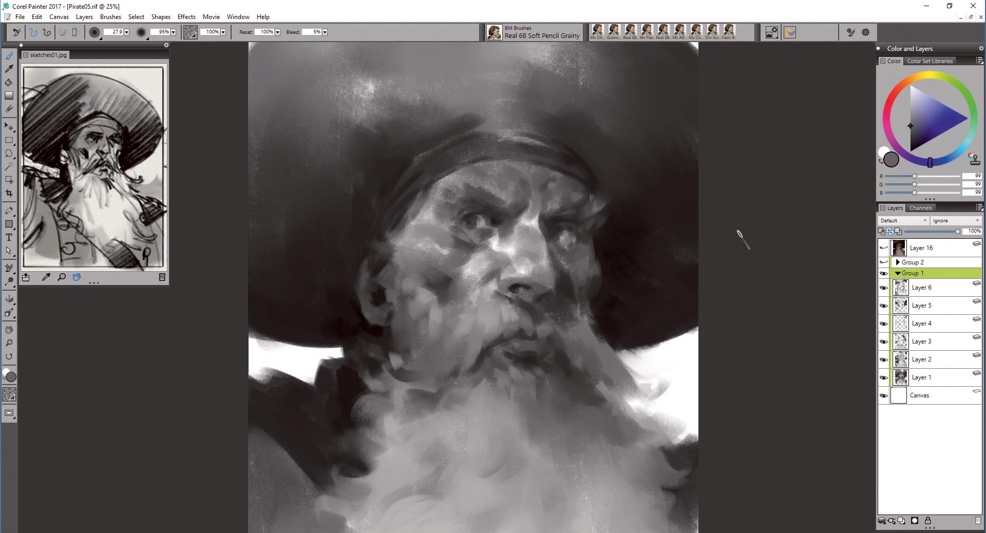
I block the basic shapes of the face and outfit with very wide strokes, adding spots here and there, and defining the pirate's facial features. I also set the mood and lighting, letting the texture and brush strokes help with those little happy accidents.
At this point I'm trying to stay in the middle of the grey spectrum; I never use 100 per cent white or black. It does look a bit flat, but this is just the first step: it's the foundation on which I'm building on. I create new layers whenever I'm happy with the result – this enables me to make changes if subsequent work doesn't quite go to plan.
10. Keep on rendering… but don't overdo it
This is still the sketching phase, so I continue working loose and experimenting. I use the Undo function a lot, looking for that perfect stroke. I add a bit more detail to parts of the portrait that are focal points – the face and beard – and leave the rest up to the imagination of the viewer (his hat and coat).
Article continues belowI always imagine a vertical line going through the focal point and place all the detailing there, while I leave the edges rough and unfinished. Remember, the painting is finished when you decide it's finished.
11. Explore digital glazing
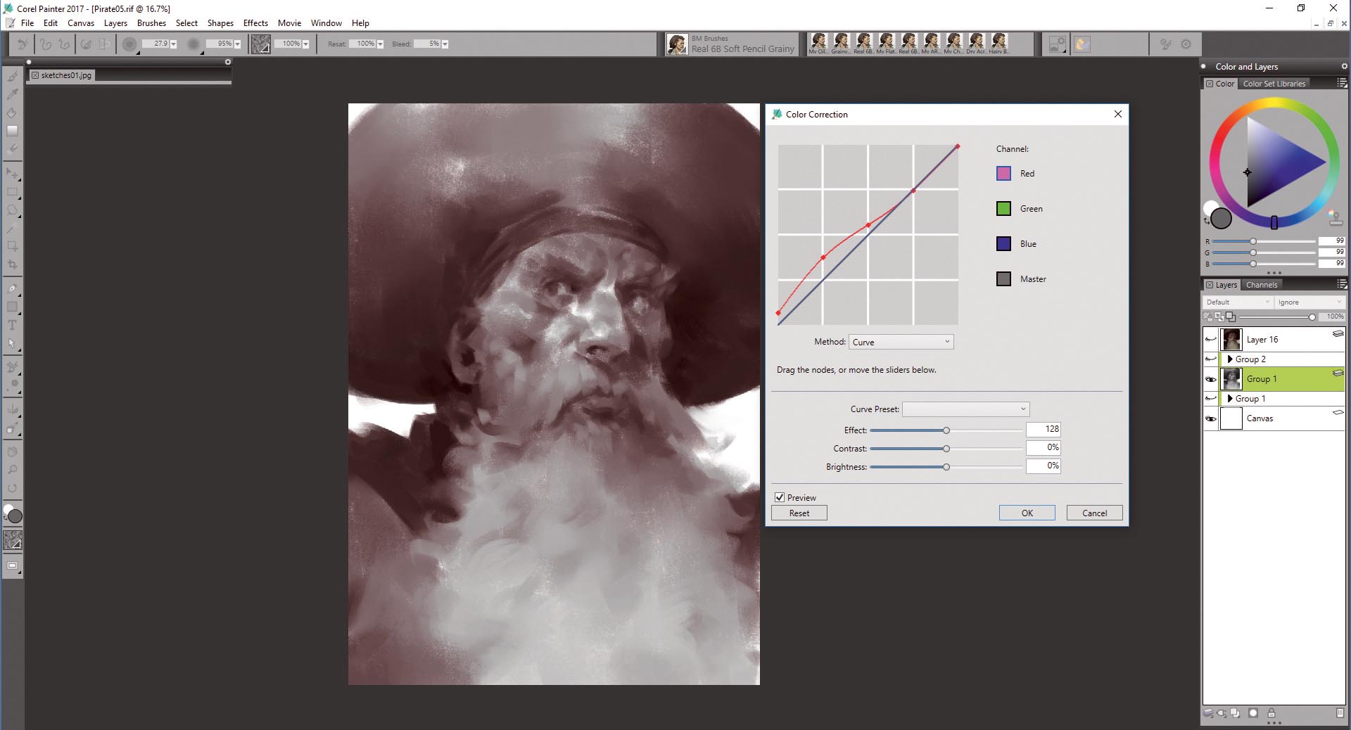
Let me explain a bit about the digital glazing technique. The whole work is done in greyscale with attention to values. Afterwards I use layers and different blending modes – Multiply, Overlay, Color, Soft Light and so on – to add colour on top. In other words, I'm colouring the image.
First, I flatten all the layers. Then, using the Correct colors tool (select 'Effects > Tonal Control > Correct colors') I choose the red channel and adjust the curve until I achieve some reddish/brown values.
12. Experiment with colours
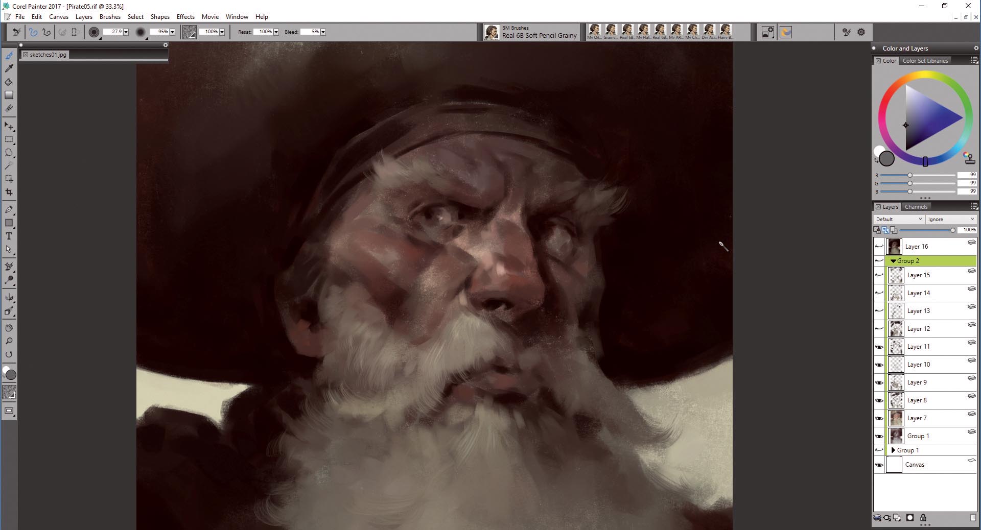
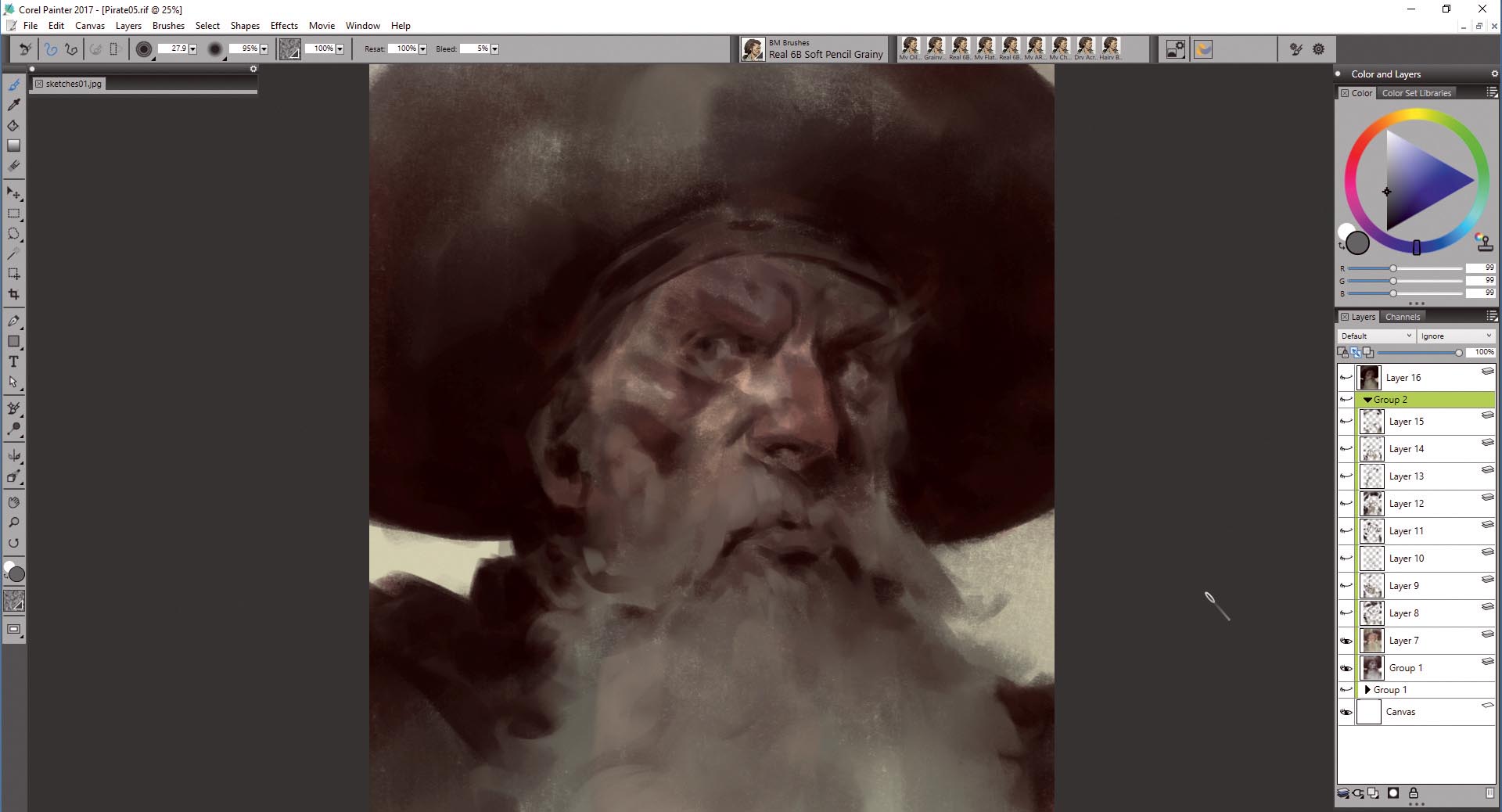
I create a Multiply layer and lay down some colours. And here's why I get rid of the greys: when starting to add colours, your pastel brush will pick up and blend some of the colours from the underpainting. And you don't want to mix grey and get muddy colours. I use a very desaturated subtle green colour as the base, which mixes with the red, creating some interesting effects. Some parts of the face – like the nose, cheeks and ears – need additional colour to make the face pop out of the canvas.
Sign up to Creative Bloq's daily newsletter, which brings you the latest news and inspiration from the worlds of art, design and technology.
13. Refine the image
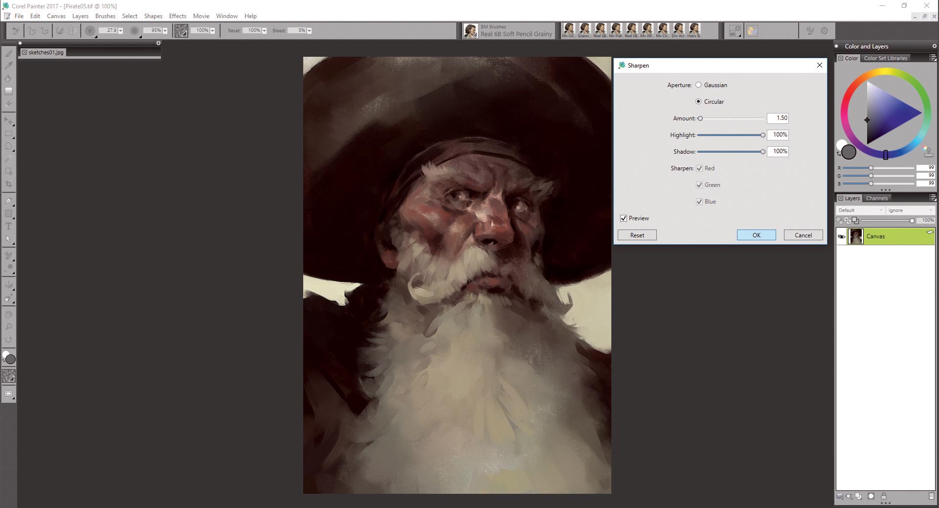
Once I have the basic colours down and I'm happy with the result, I create a default layer on top and start painting. I use the same Oil Pastel brush for some hard edges and My Chunky Pastel brush for smoothing and blending. I'm trying to keep some of the original strokes that I like while refining the image, adding contrast and details.
I try not to pick the colours from the painting, but rather from the colour wheel, otherwise things gets muddy. I also experiment with different paper textures at this point and different brushes: a smoother texture for some parts of the face, bristle brushes for the hair, and so on.
14. Make some final touches
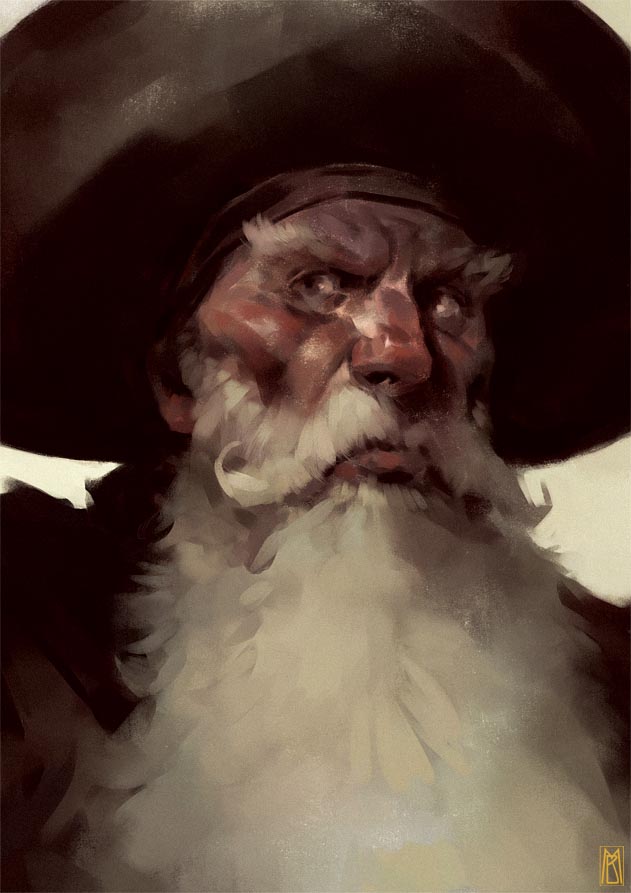
I keep on rendering until I'm happy, turning layers on and off to check that I'm on the right path and not overworking the image. I reserve the final top layer for blending some parts of the painting and detailing others. Once I think I'm done, I usually resize the image – in this case it's 18 per cent of its original size – then sharpen it so that the details and textures will pop out, and do some colour and contrast corrections. The tools can be found by selecting 'Effects > Tonal Control > Brightness/Contrast' (ctrl+shift+B) or 'Effects > Focus > Sharpen'. One final tip: always keep the original file in case you decide to print it.
This article was originally featured in ImagineFX magazine issue 143; buy it here!
Related articles:
