How to emphasise the focal point of an image
Illustrator John Petersen shares how to boost the lighting and focal point of an image.
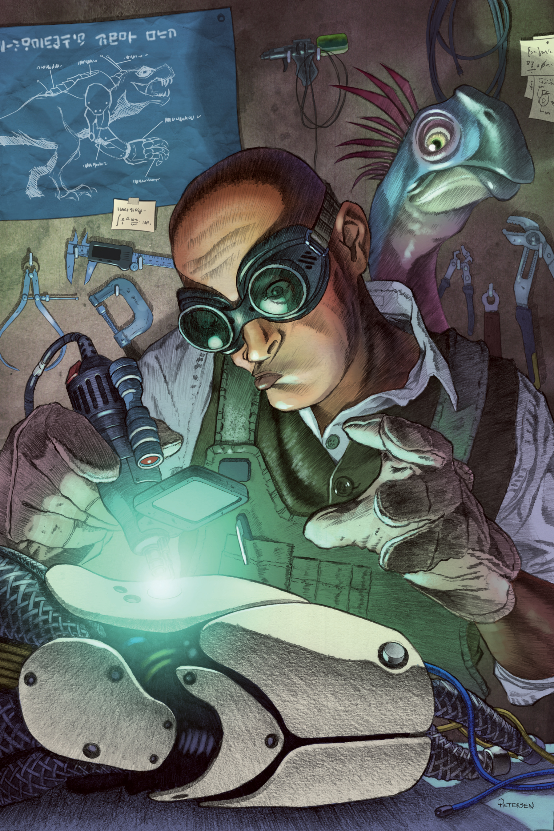
Using elements of your pencil underdrawing is a great way to capture the viewer’s attention within a piece. Furthermore, your pencil lines can emphasise light sources in the scene. Even when I create a digital piece I usually tend to start out with traditional media such as pencils.
I like the feeling of textured paper as I make my marks, and it also means I have an original piece of process art that I’m able to sell. Simulated texture in a digital art program is all well and good, but there’s nothing quite like the feel of pencil drawings on cold press board or watercolour paper.
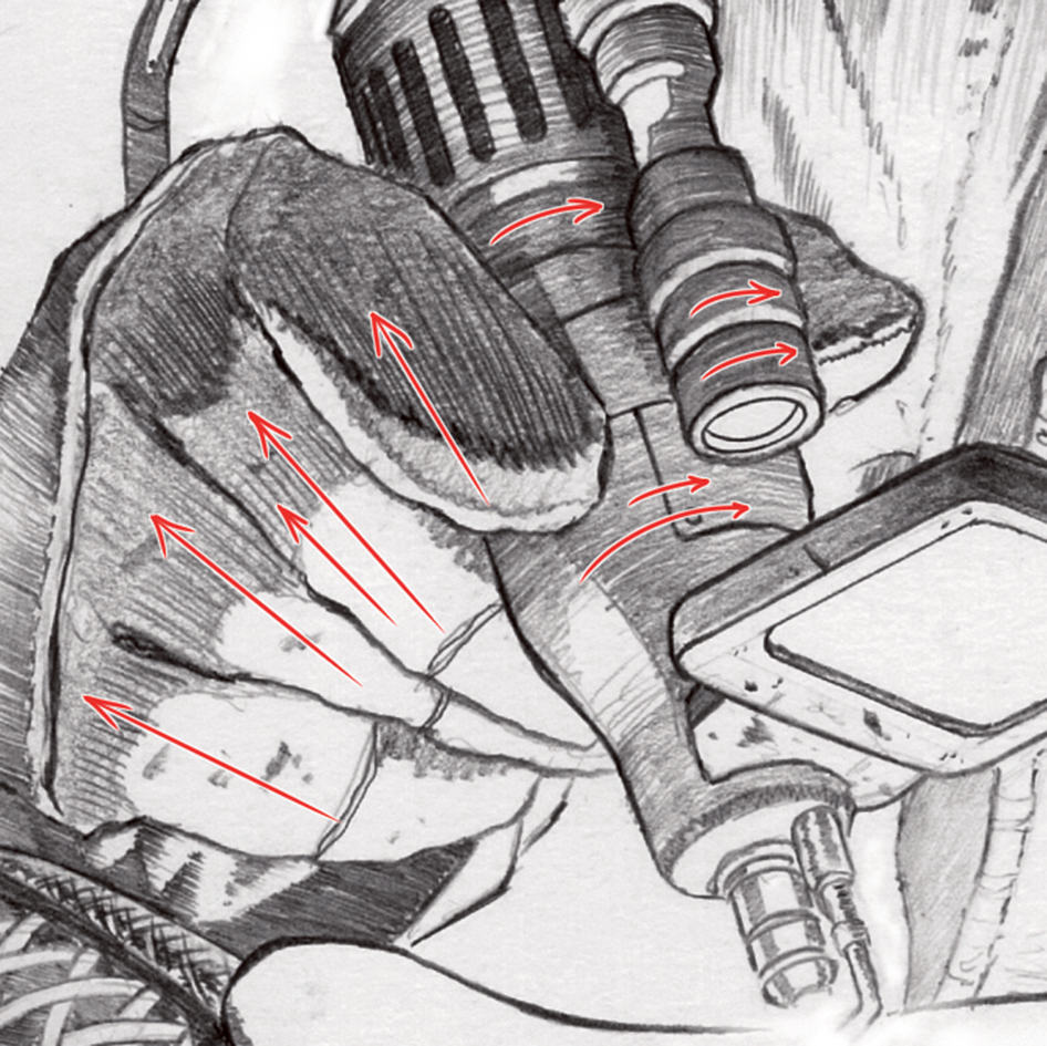
My philosophy lately has become one of focus on draftsmanship. The more time I spend on working up a detailed drawing, the less I’ll have to paint over it later.
Article continues belowColouring becomes a breeze, because the values and texture are already there, but more importantly I’m able to switch the colour theme with minimal effort. Red/yellow colour scheme too aggressive? I can work up a blue/green environment in just a few minutes.
The main takeaway, however, is to let the paper texture and pencil lines guide your eye to where you need it.
01. Gather references

My best work always happens when I have a good reference for clothing, materials and lighting. I set up a shot in my studio with a light source that’ll be radiating from the focal point. I wear funky goggles and work gloves, and kit-bash a welding gizmo for added authenticity.
02. Pencil in details
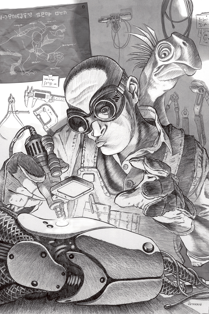
The detailed pencil drawing is where it’s at. I generate almost all of my shading and value work by aligning pencil strokes to the light source. I really take my time and concentrate on unifying the drawing. I’ll add some refinements in Clip Studio Paint after I scan the drawing.
Sign up to Creative Bloq's daily newsletter, which brings you the latest news and inspiration from the worlds of art, design and technology.
03. Create a colourful layer

I use Clip Studio Paint to add colour and other drawing refinements. There’s not much detail in this layer that’s in the drawing: just a lot of simple colour shapes and gradients. This stage is a lot of fun because you can experiment with colour schemes without too much effort.
This article was originally published in issue 155 of ImagineFX, the world's best-selling magazine for digital artists. Buy issue 155 here or subscribe to ImagineFX here.
Related articles:
- Create perspective by warping your textures in Photoshop
- How to draw your art in perspective using Adobe Illustrator
- Use perspective to create a dynamic image
