5 best and worst brand identities of 2017
The howlers and the winners of branding and logo design in 2017.
Sign up to Creative Bloq's daily newsletter, which brings you the latest news and inspiration from the worlds of art, design and technology.
You are now subscribed
Your newsletter sign-up was successful
Want to add more newsletters?
Is it really 2018 already? It seems like only yesterday we were looking forwards to all of the opportunities and design trends that 2017 had to offer. In a year that will be remembered in terms of design for its retro fonts and advances in VR, there were also plenty of rebrands and new logos to enjoy.
One person who knows all about branding is Armin Vit, the design doyen over at Brand New. Popular for his coverage of all the latest brand identity work, Vit recently compiled a retrospective of the best and worst branding efforts of 2017. We've rounded up five of the best and five of the worst entries from his review below, but for the full list be sure to head over to his site.
Because we're kind folk here, we'll kick off with a look at the best pieces of branding from 2017 (if you're not as saintly, you can skip to the worst here).
Article continues belowThe best brand identities of 2017
01. SŽDC

Chances are you haven't heard of the Czech administration SŽDC, and even less likely are the odds that you'll be able to pronounce its name – Správa železniční dopravní cesty – correctly. In English it translates as Railway Structure Administration, and simplifying the name and message of the organisation was the aim of this rebrand.
Amazingly, this clear logo accomplishes both of these aims with ease. Designed by Prague-based studio Marvil, the orange logo plays on the similarity between the letter Ž and three parallel railway tracks linked by a railroad switch. Meanwhile, the letter Ž acts as a tidy abbreviation for Železnice, which means Railway in Czech.
"Using the diacritic over the “Z” in the company’s name to create an overhead view of a railway switch is very clever. And that livery… swoon," writes Vit.
The monogram is both distinctive and authoritative, plus it looks set to work across posters, uniforms, documents and online platforms with ease. What more could you want from a rebrand?
Sign up to Creative Bloq's daily newsletter, which brings you the latest news and inspiration from the worlds of art, design and technology.
02. Misfit
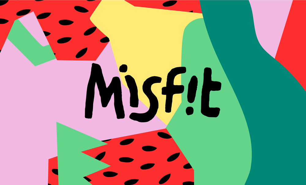
Did you know that over 20 billion lbs of fruits and vegetables go unharvested or unsold every year in the US? Neither did we. But one company that did is Misfit. Established in 2014, Misfit used fruits and vegetables that would otherwise go to waste to create its range of cold-pressed juices.
For its rebrand, Misfit turned to NY-based studio Gander. Whereas Misfit's old logo was a fairly straight laced affair of uninspiring, blocky typography, the new version has a goofy sense of humour without becoming overbearing, which echoes the misshapen ingredients. "Ugly never looked so good," writes Vit.
"We created an identity that challenges beauty standards and glorifies the oddballs," Gander told Brand New. "Through illustration, photography and web design, we were able to tell Misfit’s story and educate consumers in a way that was fun and approachable."
03. Mozilla

Global nonprofit organisation Mozilla has been dedicated to making the web better since 1998 thanks to its open source products and open standards. So when it came to a rebrand, it made sense that Mozilla would team up with the equally altruistic Johnson Banks.
Not only were Mozilla and Johnson Banks a good match in terms of ethics, they're both a little madcap. To tie into Mozilla's open source services, Johnson Banks followed suit and decided to do its rebranding work in public by sharing every step of the process.
It's just as well that the design was strong enough to hold up to the scrutiny. Complete with typography that nods to URL language and a diverse range of colourful alternatives to help it stand out, Mozilla's makeover has truly earned its place as one of 2017's best logos and brand identities.
04. Ugly Drinks
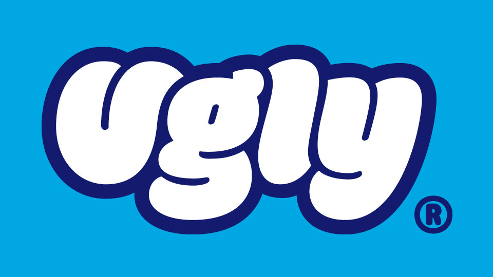
"Healthy doesn't have to be boring," that's how independent design agency Jones Knowles Ritchie approached this rebrand for Ugly Drinks. Set up in 2016, Ugly Drinks aims to provide a healthy alternative to the familiar sugary soft drinks that currently dominate UK shops.
Whereas the company's previous look focussed on the ugly angle – complete with a deliberately clunky typeface – this new design packs more of an attitude. With the letter "U" shaped like a slurping tongue, Ugly Drinks now has a stylish wordmark to help it stand out from the crowd.
"The overall design of this is fantastic and, what’s better, it’s fueled by a great sense of humour," says Vit.
The flexible piece of type design looks great either on its own or paired with a range of fruit icons to create cheeky characters. Ugly Drinks co-founder Hugh Thomas hopes that this identity will help define the brand and turn it into something people will be happy to be seen with.
05. Chobani
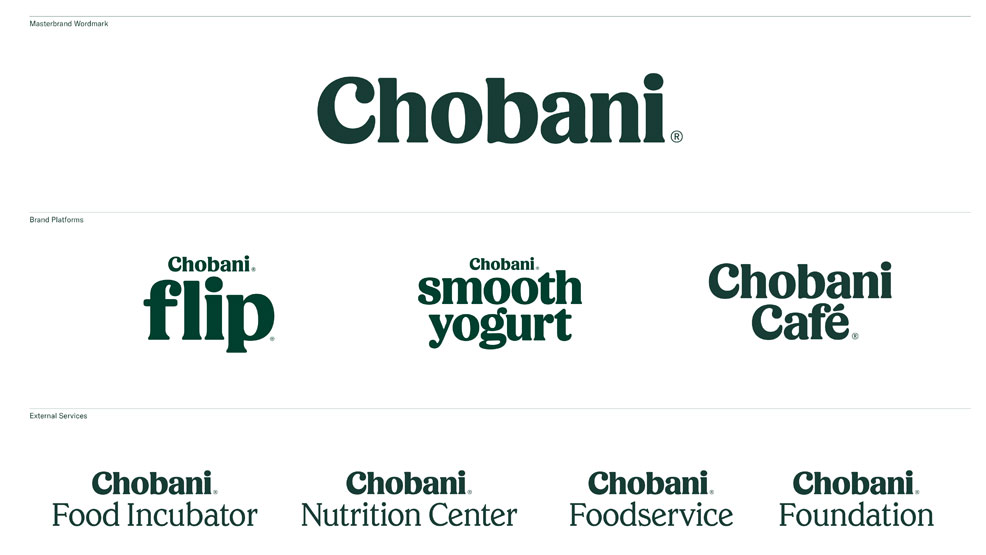
Greek yoghurt company Chobani has come a long way since it was launched in 2007. In 2012 it was the official sponsor of the US Olympic Team, and in 2017, Chobani decided a brand refresh was in order.
Designed in-house and led by chief creative officer Leland Maschmeyer, the new typographic logo does a much better job than the previous design when it comes to communicating a rich, sensuous sensation, which makes the rebrand a much better fit for the product.
Vit himself is a huge fan of the design. "I think it is literally and absolutely perfect not just in execution but in representing the product," he explains. "The green colour is unexpected but it looks stunning on the typography and more so in the packaging."
Now that we've covered the best brands of 2017, it's time for the dishonourable mentions as we look at the worst identities the year had to offer.
The worst brand identities of 2017
01. General Mills
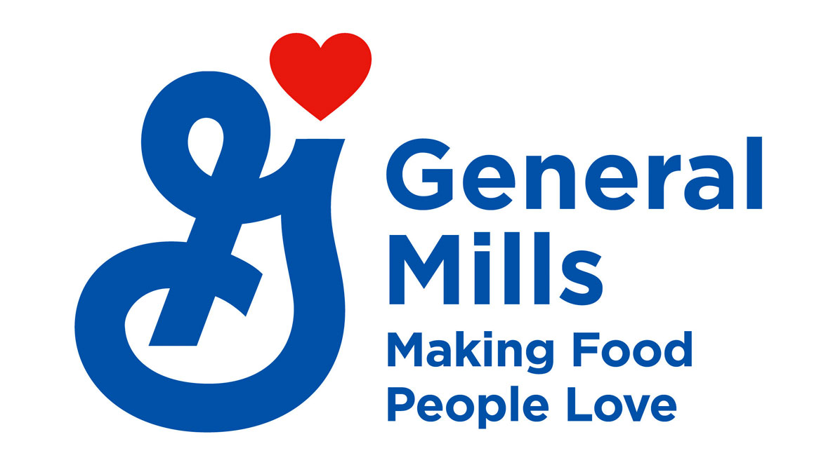
This update to the branding of global food company General Mills is all about "telling the General Mills story thoughtfully, proactively and consistently," according to a blog post in the wake of its new logo launch.
It went on to add: "With our newest logo, the familiar “Big G” continues to exemplify strength, longevity and trust – and now love." Pass us the sick bag...
It's this schmaltzy lovey-dovey message from a corporate super-entity that left Vit cold when it came to this rebrand. And even though he admits that graphically it's not the worst design in the world, the heart just comes across as insincere and lazy. We're definitely getting shades of 'Big Brother loves you' here. Very dystopian.
02. Skype
You know what Skype is. Established in 2003, the instant messaging app became the go-to way for millions of people to communicate online thanks to its text message and video chat services. Its new logo, though, was less well received.
So where did the Skype rebrand go wrong? For starters, the previous wordmarks-in-bubbles logo at least had originality and was recognisable. This new version looks dangerously generic.
Vit puts this at the feet of a merger with Microsoft that was completed in 2011. This might help the tech giant to tie in Skype's look with the rest of its software, but it's a move that does nothing to improve or build on Skype's image. As Vit writes, "it's aligned with the Microsoft brand architecture, which no logo asked for ever."
03. City of Vancouver
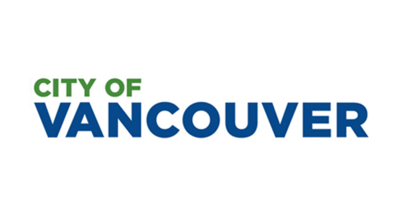
This logo for the City of Vancouver Government Administration is very much a case of "you get what you pay for". The mystery firm behind this brand design was chosen for its low low prices... and it shows.
When it came to judging this rebrand, Vit is at least firm but fair when he points out that this design isn't meant to be an all-singing, all-dancing piece of typography to attract tourists. This is a governmental logo. But does that mean it can get away with being this boring?
Vit admits that at least the typographer seems to know what they're doing, as all the alignment sits correctly. However there's no getting away from just how inconsequential this rebrand looks, or as Vit puts it, "this is insanely bland. It makes Scranton, PA, sound exciting." Quite.
04. AXIS Dance Company
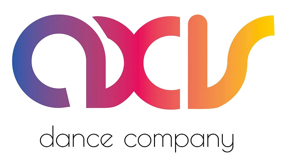
We find ourselves disagreeing with Vit when it comes to this logo for integrated contemporary dance company, AXIS. Or, if not disagreeing, not finding ourselves as offended by this rebrand.
Created to celebrate the company's 30-year anniversary, AXIS' colourful new wordmark is inspired by fluid dance moves. It's a sound enough concept, so where does it go wrong?
"The new logo is a conceptual and formal abomination," says Vit. He goes on to lay into the wordmark's lack of motion, elegance and energy. As far as he's concerned, the gradients only serve to add insult to injury and highlight how cheap and vacuous the logo is. Ok, Vit, tell us what you really think...
In his defence though, Vit only has an issue with the logo, not the company itself. "The main reason I’m coming down so hard on this is because this organisation and its dancers deserve something so much better that properly reflects what they do, the challenges they are able to overcome, and the beauty of movement they are able to create," he explains.
05. Redbox
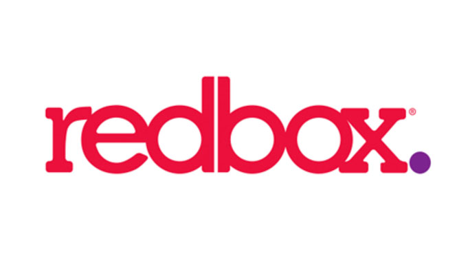
In an age of Netflix binge watching, it's good to see Redbox is still flying the flag for good old DVD and video game rentals. What's less good to see is its new logo.
On the surface you might be put off by the purple period, but look close and this logo gets even worse. First of all there are clumsy slabs, then there's the wonky 'e', and finally the kerning is so tight that the pairing of "d" and "b" look a little too phallic for their own good. As Vit says, it's "painfully amateurish and unappealing".
Vit notes that many of his Twitter followers read it as 'Redbax' due to the too-tight spacing. "I saw this as a sign that they don’t treat their brand seriously enough," he says of Redbox.
Topping off the rebrand is the smug tagline "so smarter". Smarter than what, exactly? Streaming films and games online? We're not convinced.
Related articles:

Dom Carter is a freelance writer who specialises in art and design. Formerly a staff writer for Creative Bloq, his work has also appeared on Creative Boom and in the pages of ImagineFX, Computer Arts, 3D World, and .net. He has been a D&AD New Blood judge, and has a particular interest in picture books.
