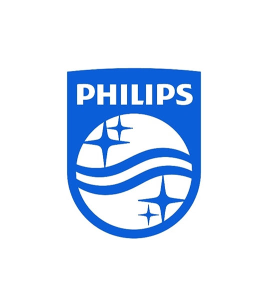
Philips unveils new logo and identity
Philips has unveiled a new logo and brand identity which centres on 'innovation and people'. What do you think of it?
Sign up to Creative Bloq's daily newsletter, which brings you the latest news and inspiration from the worlds of art, design and technology.
You are now subscribed
Your newsletter sign-up was successful
Want to add more newsletters?

Leading Dutch technology company Philips have unveiled this brand new logo and identity across the entire brand (above).
Earlier this week they showcased a piece-by-piece teaser, with the new logo now coming to the forefront of their new look. Developed by the in-house design team, Philips also worked with partners including Interbrand, Ogilvy and OneVoice for the new branding.
Based on the strapline 'innovation and people', the new shield logo harks back to the company's original logo design back in 1934. However, this new look shield has curvier aspects to it, with thicker and softer lines throughout.
Article continues below 
However, Philips have stated that they will continue to use their previous blue wordmark (above), as it aims to 'remains true to its legacy, rooted in its early years at the beginning of the 20th century'. The new logo will appear on all their upcoming promotional material.

[via Design Week]
Like this? Read these!
- Free tattoo fonts for designers
- Create a perfect mood board with these pro tips
- The ultimate guide to logo design
What do you think of the new logo? Let us know in the comments box below!
Sign up to Creative Bloq's daily newsletter, which brings you the latest news and inspiration from the worlds of art, design and technology.

The Creative Bloq team is made up of a group of art and design enthusiasts, and has changed and evolved since Creative Bloq began back in 2012. The current website team consists of eight full-time members of staff: Editor Georgia Coggan, Deputy Editor Rosie Hilder, Ecommerce Editor Beren Neale, Senior News Editor Daniel Piper, Editor, Digital Art and 3D Ian Dean, Tech Reviews Editor Erlingur Einarsson, Ecommerce Writer Beth Nicholls and Staff Writer Natalie Fear, as well as a roster of freelancers from around the world. The ImagineFX magazine team also pitch in, ensuring that content from leading digital art publication ImagineFX is represented on Creative Bloq.
