Virgin redesigns its original logo
As part of its 40th anniversary celebrations, Virgin revisits its past and releases a new, 'finished' version of its original 1973 logo.
It's typical. You wait ages for a reminder that some of the biggest 21st century corporations grew out of the hippy counterculture of the 1970s... and then two come along at once.
Yesterday we note how the Steve Jobs movie poster recalls how Apple was founded by an acid-dropping Buddhist rebel. And here comes a reminder of how megacorporation Virgin began life as a small-time mail-order record label for lovers of hippy music such as Gong's Flying Teapot (Radio Gnome Invisible, Pt. 1).
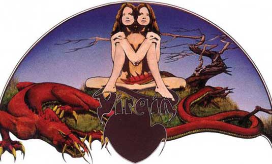
The original logo for Virgin, known as the 'Gemini' or 'Twins' logo, was designed by English artist and illustrator Roger Dean, who's famed for his exotic, mystical landscapes. A far cry from the current signature-style Virgin logo, it featured a young naked woman in mirror image with a large long-tailed serpent (shown below):
Article continues below 
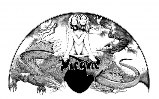
Now, to celebrate the 40th anniversary of Virgin Records, Dean has released this newer, "more confident" version of the logo (below):

Dean was happy with the original design, he says, "but I always wanted to do a much more elaborate final, final drawing". However, "the original drawing has just been waiting in four different studios over the years, as I’ve moved from place to place".
Last Christmas, Dean finally finished it and made three versions: one in black and white; another in black and white with sepia sky, and a third in colour. These are now available to buy as limited-edition prints from his website.
[via Virgin.com]
Sign up to Creative Bloq's daily newsletter, which brings you the latest news and inspiration from the worlds of art, design and technology.
Liked this? Read these!
- The best album designs from music's greatest decade: the 70s!
- 10 classic Storm Thorgerson album cover designs
- Why Bowie's new album art looks shockingly familiar
- The ultimate guide to designing the best logos
Have you spotted a big brand getting playful with its logo? Let us know about it in the comments!

The Creative Bloq team is made up of a group of art and design enthusiasts, and has changed and evolved since Creative Bloq began back in 2012. The current website team consists of eight full-time members of staff: Editor Georgia Coggan, Deputy Editor Rosie Hilder, Ecommerce Editor Beren Neale, Senior News Editor Daniel Piper, Editor, Digital Art and 3D Ian Dean, Tech Reviews Editor Erlingur Einarsson, Ecommerce Writer Beth Nicholls and Staff Writer Natalie Fear, as well as a roster of freelancers from around the world. The ImagineFX magazine team also pitch in, ensuring that content from leading digital art publication ImagineFX is represented on Creative Bloq.
