Why UX design is just as important as a logo
Branding is not just about visual identity.

The word 'branding', once primarily tied to visual identity and communication, has undergone significant changes. In recent years, a brand's core is no longer just about logo or ad campaigns.
Instead, it's critically defined by all its digital interactions and online presence. Here, we will explore why digital design, specifically user experience (UX) and user interface (UI), isn't just a supporting element but a crucial foundation for building and perceiving a modern brand. You may also be interested in my piece on why simplicity matters in UX/UI design.
Beyond the logo

Consider this: the best logos are like a handshake. It's the first impression, much like an introduction. But what follows that initial connection? That's precisely where user experience (UX) and user interface (UI) design become crucial. Your online presence, your applications, your digital offerings – these aren't merely static pieces. They're vibrant, interactive environments where individuals perform tasks and participate in activities.
Although a logo continues to be a powerful identifier, it's progressively becoming a gateway rather than the complete definition of a brand's essence.
In the digital age, a brand's character is actively shaped by how users interact with it, and UX/UI serves as the primary channel for conveying its fundamental traits.
UX/UI doesn't just present brand identity; it brings it to life through functional sophistication and visual exactness
UX design, by concentrating on understanding users, organising information, and ensuring ease of use, directly transforms a brand's principles into concrete, usable journeys. For example, a brand that values speed and clarity will demonstrate this through a simplified setup process and straightforward navigation.
Conversely, a brand highlighting luxury and exclusivity might utilise intentional animations, refined typography, and curated special content presentation to evoke that sensation.
User interface (UI) design, as the visual expression of user experience, establishes the brand's aesthetic and interactive vocabulary. It determines colour schemes, fonts, icons, button designs, interactive states, and small animations – all of which contribute to a complete brand experience. A carefully developed UI ensures visual uniformity across all digital interaction points, strengthening brand recognition and memorability.
Daily design news, reviews, how-tos and more, as picked by the editors.
Inconsistency in UI elements across platforms can cause confusion, breaking apart the brand's perceived identity and weakening its values. Therefore, UX/UI doesn't just present brand identity; it brings it to life through functional sophistication and visual exactness.
We can think of it as an extension of the brand, considering that many customers will first encounter it through screens, via apps or websites. This is especially true for digital-first services and brands that were born entirely in the digital space.
The invisible hand: how UX/UI shapes brand perception

How people perceive a brand is a complex mix of direct interactions, emotional reactions, and personal sentiments. In digital, UX/UI deeply influences these aspects, acting as the primary way users judge a brand's reliability, trustworthiness, and character.
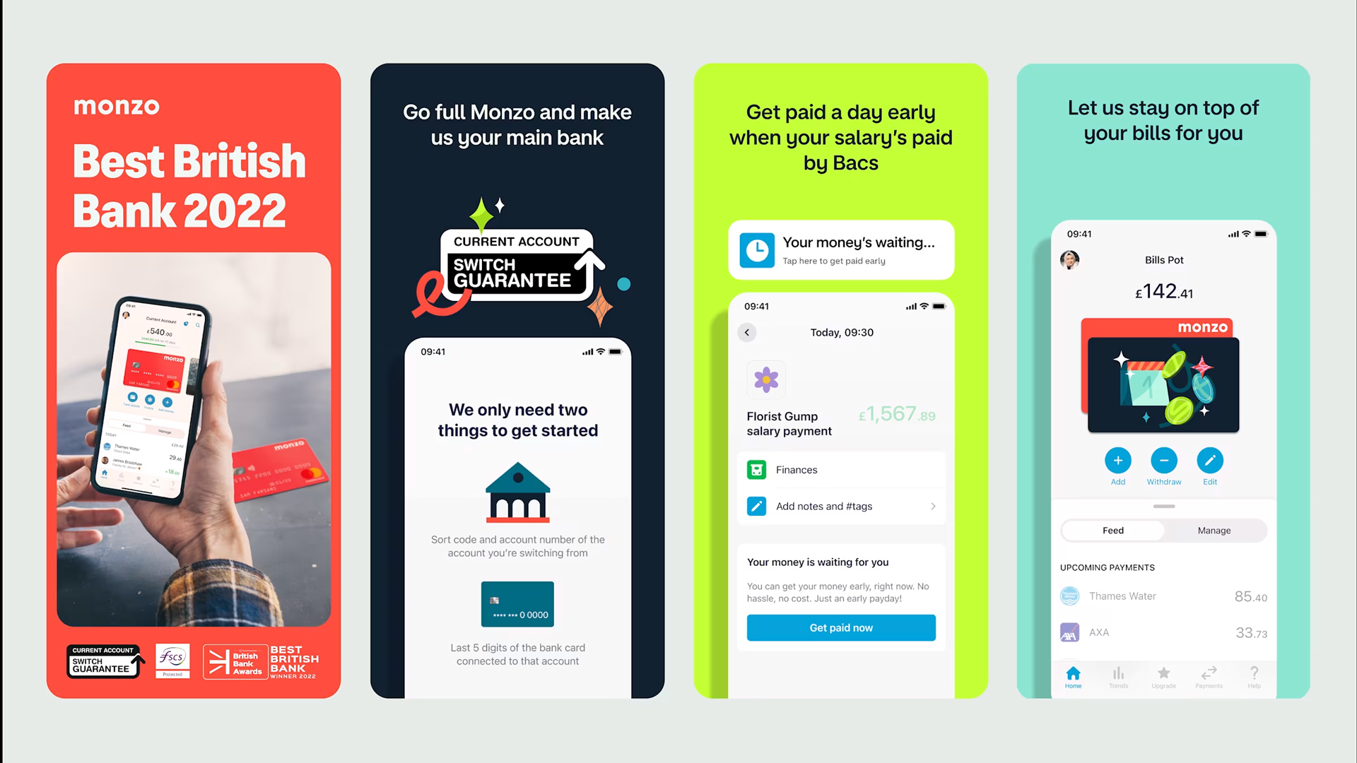
Imagine trying to buy something online, and the website keeps freezing, or you can't find the "checkout" button. Frustrating, right? Those negative feelings immediately stick to the brand. On the other hand, if a website is smooth, quick, and simple to use, you feel good about the brand – you simply trust them. That trust and dependability come from good UX. (See CB's deputy editor's piece on why she loves Monzo's UX so much as an example.)
A smooth and easy-to-use experience creates positive emotional responses. When a user can effortlessly navigate a website, finish a task without difficulty, or easily find information, they connect these good feelings with the brand itself.
Beyond just how things work, UX/UI subtly communicates a brand's personality. These design choices, often minor, strengthen the brand's desired image. Using a distinct design language consistently across all digital assets builds a cohesive story that connects with the user, shaping their unconscious view of the brand's character. In essence, the usability and aesthetic appeal of a digital product become direct reflections of the brand’s commitment to its users.
Creating business impact and brand value
The impact of strong UX/UI goes beyond just looks; it directly leads to clear business benefits and significantly boosts overall brand value. A well-designed user path, made for clarity and easy action, can increase conversion rates. Whether it's signing up for a service, making a purchase, or downloading a resource, intuitive UX/UI removes obstacles, guiding users efficiently toward what they want to achieve. This immediate financial gain highlights the direct return on investment in design.
Positive user experiences encourage repeat engagement
Customer retention and loyalty are also vital factors: positive user experiences encourage repeat engagement. When users find a digital product easy and enjoyable to use, they're more likely to come back to it. Loyal customers not only generate ongoing revenue but also become brand advocates, contributing to organic growth through positive word-of-mouth.
Brands that consistently deliver excellent digital experiences are also perceived as innovative, customer-focused, and of high quality. This increases brand equity, allowing businesses to charge higher prices, attract top talent, and build a stronger market standing.
Investing in UX/UI becomes an investment in the core value and reputation of the brand itself. The competitive edge is perhaps one of the most important pillars of impact: in crowded markets where product features can often be copied, the user experience becomes a crucial differentiator. A superior UX/UI can attract and keep customers even when competitors offer similar functions, creating a unique market position and fostering a loyal user base.
Beyond aesthetics: UX as a market differentiator

While good looks are undoubtedly important for initial appeal, the real power of UX/UI as a market differentiator lies in its ability to solve user problems, anticipate needs, and provide genuine value beyond surface-level beauty.
A brand that prioritises UX/UI shows a deep understanding of its audience and a commitment to user satisfaction. This customer-centered approach resonates strongly among competitors.
Companies that invest in user research, improve based on feedback, and constantly refine their digital touchpoints are effectively telling their users, "We understand you, and we care about your experience." This empathy, naturally woven into the digital design, builds a stronger emotional connection and sets the brand apart as one that truly puts its users' success and comfort first.
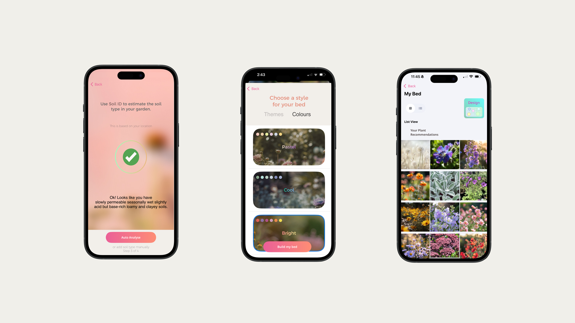
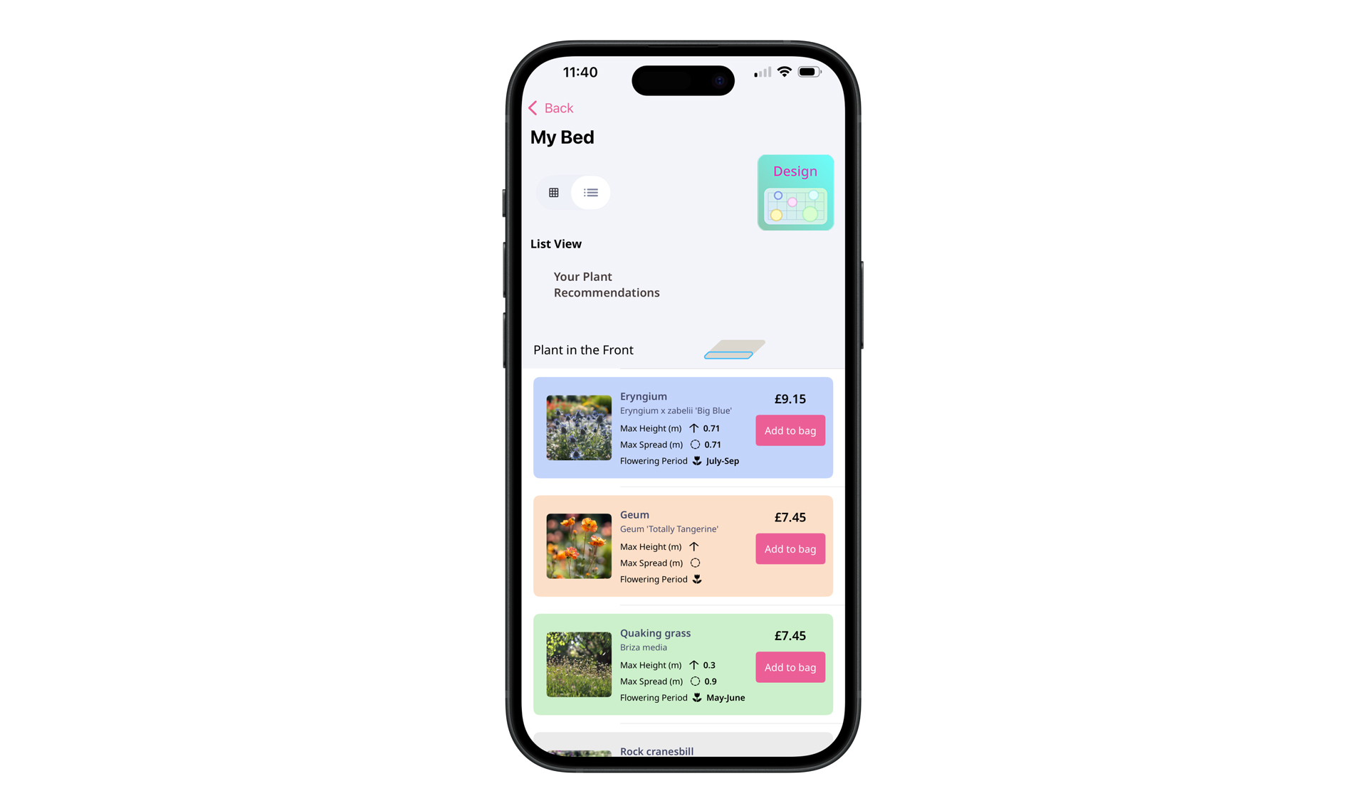
Another example of a brand Creative Bloq loves that does this well is gardening app Hota, which has refined its features due to user feedback.
Tips for creating a solid branded UX/UI
Creating an excellent branded UX/UI means embedding your brand's essence into every digital interaction. Here are a few things to consider:
- Start with strategy: Before designing, thoroughly understand your brand's values, personality, tone, target audience, and competition. Your UX/UI should reflect these core elements.
- Establish a comprehensive design system: Think of this as your brand's digital DNA. It's a dynamic library of reusable components and directives. This includes elements like colour palettes, typefaces, icons, buttons, and input fields that convey your brand's unique aesthetic.
- Emphasise UX writing and content: This is your brand's way of speaking. Every word within your digital product holds significance. Concentrate on defining your brand's tone (whether it's formal, humorous, compassionate, or something else) and apply it uniformly to all minor text, from button labels and error messages to guided onboarding sequences.
- Maintain cross-platform consistency: Your brand should feel cohesive across all digital platforms (such as web, mobile, and desktop). Rely on your unified design system and shared UX principles. Tailor designs to each platform's specific requirements, rather than simply scaling them.
- Iterate and evaluate constantly: Your brand and its digital presence are always changing. Conduct usability studies, A/B experiments, and analyse data to confirm your branded UX/UI is achieving its objectives and resonating with users.
Rodolpho is a judge on this year's Brand Impact Awards, which includes a new category, Interaction, focusing on UX/UI in branding. Enter the Brand Impact Awards

Rodolpho is a multidisciplinary digital designer working at the intersection of product, brand, and technology. Currently, at Google, he designs digital products used by more than 3 billion people worldwide. Before that, he was a Design Director at McKinsey & Company. Over the past 13 years, he has been transforming ideas into first-class digital experiences for startups and big leaders.
You must confirm your public display name before commenting
Please logout and then login again, you will then be prompted to enter your display name.
