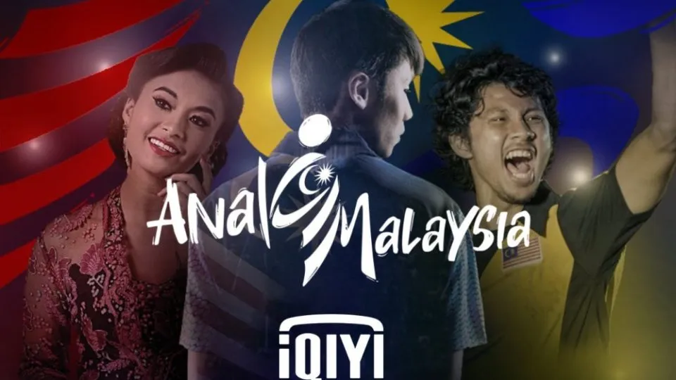
We may have seen more than a few unfortunate design blunders over the years, but last year gifted us one that truly hit a bum note – and we're still giggling. Back in September, a Chinese streaming service was forced to apologise for an embarrassing Malaysia Day poster that was, shall we say, rather easily misread. Read on for our original story...
The design is supposed to read 'Anak Malaysia' (which translates as 'Child of Malaysia'), and was designed to promote local shows available to stream for free during Malaysia Day 2020. But the phrase was given a stylised typographical treatment to incorporate the crescent and star of the Malaysian flag, resulting in some, er, legibility issues. Perhaps the designers should have played it safe with one of our best free fonts.
That's right, it looks like it says 'Anal Malaysia'. And is if that wasn't enough, it also appears to feature a squatting figure between the two words. Quite how this made it through design meetings, we can't imagine (were there meetings? Did anyone see it other than the designer?), but it has caused quite a rumpus on Twitter.
Anal Malaysia! Our Nation latest hit block-buster! pic.twitter.com/fz23HMSbZ9September 14, 2020
it took me ages to notice the k. pic.twitter.com/CuNhYEICSlSeptember 13, 2020
OMG WHO APPROVED THIS 😂😂😂 pic.twitter.com/EE1TuqnSV9September 13, 2020
The streaming service was forced to respond to the backlash, offering a light-hearted apology (below) titled 'Let us explain'. "We saw your reactions on our campaign logo," it reads, "and… we wanted to confirm that it’s ‘Anak Malaysia’ and nothing else!"
Hellooo guys just a clarification for those who're confused about the logo hehe 😬😬It's ANAK Malaysia okay! Remember, award winning films & drama like Ola Bola for FREE only for this month! You just need to download the iQIYI App or go to https://t.co/sXoyRATMa2 #AnakMalaysia pic.twitter.com/GX2MyvErGlSeptember 13, 2020
While we're pleased to know that the design fail was a mistake, we'd still love to know exactly what the designers were thinking – and how it slipped through the net. We're not sure we'd call iQIY's words a complete explanation – but perhaps we're being anal.
iQIY isn't the first company to pull an unfortunate design fail. Remember when Australian Made's new logo was scrapped for its uncanny resemblance to a certain virus you may have heard of? Still, not every design blunder deserves to be flushed away – here are 12 design fails that were so bad they were actually good.
Read more:

