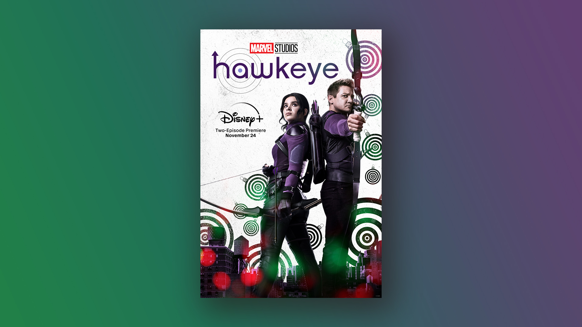
It seems we're not the only ones who aren't loving the new Hawkeye poster
It has the internet totally divided.
Sign up to Creative Bloq's daily newsletter, which brings you the latest news and inspiration from the worlds of art, design and technology.
You are now subscribed
Your newsletter sign-up was successful
Want to add more newsletters?
We are just weeks away from the release of the Hawkeye series, and as the anticipation for the show keeps building, Marvel has treated us to a new poster. But we aren't sure how to feel about it, and the internet agrees.
The series is set to be released on November 24th and with just two weeks to go until release, the official Hawkeye Twitter has revealed a third poster for the miniseries. The series is set in New York during Christmas time, (which is why the baubles in the poster make sense, we guess?) However, the latest design is, let's say, underwhelming, and the internet can't decide whether to love it or hate it. Either way, we are looking forward to the series, and you can stream it later this month on Disney Plus, which is currently only $1.99/£1.99 for the first month for new customers.
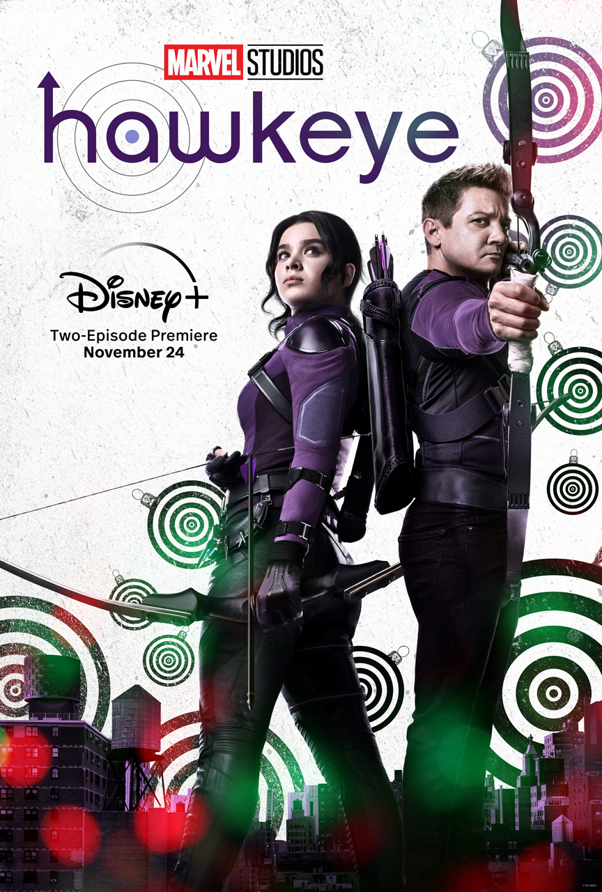
We can't say we love the design. Marvel Studios obviously found it difficult to combine the Christmas theme and superhero genre as the previous Hawkeye poster is just as bizarre as this one. The poster has taken inspiration from the original comic covers with its bullseye-like circles and typography, but according to The Direct, the original artist David Aja hasn't even been credited by Marvel, losing it points in our book.
Article continues below 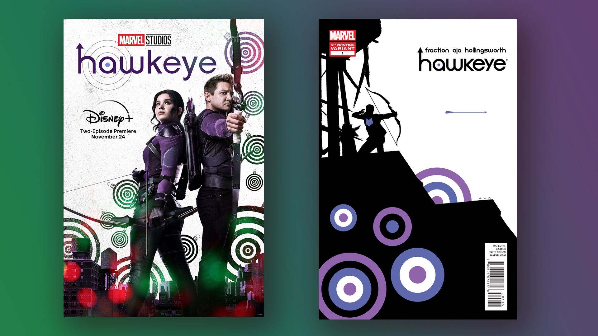
Maybe it's the excessive use of white space, or its seemingly random light flares along the bottom that add very little to the poster, or perhaps it's the purple, red and green colour palette that makes this poster so unappealing to the eye. As a whole, we have to say it looks quite amateurish. We can appreciate that the poster is staying true to the comic book designs though, and we like the nod back to its roots.
It seems as though much of the internet agrees with us, and many people have taken to Twitter to criticise the new design. One user tweeted, "Hate it, but I love the trailer," and another asked, "What is this?". Many of the tweets about the poster have been hilarious, and several people have compared the design to a show Disney might've released in the 00s – which we think is fairly accurate.
This looks like it aired on Disney Channel in the early 00s https://t.co/MGaswfnSxtNovember 10, 2021
this looks like a 13 year old did it on picscart for a fanpage https://t.co/VaKe2XKTX9November 10, 2021
The only defense for such an ugly poster would be if it was sponsored by Target https://t.co/Gm6jyVYte9November 11, 2021
However, not everyone is being as critical as we are about the poster, in fact, many people over on Twitter have praised the design, and have expressed their excitement for the show. One Twitter user tweeted, "This show has the best posters wow," and another tweeted, "I really love this poster, I already love Kate and I just can’t wait to see her in action," which we have to agree with, we are really excited to see Kate Bishop in the Marvel Cinematic Universe as Hawkeye takes her on as his unlikely apprentice.
Hawkeye has the best posters in the MCU and nobody can change my mind 😩 pic.twitter.com/cRGS4qu90ENovember 10, 2021
hawkeye posters appreciation tweet pic.twitter.com/t97nVaqx6GNovember 10, 2021
#Hawkeye NEVER MISSES when creating these ICONIC posters 🏹💜🎯 pic.twitter.com/al4Lj4Kim7November 10, 2021
Despite the random poster designs, we are looking forward to watching the series as it comes out in the build-up to Christmas. If you haven't got Disney Plus yet then check out our handy guide on how to download and subscribe Disney Plus. Or why not check out our best Black Friday and Cyber Monday TV deals and upgrade your viewing experience.
Sign up to Creative Bloq's daily newsletter, which brings you the latest news and inspiration from the worlds of art, design and technology.
Read More:
- Apple iPhone 14: design, specs and price – here's everything we know
- So Netflix has games now (yep, we're confused too)
- Hilarious Google app finds your pets in famous paintings

Amelia previously worked as Creative Bloq’s Staff Writer. After completing a degree in Popular Music and a Master’s in Song Writing, Amelia began designing posters, logos, album covers and websites for musicians. She covered a range of topics on Creative Bloq, including posters, optical illusions, logos (she's a particular fan of logo Easter eggs), gaming and illustration. In her free time, she relishes in the likes of art (especially the Pre-Raphaelites), photography and literature. Amelia prides herself on her unorthodox creative methods, her Animal Crossing island and her extensive music library.
