Malika Favre's new Kama Sutra alphabet is gloriously sensual
Warning: Typo-graphic content.
Sign up to Creative Bloq's daily newsletter, which brings you the latest news and inspiration from the worlds of art, design and technology.
You are now subscribed
Your newsletter sign-up was successful
Want to add more newsletters?
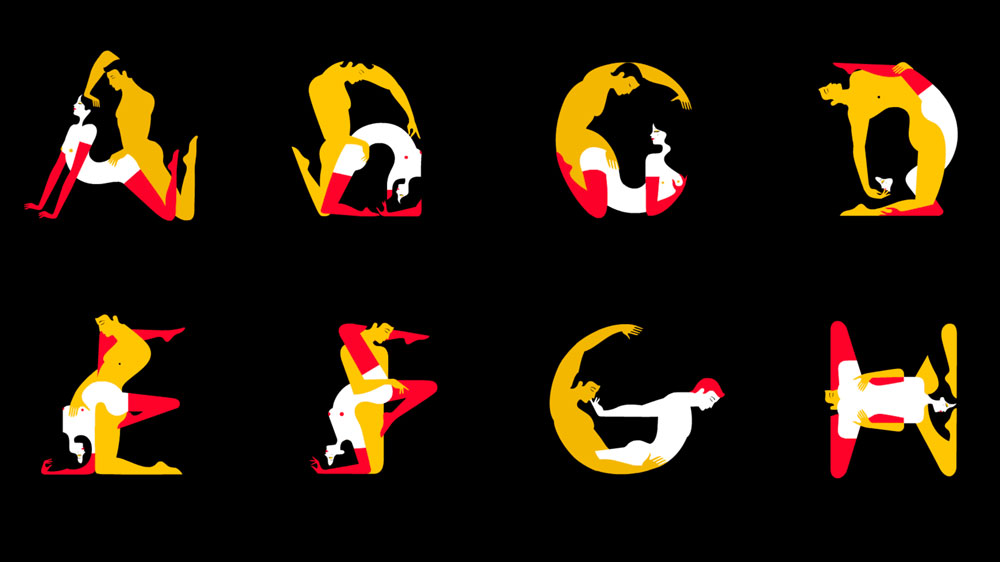
We've reported on many new typography designs in our time, but none that could be labelled truly NSFW. Until now. Kama Sutra A-Z is a sensual new book containing a new typographic (and it is extremely graphic) alphabet, which ingeniously uses erotic positions to take the form of letters.
Created by French illustrator Malika Favre, the illustrations take on the minimal vibrancy of her signature style. The typography, which feels a little like kinky cheerleading ("give me an A!"), plays with negative space – with the sexual partners curving and morphing together and apart at crucial places to create the letter forms. Though it may be a little more niche than the typography found on our list of free fonts, it's one of the most innovative pieces of typographic art we've seen.
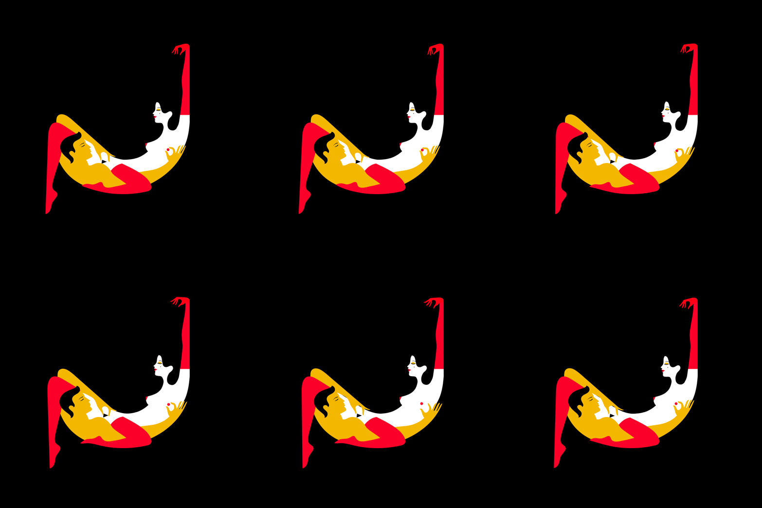
Though the alphabet was created for print, viewing the alphabet online gifts you to ability to see the typography in animated form, adding movement to the letters (see the J above), and breathing life into the positions. Each letter has a phonetically-inspired name (the J above is the Jolly Hammock, for example).
Article continues below 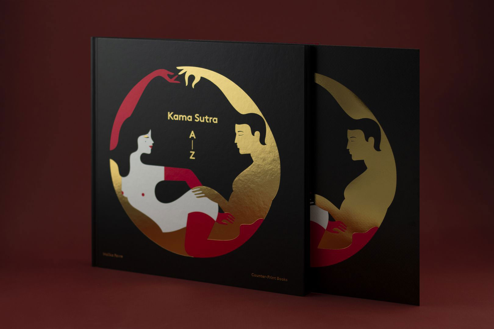
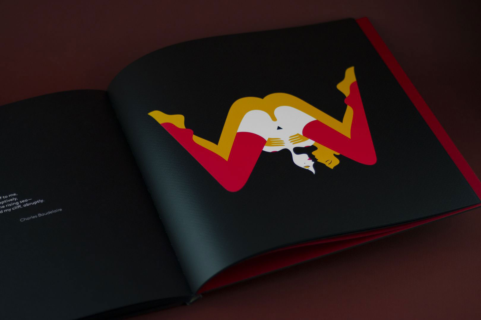
Originally created as just eight letters for an exhibition in 2013, Favre expanded the collection into an entire alphabet for the book (check out the cover above). Each illustration comes with a literary excerpt, and there's a strong emphasis on female writers, both modern and classic. A limited number of foil prints are also available alongside the book. Explore some of the illustrations below, in gif and print form, starting with W.
Favre embraces the symmetry of the H, below.
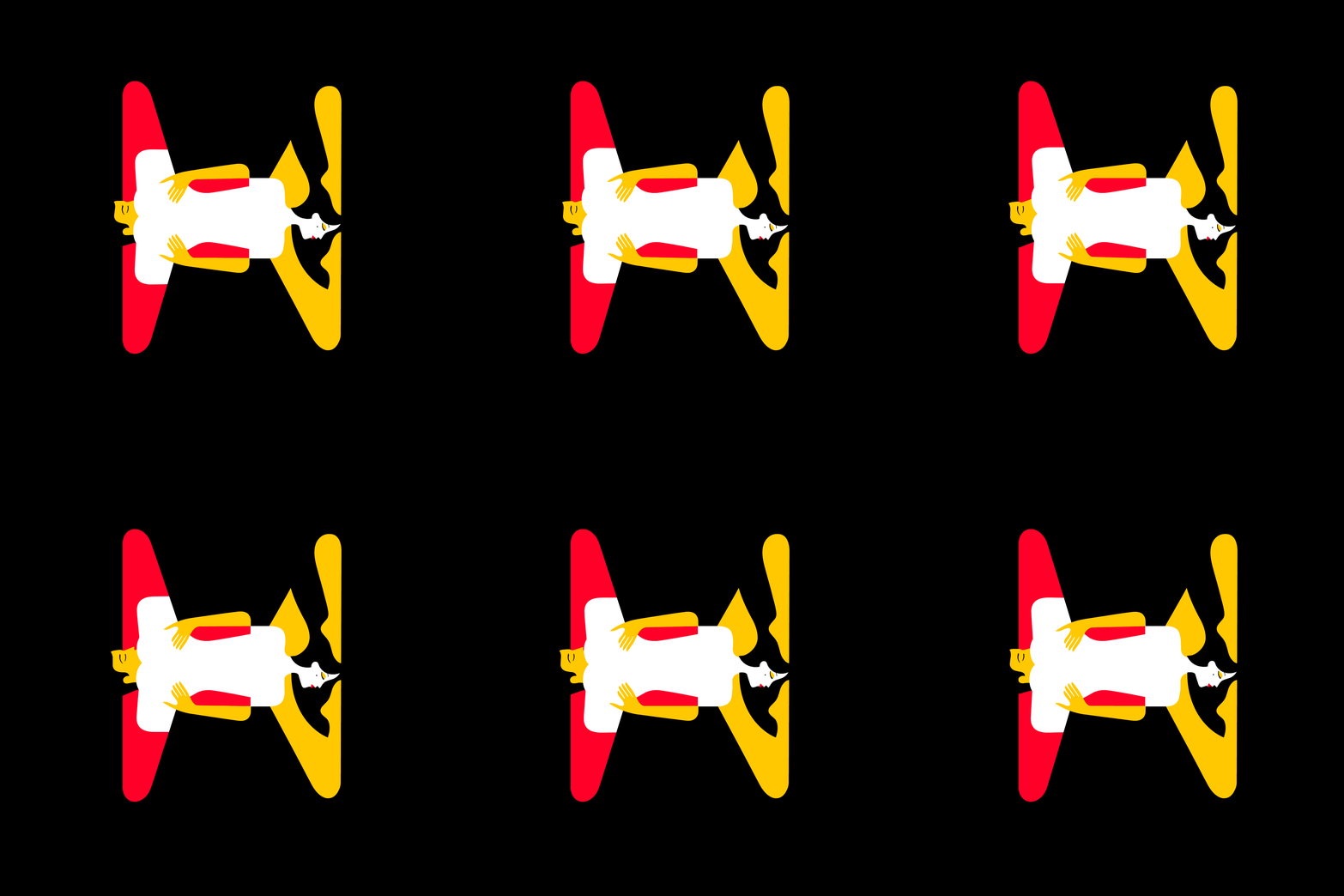
And the curves of the O...

Whereas the V is all sharp, straight lines.
Sign up to Creative Bloq's daily newsletter, which brings you the latest news and inspiration from the worlds of art, design and technology.
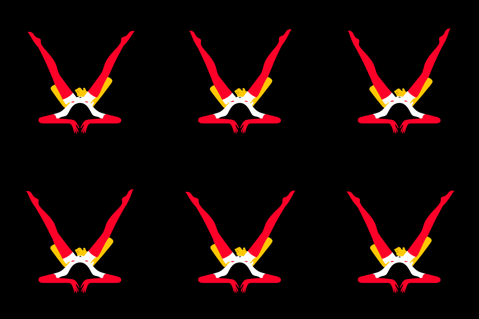
Discover the whole alphabet and buy the book on the stunning Kama Sutra Book – A-Z website (which includes every gif), or you can buy it on co-publisher Counter Print's website, too.
Feeling inspired? Head over to our guide on how to use colour to make your illustrations pop. Plus, see some more stunning examples of negative space. Though none quite as hot and steamy as this.
Read more:
- 10 logos that make clever use of negative space
- Typography design: Rules and terms every designer must know
- Kinetic typography: 42 must-see examples

Georgia has worked on Creative Bloq since 2018, and has been the site's Editor since 2023. With a specialism in branding and design, Georgia is also Programme Director of CB's award scheme – the Brand Impact Awards. As well as immersing herself with the industry through attending events like Adobe Max and the D&AD Awards and steering the site's content streams, Georgia has an eye on new commercial opportunities and ensuring they reflect the needs and interests of creatives.
