The new Microsoft Office rebrand isn't going down well
Even the logo is confusing.
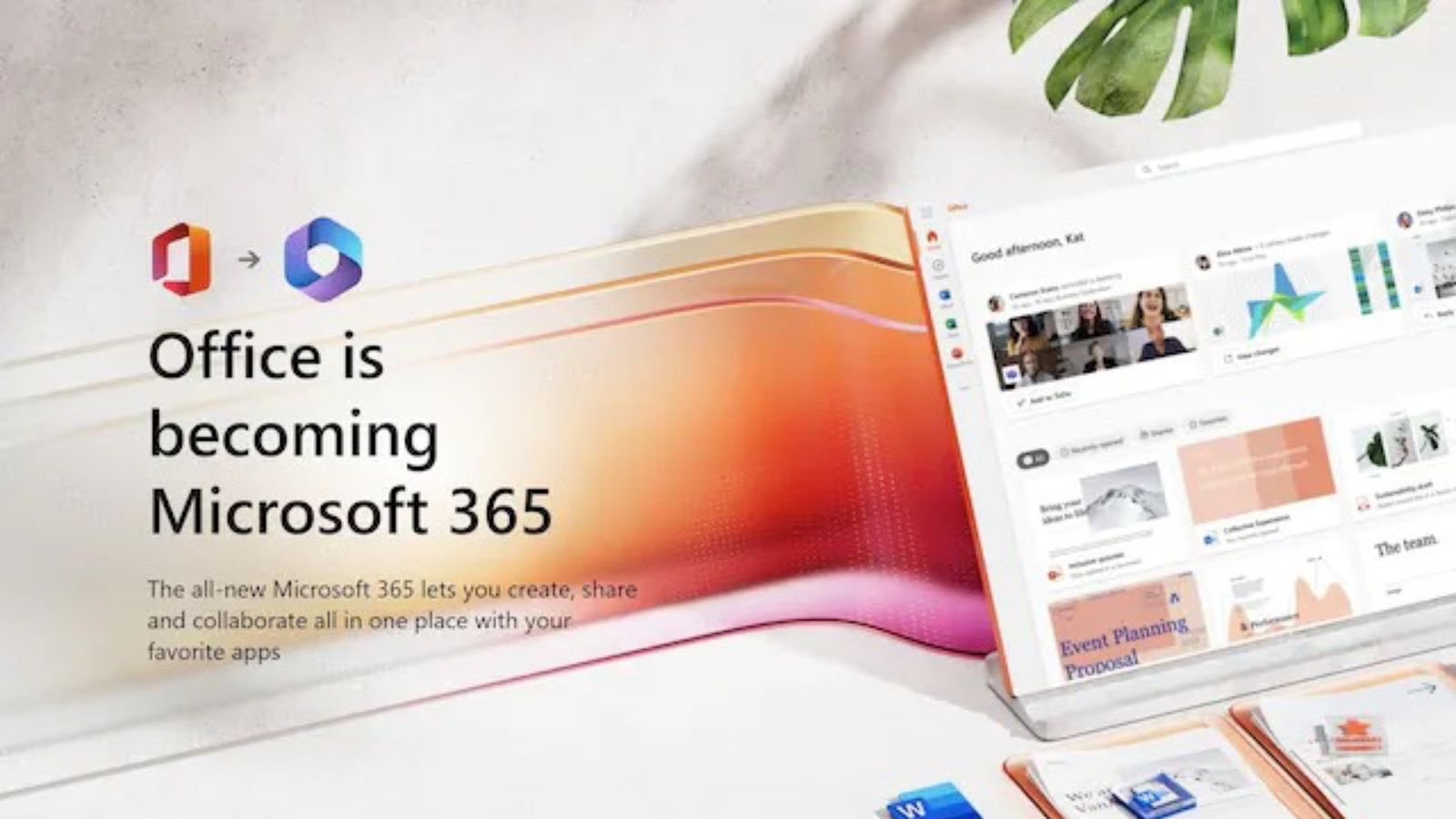
If, like everyone else on the planet, your CV proclaims you to be 'proficient in Microsoft Office', get ready to hit the edit button. After 32 years, the Office suite is no more, with Microsoft rebranding the whole thing with a new name and logo. And it's all a little confusing.
From Word to PowerPoint, the Office apps are among the most famous pieces of software in the world. But from now on, they're part of Microsoft 365. Yep, Microsoft has officially turned on its Out of Office. And there's a new logo to boot (but it won't be making our list of the best logos of all time.)

Announcing the news on its website, Microsoft declares that it's going all in on the 365 branding. "Over the last couple years, Microsoft 365 has evolved into our flagship productivity suite," the company says, "so we are creating an experience to help you get the most out of Microsoft 365. In the coming months, Office.com, the Office mobile app, and the Office app for Windows will become the Microsoft 365 app, with a new icon, a new look, and even more features."
Article continues below 
And that new app comes with a new logo – one which isn't going to help users forget the 'Office' name. Because it's still, basically, an 'O'. The 365 app, the home for all things Word, Excel, Powerpoint and more, features a overlapping squared-off circle design. It's pleasingly simple enough – but surely, if Microsoft is retiring the 'Office' brand, it would be keen to steer users' minds away from that name?
And aside from the confusing new logo, it seems users aren't welcoming the news with open arms. Office has been around since 1990, and doing away with the branding is a pretty major move – one that not all users are taking well.
You'd have to be clinically insane to get rid of the Office brand pic.twitter.com/4VCfBnE845October 12, 2022
32 years in, Microsoft has decided to rebrand “Microsoft Office.At a time where business benefits, service value, price sensitivity, and innovation edge are key challenge, I honestly can't see how a new brand and logo is going to help customers?https://t.co/fZ3XKbnlN7October 14, 2022
Oh boy… Possibly worst rebrand of this century.#Microsoft #MicrosoftOffice #Rebrand #Design #Techhttps://t.co/iGC1IYEjfdOctober 14, 2022
The office rebrand is the strangest to me, especially bc of how many people it's gonna confuseEveryone knows Microsoft Office and has for decades, so changing it to such a confusing name is dumb.There's already Windows 365 and Office 365 (although that's going away) soOctober 13, 2022
Of course, once the dust has settled, the rebrand could prove to be a shrewd move. Even some of the most hated rebrands now barely raise an eyebrow (remember the furore over the Airbnb logo in 2014?). But Microsoft is certainly taking a risk in retiring an iconic (dare we say beloved?) brand – especially since that 'O' logo will keep it in the memory. Fewer of us might be going to the office these days, but it seems not everyone is quite ready to let it go.
Read more:
Sign up to Creative Bloq's daily newsletter, which brings you the latest news and inspiration from the worlds of art, design and technology.

Daniel John is Design Editor at Creative Bloq. He reports on the worlds of design, branding and lifestyle tech, and has covered several industry events including Milan Design Week, OFFF Barcelona and Adobe Max in Los Angeles. He has interviewed leaders and designers at brands including Apple, Microsoft and Adobe. Daniel's debut book of short stories and poems was published in 2018, and his comedy newsletter is a Substack Bestseller.
