The new Google Play logo is more different than you might realise
When it comes to graphic design, there can be few bigger or more important jobs than redesigning one of Google's ubiquitous logos. Sure, maybe the Coke signature, McDonald's arches or Apple's Apple, but then they're unlikely to change any time soon. With over 2.8 billion Android users in the world right now, the redesign of the logo for its app store Google Play is a pretty big deal by anyone's standards.
But finally – and as we correctly predicted a full 18 days ago – there is indeed a brand new Google Play logo. And while it's evolutionary rather than revolutionary, it is very much a new look. Compare it to the previous logo (below) and see if you can spot the differences (and don't forget to see our guide to how to design a logo for some tips for your own work).
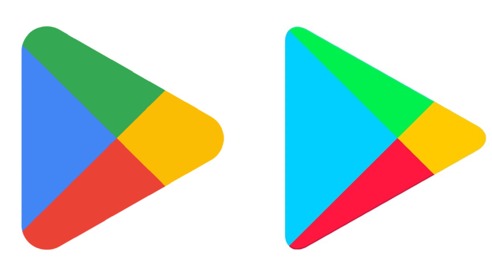
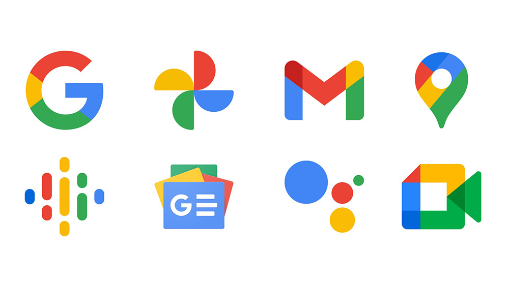
While the new Google Play logo retains the basic form of the previous design, which cleverly evokes a 'Play' button, the colours (red, green, blue and yellow) are now bolder, more saturated and make more of an impact. The change brings the colours in line with other Google logos, such as the Google Chrome and Google Drive logos and the logo for the eponymous search engine. If you're interested, the exact colours are as follows:
Article continues below- Red: #EA4335 (91.76% red, 26.27% green, 20.78% blue)
- Cyan blue: #4285F4 (25.88% red, 52.16% green, 95.69% blue)
- Yellow: #FBBCO4 (98.4% red, 73.7% green, 1.6% blue)
- Green #34A853 (20.39% red, 65.88% green, 32.55% blue)
But look closely, and you'll see that this isn't the only change. The shape of the play icon has been changed too, with the corners now more rounded. And the proportions of the colour segments have changed too. While the light blue in the previous logo took up the largest amount of space, now the four colours have been given more equal weighting. This all provides a greater sense of balance – in fact, the old logo now feels somehow wrong in comparison.
Whether or not you like the new look, it certainly fits in better with Google's branding overall, including the flat redesign of the Chrome logo that Google launched back in February.
Tian Lim, vice president of Google Play, announced the latest change in a blog post celebrating the Play Store's 10th anniversary (it's the same age as us!). He said the new logo "better reflects the magic of Google and matches the branding shared by many of our helpful products — Search, Assistant, Photos, Gmail and more."
All that suggests we're not likely to see anything very eye-catching or radical from Google's branding in future months. The direction of travel seems firmly focused on bringing all their designs closer in line with each other, and with Google's own Material Design principles. That means that any changes in the near future are likely to be pretty subtle, and may even go unnoticed.
Sign up to Creative Bloq's daily newsletter, which brings you the latest news and inspiration from the worlds of art, design and technology.
Of course, this latest change isn't the first tweak to the Google Play logo since the app store's launch. The last version of the logo dated back to 2016, when Google ditched gradients for block colours and corrected a misaligned centre where the colours meet – a major logo design crime that was shocking to see in such an established company, even if we only noticed it when we zoomed in.
For more pointers on what to avoid, see our pick of the worst logos of 2022 so far. And if you need to upgrade your tools for your own design work, see our guide to the best graphic design software.
Read more:

Tom May is an award-winning journalist specialising in art, design, photography and technology. He is the author of the books The 50 Greatest Designers (Arcturus) and Great TED Talks: Creativity (Pavilion). Tom was previously editor of Professional Photography magazine, associate editor at Creative Bloq, and deputy editor at net magazine.
