
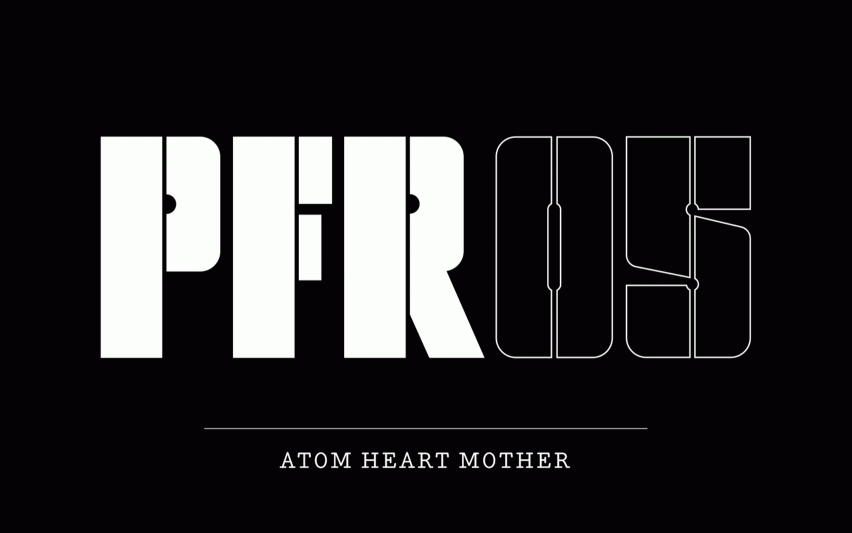
As if creating groundbreaking albums wasn't enough for Pink Floyd, they've also influenced the world of graphic design. Taking its cue from the typography featured on the rock band's 1977 album Animals, Pentagram's creative team, led by partner Harry Pearce, has designed a full stencil-based alphabet and logotype.
The new typeface is part of a wider identity overhaul for Pink Floyd Records, with the distinctive set to be used as a headline font for new releases and merchandise.
Rather appropriately, the Animals album is right in the middle of Pink Floyd's canon, so it was always perfectly placed to represent their career as a whole. And thanks to its stencil and spray paint roots, the typeface avoids coming across as too sleek and corporate, which can sometimes be the case with more traditional professional fonts.

Loaded with idiosyncrasies and inconsistencies, the letterform was a complex one to scale up. Having originally been designed to work on 12" LPs, Pearce and his team had to adjust the stencil cuts through the lettering to make sure the whole design balanced out.
On top of this, the team had to build the system around a limited set of previously available letters. The hard work was worth it though, and now the band has an evocative font that calls to mind the stencilling on all its equipment and tour boxes.
Related articles:
- Pentagram matches colours with moods
- Pentagram creates new typeface for Smithsonian Design Museum's logo
- Want to work at a global design consultancy like Pentagram?

