Rightmove reveals new logo design
Property search company Rightmove reveals a new logo that aims to help people "find your happy".

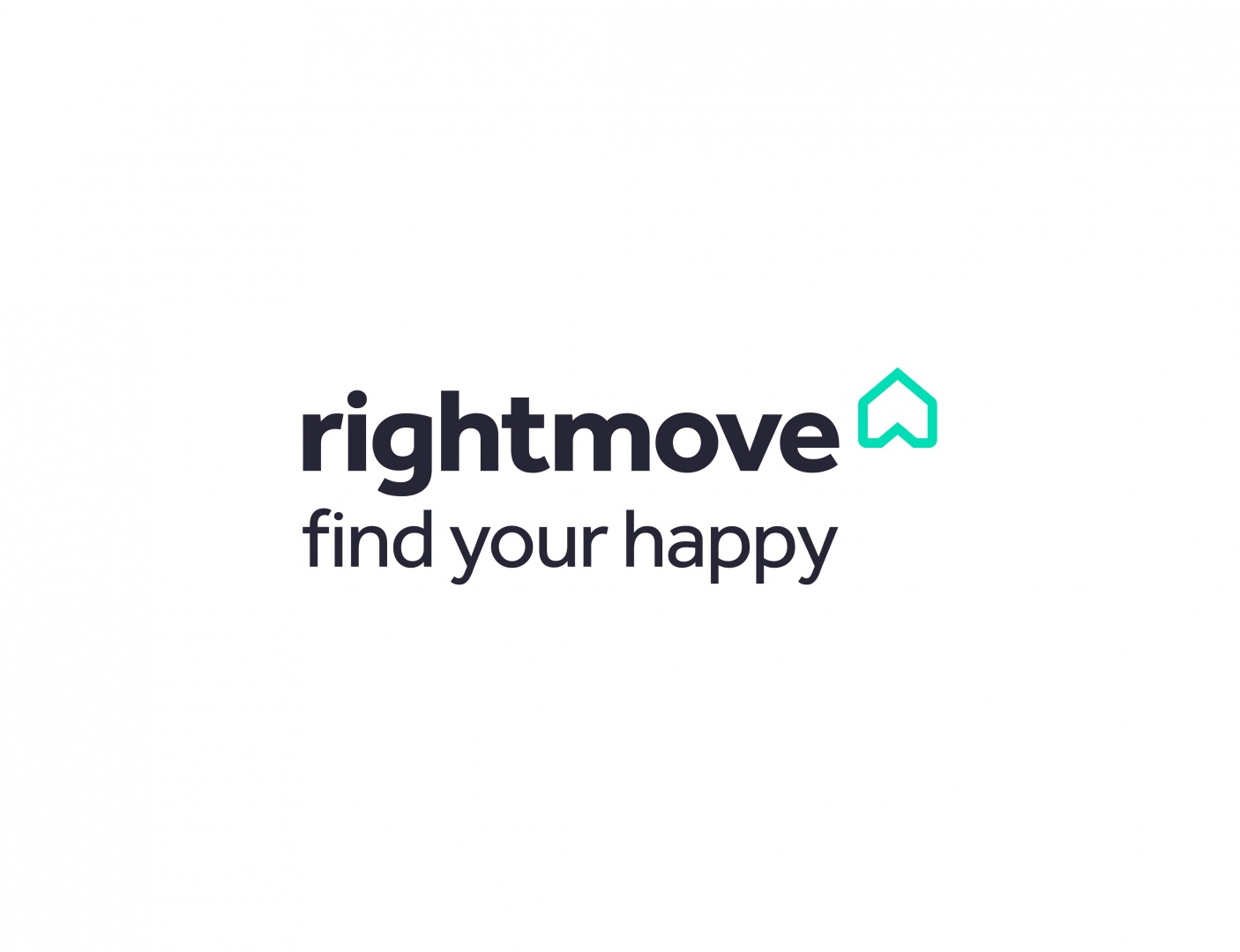
Property hunting is one of the most stressful things a person can go through, so it makes sense that Rightmove have gone for a cheery, optimistic look for their latest rebrand. Designed by The Team, this revamped look for the property search company includes a new logo design and branding framework which will work across online and offline platforms.
Started in 1999, Rightmove claims to advertise roughly 90% of all homes advertised by estate agents all over the UK. Their original mission statement was to "help people make the right move", but over time this evolved into helping people "find you happy". It was this new angle which The Team didn't think was reflected in Rightmove's visual identity.

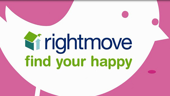
To give Rightmove some human warmth, The Team have created a house symbol with softened edges and a brighter colour palette than before. Whereas Rightmove's previous house and arrow logo communicated the idea of a property search, it was no longer fit for purpose when it came to an emotional angle.
“The best brands always engage on an emotional level and have a distinctive emotional quality," says The Team's brand strategy director, Dan Dufour. With bolder colours and an inverted house symbol that resembles a heart, the creative team hope the new logo will get the Rightmove message across more clearly when it rolls out from December 13.

Related articles
- 7 things to consider when planning a rebrand
- Designing the Golden Pin Awards 2016 branding and logo
- 6 ways to improve your logo design
Sign up to Creative Bloq's daily newsletter, which brings you the latest news and inspiration from the worlds of art, design and technology.

Dom Carter is a freelance writer who specialises in art and design. Formerly a staff writer for Creative Bloq, his work has also appeared on Creative Boom and in the pages of ImagineFX, Computer Arts, 3D World, and .net. He has been a D&AD New Blood judge, and has a particular interest in picture books.

